I had the CD and every few months I'd notice something new: a face, a joke, an object that didn't belong, and immediately go find a mate to see if they'd spotted it too. This was one of those records that felt inescapable in the mid-90s, blasting out of someone's car before I'd even bought my own copy. Turns out I wasn't looking at what I thought, either.
| Album | Dookie |
| Artist | Green Day |
| Released | February 1, 1994 |
| Label | Reprise Records |
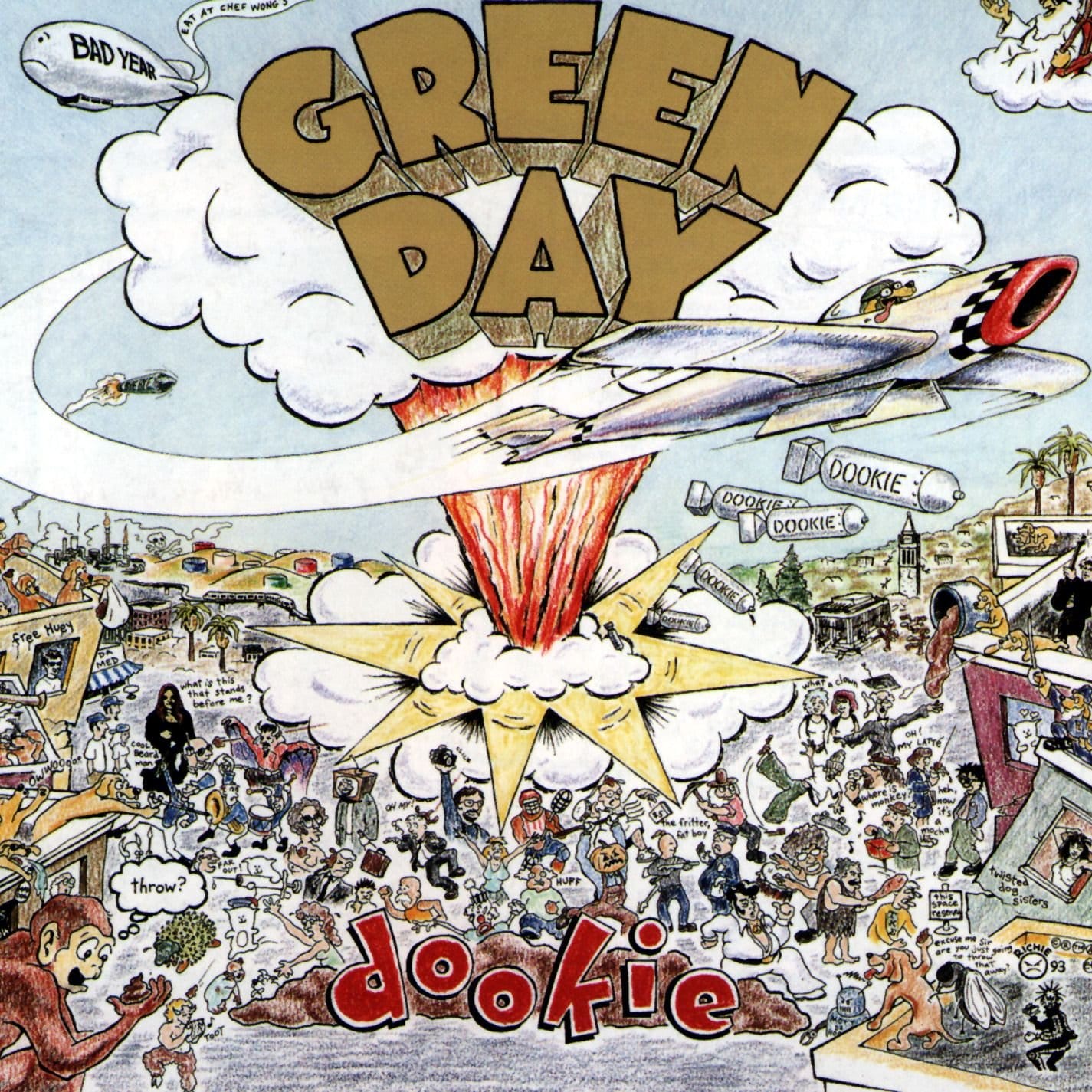
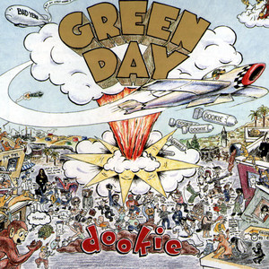
| On the cover | An illustrated Telegraph Avenue, Berkeley, exploding into cartoon anarchy — dogs, poop-flinging monkeys, and dozens of hidden references |
| Format | Illustration (colored pencil) |
| Design | Richie Bucher |
| Decade | 1990s |
| Buy | Amazon / eBay |
The Grosser Original Title
Before it was Dookie, it was nearly something considerably worse. The band's working title was "Liquid Dookie", a nod to what happened to their digestive systems after eating spoiled food on tour. It's hard to imagine that phrase surviving onto record store shelves; even Green Day decided it was a bridge too far and trimmed it down to the marginally less graphic Dookie.
Two Words And A Fighter Jet
Illustrator Richie Bucher, an East Bay artist connected to the band through their original drummer John Kiffmeyer, was given almost no brief at all. By his own account, all he had to work with was the band's name and the word Dookie. He'd been listening to their earlier album Kerplunk! on repeat, and the first two songs reminded him of a fighter jet swooping down; that image became the anchor he built the whole chaotic scene around. He didn't have much time to turn it around either, reportedly pulling an all-nighter to get a rough version onto paper before presenting it to the band, still not entirely sure it captured what he had in his head. Green Day approved his sketch and left him to fill in the rest however he liked.
Berkeley, Exploding
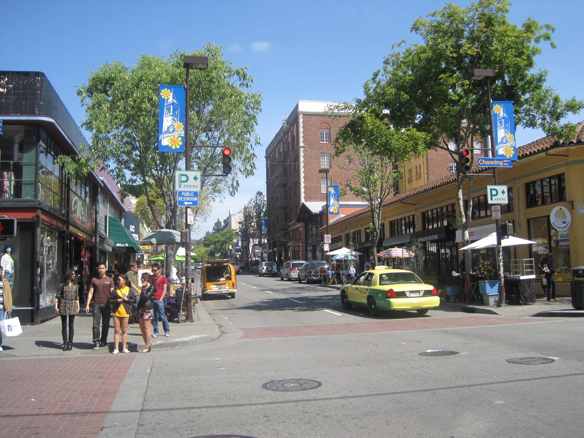
The setting is Telegraph Avenue in Berkeley, California. It's real ground for the band, the street where they'd hung around and worked out ideas in their earliest days before Dookie became their major label debut. It's the same East Bay scene that produced 924 Gilman Street, the all-ages punk club where Green Day cut their teeth, so putting the chaos there wasn't just a design choice, it was practically a hometown tribute. Bucher wasn't illustrating a random cartoon riot; he was blowing up a specific, familiar strip of the band's own suburb.
What Dookie Actually Meant To Him
As a kid, the word "dookie" meant one thing to Bucher: poop. So that's what he drew: exploding waste, poop-flinging monkeys, dogs adding to the mess, all rendered in the same bright, juvenile colored pencil style as everything else on the street. It's a deliberately dumb, unpretentious joke sitting at the centre of one of the best-selling punk albums ever made, which feels entirely in keeping with the band it belongs to.
The Comics He Grew Up On
Bucher has never pretended this was purely original invention. He's pointed to Gilbert Shelton's underground comic The Fabulous Furry Freak Brothers as a direct influence on the loose, anarchic linework, along with the Grateful Dead's Shakedown Street. It's another sleeve built around a chaotic street scene rather than a band portrait and one I am going to have to explore in the future for Art Before Noise. Bucher also looked to John Holmstrom, the cartoonist behind the Ramones' Road to Ruin and Rocket to Russia. That last one shows up as a proper in-joke: tucked onto a blimp floating over Telegraph Avenue is a tiny banner referencing the diner sign from the back of Rocket to Russia, a wink only fellow Ramones obsessives would catch.

The Scavenger Hunt
This is where the cover earns its reputation. Scattered through the crowd and the buildings are dozens of half-hidden references: Elvis Presley, cavemen, a Chia Pet, robots, Patti Smith in an open window, and (as Billie Joe Armstrong has confirmed) a robed figure who's actually a nod to the woman on the cover of Black Sabbath's self-titled debut. AC/DC guitarist Angus Young is perched on a rooftop nearby, drawn as he appeared on the cover of Let There Be Rock. Big Star's Alex Chilton turns up in another window for reasons nobody has ever quite explained. Bucher included the UC Berkeley marching band simply because he liked watching them rehearse, and he signed his own name and logo into the bottom corner, along with "93", the year he actually drew it, a full year before the album's 1994 release.
The Poster Adds More
Here's the twist for anyone who grew up staring at the poster rather than the actual record sleeve: some of the most memorable details weren't on the original cover at all. Bucher drew the poster separately, at the label's request, after the album art was already finished, and used the extra space to add things like a bottle of Mad Dog wine, a nod to the dogs doing the actual bombing, and a cat that had been the mascot for his earlier band, Here Kitty Kitty. If you've spent years convinced a detail was staring back at you from the record cover and can't find it now, there's a decent chance it only ever existed on the poster.
The Cameo That Got Cut
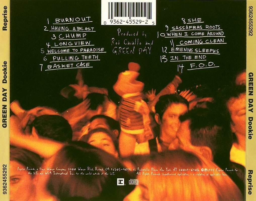
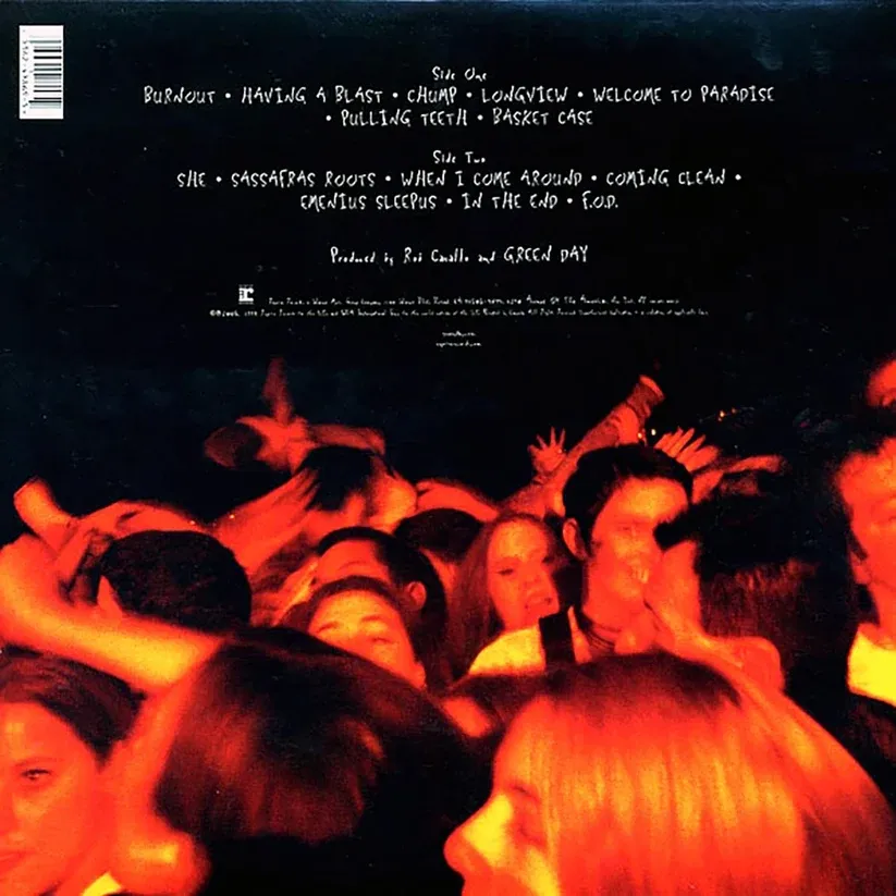
One reference didn't survive long enough for most people to notice. Early CD pressings of Dookie featured Ernie from Sesame Street crowd-surfing across the back cover, reportedly pulled from later pressings over concerns about legal action from the Sesame Street brand. Billie Joe Armstrong has also told the story of a grandmother buying the album for a grandchild, apparently under the impression it was a children's record. Whatever the exact reason it disappeared, Ernie's cameo is now one of the cover's genuine rarities.
Dookie Back Cover - With and without Ernie from Sesame Street
A Cover That Keeps Getting Copied
Dookie has sold more than 20 million copies worldwide and was certified Diamond in the US by February 1999, reportedly the best-selling record ever illustrated entirely in colored pencil. It stands out even more against the era around it, when a lot of its grunge-adjacent peers were leaning toward moody photography rather than cartoon chaos. Its influence has outlasted the decade it came from: in 2018, rapper Vince Staples paid direct homage to it with the cover of his album FM!, recreating the same kind of chaotic street-level scene, just relocated from Telegraph Avenue to his own hometown of Long Beach.
I still catch myself scanning that CD in my memory looking for something I missed the first hundred times. That might be the real achievement here, Bucher packed a single cover so densely that, thirty years on, it still doesn't feel fully finished looking at.