He Preferred Beethoven
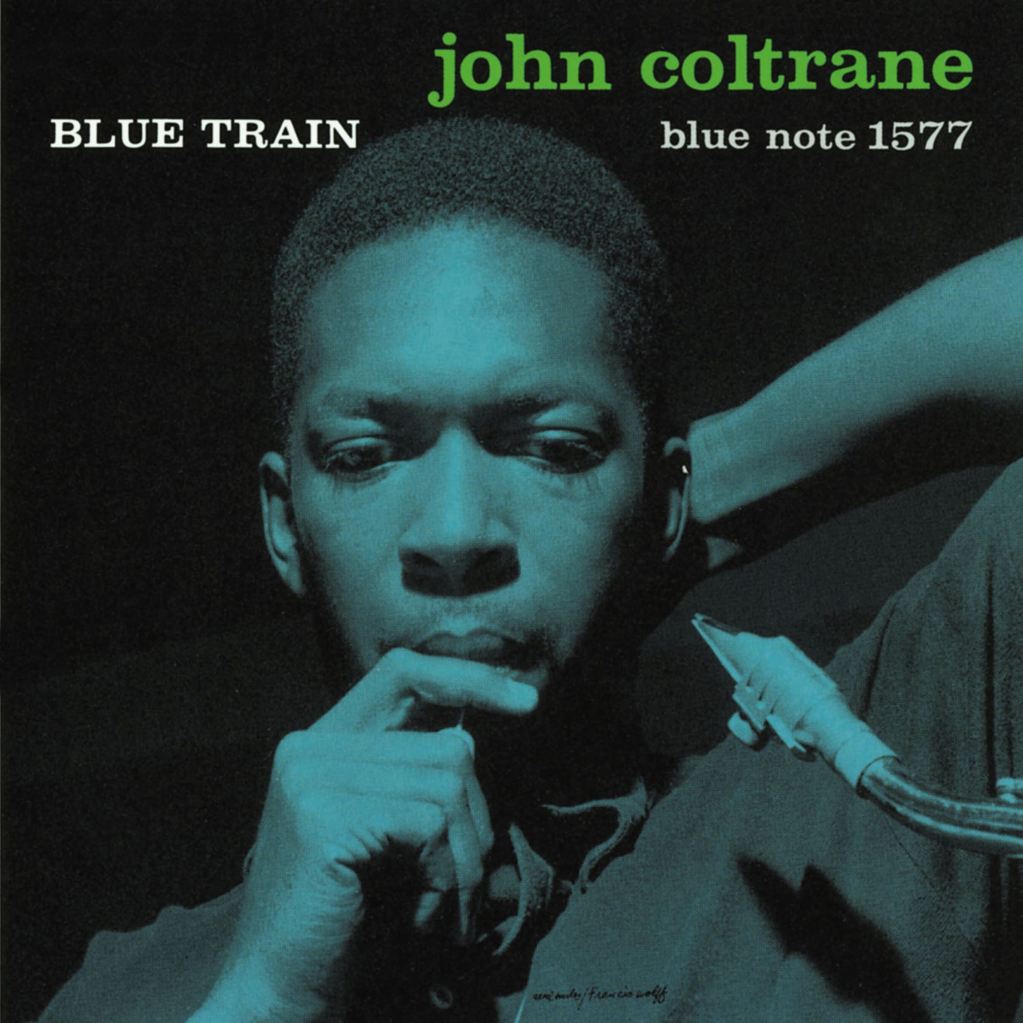
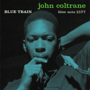
Blue Train by John Coltrane - A thoughtful, unposed photograph, designed by a man who'd rather have been listening to Beethoven.
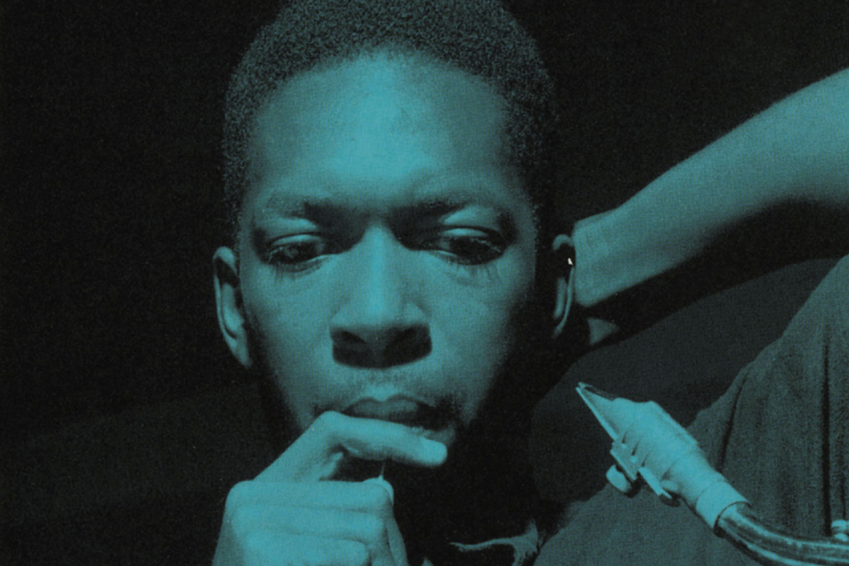

I've never trusted my own opinions about jazz much. I like what I like, but I'm always half-expecting someone to tell me I've got it wrong. So there's something comforting about Blue Train's cover: Coltrane isn't performing for anyone, isn't even looking at the camera. He's just thinking. It's the one jazz cover I've never felt like I needed permission to enjoy.
Album Anatomy
| Album | Blue Train |
| Artist | John Coltrane |
| Released | January 1958 |
| Label | Blue Note Records |
| On the cover | A reflective photograph of Coltrane, hand to his chin, saxophone slung across him, looking down in thought rather than performing |
| Format | Photograph |
| Design | Reid Miles (design), Francis Wolff (photography) |
| Decade | 1950s |
| Buy | Amazon |
The Man Who Photographed The Session
The image wasn't staged after the fact. Francis Wolff shot it during the actual Blue Train recording session on September 15, 1957, at Rudy Van Gelder's studio in Englewood Cliffs, New Jersey, alongside dozens of other candid frames of Coltrane and the band at work. Most jazz photography from this era leans toward the performative; instruments raised, mouths open, motion blur. Wolff and Miles picked the opposite: a musician mid-thought, saxophone resting rather than raised, caught somewhere between a session and a private moment nobody else was meant to see.
A One-Album Guest Appearance
At the time Blue Train was recorded, Coltrane was contracted to a different label, Prestige Records, and the original sleeve actually carries a line noting he appears "by courtesy of" that label. The same goes for pianist Kenny Drew, on loan from Riverside. Blue Train is Coltrane's only album as a leader for Blue Note, a one-off session squeezed in around other commitments, which makes it a strange thing to also be the record most responsible for shaping his visual image. He barely worked with this label again, and this is still the cover most people picture when they picture him.

He Preferred Beethoven
Reid Miles, the man responsible for essentially inventing what a modern jazz record was supposed to look like, wasn't actually a jazz fan. He preferred classical music, reportedly gave away or traded in most of the free Blue Note LPs he received as payment, and built many of his covers from producer Alfred Lion's spoken descriptions of a session rather than close listening to the results. Miles was paid modestly for the work too, around $50 a cover by his own account, often finishing several on a Saturday alongside his day job at an advertising agency. Over roughly a decade at Blue Note, from 1956 until Alfred Lion's retirement in 1967, he designed something in the region of 500 sleeves this way, defining an entire genre's visual identity almost at arm's length from the music itself. The bold, asymmetric type and tinted photography that people now think of as "the jazz look" came out of that same distant, businesslike relationship with the records he was shaping, not from someone hanging on every note.
There's something quietly reassuring in that, actually. If the person who taught jazz how to look didn't need to be a devotee to get it right, I suppose the rest of us are allowed the occasional educated guess too. I still don't always know what I'm listening to. I just know, looking at this one, exactly what I'm looking at.