White Noise
Mechanical Animals by Marilyn Manson - The cover that turned a rock star into an alien, then hid a message in plain sight.
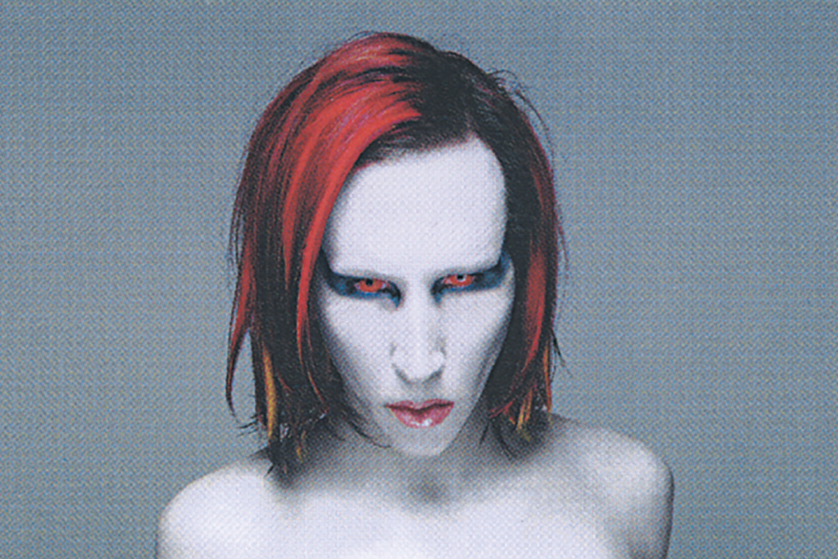

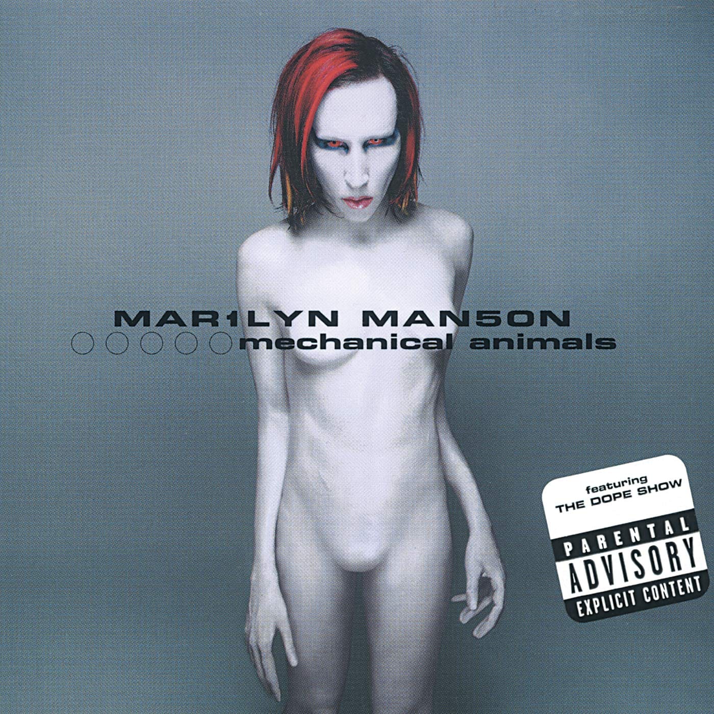
I can handle a lot from an album cover. Blood, religious imagery, severed heads, a little tasteful misery, no problem. But when I first looked at Mechanical Animals, I was drawn to the strange calm of it. Marilyn Manson is standing against a blank background, painted white from head to toe, with red hair, breasts, six fingers and no obvious interest in making any of it look comfortable.
It is not a conventionally attractive image. It is not quite disgusting, either. It sits in that awkward space between beautiful and disturbing, which is probably where Manson wanted it.
Released in 1998, Mechanical Animals was a dramatic visual and musical shift from Antichrist Superstar. Manson had gone from apocalyptic preacher to glamorous alien rock star. The cover announced that change before the first song had even started.
And then there was the message hidden in the lettering.
Album Anatomy
| Album | Mechanical Animals |
| Artist | Marilyn Manson |
| Released | 15 September 1998 |
| Label | Nothing Records / Interscope Records |
| On the cover | Marilyn Manson transformed into Omēga, an androgynous alien figure with prosthetic breasts, six fingers and an obscured groin |
| Photography | Joseph Cultice |
| Design / Art direction | P.R. Brown |
| Decade | 1990s |
Meet Omēga
The figure on the cover is Omēga, one of the characters Manson created for the album’s world. Omēga is an alien who arrives on Earth and becomes a famous musician, eventually surrounded by drugs, celebrities and people who seem to have misplaced their humanity.
That makes the cover more than a portrait. It is a product photograph for a fictional pop star.
Manson is not presented as himself. He is presented as something manufactured: part person, part mannequin, part alien, part glamorous rock cliché. The smooth white body looks almost like a shop-window display. Even the flesh seems synthetic.
Manson described Omēga as representing sexlessness and vulnerability. That gives us a useful key to the image, because the cover is confronting and it refuses to provide an easy answer. Is this a man dressed as a woman? A woman dressed as an alien? A body without a fixed identity? Or simply a celebrity turned into a thing?
The answer seems to be all of them.
The cover photograph was created by Joseph Cultice, with the image built from prosthetics, latex body paint, lighting and digital retouching. The breasts were artificial, the body was reshaped and the familiar signs of masculinity were deliberately removed or obscured.
That is the detail I keep coming back to. The image looks like a photograph, but it is actually a small production: casting, sculpting, painting, posing, lighting and retouching. The “alien” is not discovered. He is assembled.
The Cover that got Covered
The controversy was immediate and, in some ways, predictable. The cover showed Manson apparently naked, with breasts and an airbrushed groin. Retailers that were perfectly comfortable selling violent films, violent games and violent lyrics suddenly became very concerned about a pair of prosthetic breasts.
Wal-Mart refused to stock the album in its original form. Other retailers required alterations or stickers to cover the offending details. The album’s packaging became controversial before many people had even heard the record.
There was something wonderfully absurd about the argument. Manson’s body was not being presented as pornography. It was being used as a visual question: what happens when a rock star removes every familiar sign of masculinity?
The retailers’ response answered that question in its own way. The problem was not necessarily nudity. It was ambiguity.
The cover did not give the viewer a safe category. It did not say “male body” or “female body” and leave the matter there. It presented a body that had been deliberately altered, then asked the public to look at it. The sticker placed over the image became another part of the artwork; a small admission that the cover had won.

The Message in the Middle
The most famous hidden message is contained in the cover lettering. Rearrange the words and the typography creates the anagram:
Marilyn Manson Is an Alchemical Man
That is a very Manson sentence. It sounds like a declaration, a magic spell and a piece of heavy-metal nonsense all at once.
But “alchemical” is doing useful work here. Alchemy is traditionally associated with transformation: turning one substance into another, especially base metal into gold. On Mechanical Animals, Manson turns himself into something else. Brian Warner becomes Marilyn Manson. Marilyn Manson becomes Omēga. A human body becomes an alien body. A rock album becomes a piece of conceptual theatre.
The cover is not just showing transformation. It is performing it.
The anagram also suggests that the image is not as random as it first appears. The blank background, the white latex, the altered anatomy and the carefully arranged lettering all feel like parts of a coded system. Manson wants the viewer to suspect that there is another layer underneath the obvious shock.
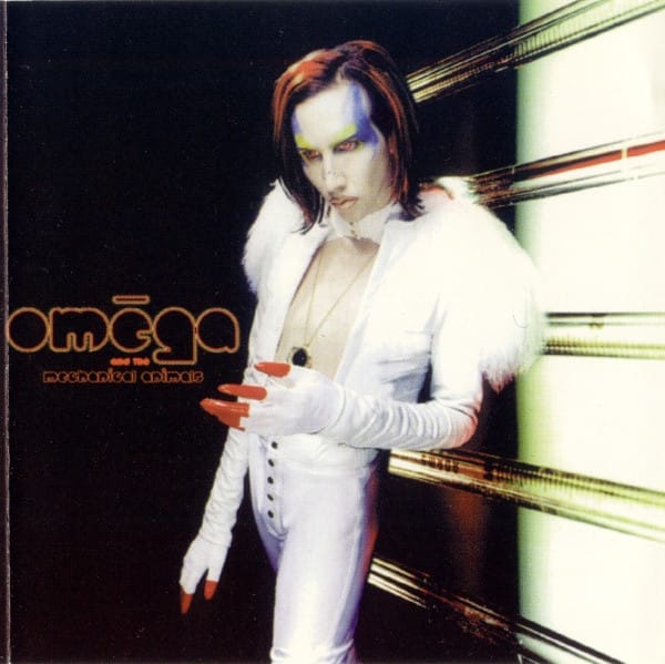
The reverse side of the booklet presents the fictional band Omēga and the Mechanical Animals in a less explicit image. The album’s two identities are built into its packaging: Marilyn Manson on one side, Omēga on the other.
That split reflects the record itself, which moves between the vulnerable, alienated perspective of Omēga and the more decadent world of fame, sex and drugs. Even the sleeve seems to be asking which version of the artist is real.
Yellow Plus Blue
The hidden message does not stop with the anagram.
The original CD packaging used a blue jewel case. Inside the booklet, some of the lyrics and text were printed in yellow against busy backgrounds, making them difficult (or impossible) to read normally. Hold the booklet against the blue plastic and the colours shift. Yellow and blue produce green, and the concealed words become visible.
The booklet even provides the instruction: “Yellow and blue = green”.
This is a clever trick, but it also fits the album’s central idea. The packaging does not simply contain information. It makes the listener work for it.
Among the hidden messages are references to Coma White, machines, dead stars and the album’s secret computer track. One message changes “The Speed of Pain” into “Freed of Pain”, turning a song title into a small visual transformation of its own.
There are more hidden references scattered through the packaging, which is why the album’s hidden messages have kept fans examining the artwork long after the original release. This is the sort of thing that made physical albums feel like objects rather than containers.
The album was not hiding a secret in an inaccessible vault. It was hiding one in the thing sitting beside your stereo.
Designed to be Uncomfortable
The cleverness of Mechanical Animals is that the controversy and the concept are inseparable.
Manson did not simply put a naked body on the cover to annoy retailers. He created a body that challenged the viewer’s assumptions, then placed it in the most clinical setting possible. There is no dramatic background, no blood, no flames and no theatrical gothic clutter. Just white space and a figure that looks as though it has been prepared for display.
Cultice has said that he wanted to make Manson look beautiful, with David Bowie’s Diamond Dogs as an influence. Elle Macpherson was also reportedly used as a reference for the body’s shape.
That intention is important because it explains why the image feels so polished. It is not a failed attempt at glamour. It is glamour pushed past the point where it remains reassuring.
The result is an album cover about artificiality that is itself highly artificial. The human body has become a costume. Gender has become a design decision. Celebrity has become a product. Even the hidden messages suggest that what we see on the surface is only one version of the truth.
For all its machinery, though, there is something vulnerable about Omēga. The figure is completely exposed, but emotionally unreadable. The body is altered, yet the face still belongs to Manson. He is both hiding behind the character and putting himself on display.
That tension is why the image has lasted. Shock fades quickly. What remains is the question it asks: when a performer changes himself into a product for public consumption, how much of the person is left?
A Cover that Refuses to Settle
I don’t think Mechanical Animals is a comfortable image, and I don’t think it is supposed to be. It is too polished to be punk in the traditional sense, too strange to be straightforward glam and too carefully coded to be dismissed as simple provocation.
The cover’s hidden message calls Manson an “alchemical man”. That may sound like self-mythologising (and it is, a little bit) but it is also an accurate description of what the artwork does. It takes a familiar rock star, covers him in latex, adds an impossible body, photographs the result and turns the image into a puzzle.
Then the retailers tried to cover it up. Which only made the whole thing more visible.
It is not just a picture of an alien.
It is a picture of a person being turned into one.