Before we talk about the design, let's talk about what we are actually looking at.
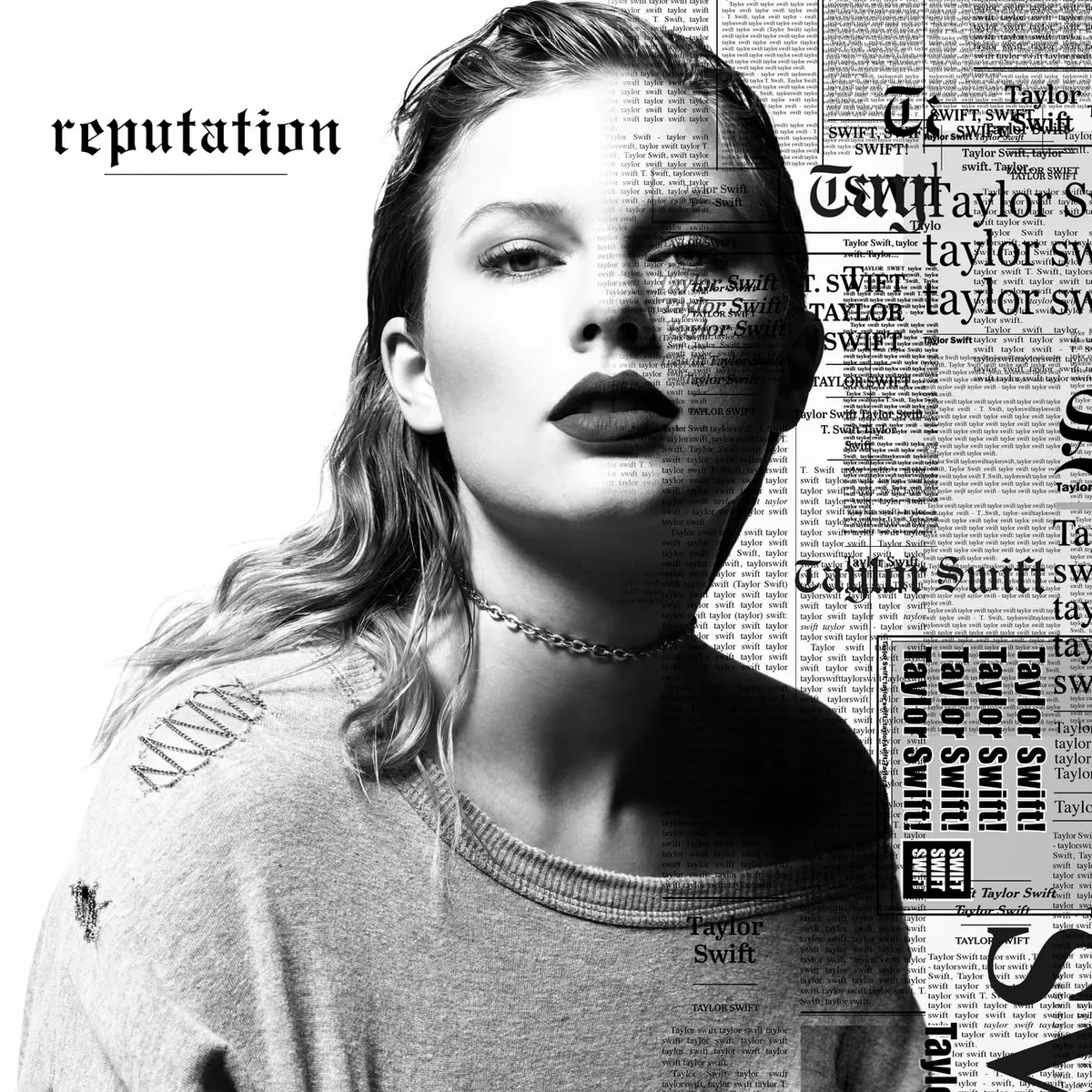
Taylor Swift in black and white, her name printed in large gothic-style newspaper clippings, with Reputation below it. She's looking directly at the camera with an intense, almost defiant stare, her hair slicked back.
The left side of her face is covered in newspaper-style text with her name printed repeatedly.
Your name. Over and over. Until it stops meaning anything. Until it becomes wallpaper. Until the word Taylor Swift is so omnipresent on this cover that it ceases to be a person's name and becomes something else; a brand, a noise, a target, a symbol.
That is not an accident. The font used for the Reputation album cover is Engravers Old English. It is bold and dramatic, fitting for the album's theme. Gothic newspaper typography. The kind of font used in tabloid headlines. The kind of font that screams scandal and drama and PUBLIC ENEMY NUMBER ONE.
She took the language of the people who had been writing about her and put it on her own face.
Album Anatomy
| Album | reputation |
| Artist | Taylor Swift |
| Released | 10 November 2017 |
| Label | Big Machine Records |
| On the cover | A black-and-white photo of Swift, hair slicked back, dark lipstick, superimposed over repeated newspaper clippings of her own name |
| Design | Mert & Marcus (photography) |
| Genre | Pop |
| Decade | 2010s |
| Buy | Amazon / eBay |
What Happened Before The Cover
To understand the Reputation cover you need to understand the two years that preceded it. And yes, this means talking about Kanye West. Briefly.
In 2016, Kim Kardashian posted a recorded phone call between Taylor Swift and Kanye West, a call in which Swift appeared to approve lyrics about her in West's song Famous. The internet turned on Swift immediately. Her social media mentions were flooded with snake emojis. The hashtag #TaylorSwiftIsASnake went viral. She went dark. No social media and no public appearances for almost a year.
When she returned, she returned as this. A black and white photograph. Gothic newspaper typography. Her own name repeated until it becomes noise. Where feminine font once was, there is now a gothic serif font with newspaper-style typography surrounding her photograph. A combination of the black and white colour scheme, Swift's domineering pose, and the more structured font type all demonstrate a level of strength in herself.
The old Taylor was dead. She said so herself in the first single. The cover was the visual confirmation.
Mert and Marcus
The cover was shot by renowned photographers Mert and Marcus. Mert Alas and Marcus Piggott who have photographed Madonna, Lady Gaga, Versace campaigns, and now, Taylor.
This matters. Mert and Marcus are not pop photographers. They are high fashion photographers; their aesthetic is dark, dramatic and deliberately challenging. Bringing them in to shoot the Reputation cover was a statement in itself. This was not going to be another brightly lit Taylor Swift album cover with a floral backdrop.
She is captured in a high-contrast photograph. Such an image creates a highly graphic effect and removes most of the mid-tone shadow from her face. The detail in the image is in her hair and clothing.
Her face, the face that everyone knows, the face that has been on magazine covers and concert posters for a decade is almost obscured. Covered by her own name. Hidden behind the reputation.
The Controversy
The cover landed and the reaction was immediate. And divided.
Fans took to Twitter to rip on the design. Some called it brilliant; a genuine artistic statement about fame, media and the weaponisation of someone's own name against them. Others called it try-hard. Overwrought. The pop equivalent of putting on a leather jacket to prove you're edgy.
Opinion seemed split between those proclaiming horror at the trend of bad design, while others fell into claims of Swift ripping Kanye West.

Did It Work?
As a piece of image rehabilitation? Yes. Completely. This cover is a masterclass in owning your narrative. After a period of intense media scrutiny and public drama, Taylor leaned into it with this imagery. By using newspaper clippings as her own branding, she reclaims the narrative.
As a piece of genuine artistic risk? Less certain. The cover is slick, expensive and technically accomplished. Mert and Marcus are phenomenal photographers. But there is something slightly calculated about it that makes it feel more like strategy than vulnerability.
What The Cover Actually Says
I am Taylor Swift. My name is everywhere. You have been saying it for years; in headlines, in think pieces, in snake emojis. You have turned my name into a weapon and used it against me.
So I took it back. I put it on my own face. I covered myself in my own name until the name stopped meaning what you wanted it to mean and started meaning what I wanted it to mean.
That is a bold statement. Made with gothic newspaper typography and a Mert and Marcus photograph and a font called Engravers Old English.
Is it art? Is it strategy? Is it both?
She was trying to change her reputation. She said so in the title. The cover just shows you what that looks like from the outside.