



When I first saw the cover of Yeezus, I looked at it. I moved on. I didn't care.
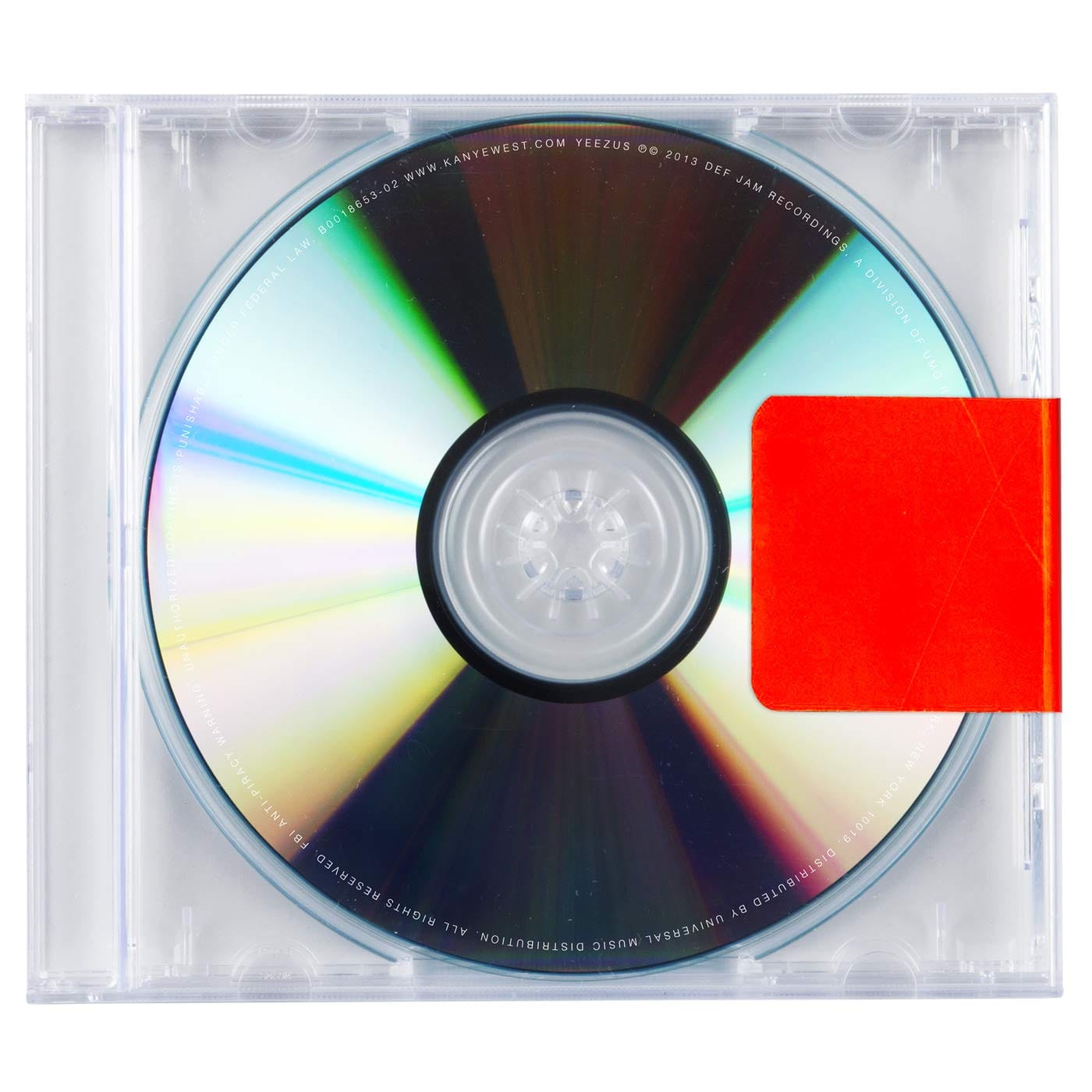
A clear plastic CD case. A piece of red tape. Nothing else. No band name. No album title. No image. No effort, or so I thought. Just Kanye being Kanye. Again. The most provocative artist in music doing something provocative for the sake of being provocative. Fine. Whatever.
However, I was wrong. Not about the music, Black Skinhead is a great song. But about the cover. Because the cover of Yeezus is not nothing. It is one of the most deliberate, most considered, most conceptually loaded pieces of album packaging in modern music history.
The Reducer
Before we talk about the cover we need to talk about Rick Rubin. Because the cover and the music were born from exactly the same impulse.
In early 2013, Kanye West asked legendary producer and Def Jam Recordings co-founder Rick Rubin to help complete his new album. With only weeks to meet West's deadline and a rough cut of sixteen unfocused and unfinished tracks, the task appeared nearly impossible. The rough cut ran nearly three and a half hours. In the studio, the two began deconstructing the tracks, unveiling the edgy and minimal and hard sound West had been searching for. The duo worked for sixteen days, fifteen hours a day, with no time off.
West's instructions to Rubin were precise; take everything in a stripped-down, minimal direction. Remove elements. Reduce. Simplify. And when Rubin had finished, West delivered his verdict on the collaboration with characteristic economy: "He's not a producer, he's a reducer."
A reducer. Strip everything back. Take away what isn't needed. Leave only what is essential.
The cover of Yeezus is the visual expression of that exact philosophy. And it was always going to be.
The Anti-Cover
The original physical release shipped in a clear jewel case with no booklet or printed tray card. On many copies a red strip of industrial tape sealed the spine. The vinyl release used a minimalist semi-transparent sleeve.
No artist name. No album title. No image. No liner notes. Nothing.
West ranted about the cover: "With this album we ain't drop no single to radio. We ain't got no NBA campaign, nothing like that. Shit, we ain't even got no cover. We just made some real music."
Disgruntled with the state of the music industry in 2013, viewing pop radio as uninspired, marketing as cynical, packaging as a commercial exercise, West made a decision that was simultaneously the laziest and most labour-intensive thing he could have done. Lazy because it required no design. Labour-intensive because it required the complete dismantling of everything the music industry expected an album to be.
A piece of tape on a clear case is not an absence of design so much as a critique of design, legible only against the maximalism it was rejecting.
The cover of Yeezus only makes sense when you know what came immediately before it, My Beautiful Dark Twisted Fantasy, which we've already written about on this blog. That album featured George Condo paintings, multiple alternate covers, a gatefold sleeve, and some of the most elaborate album packaging in recent memory. Yeezus followed it with a piece of red tape on a clear plastic case.
The maximalism of MBDTF and the minimalism of Yeezus are in direct conversation with each other. Same artist. Three years apart. Two completely opposite visual philosophies.
Peter Saville's Fingerprints
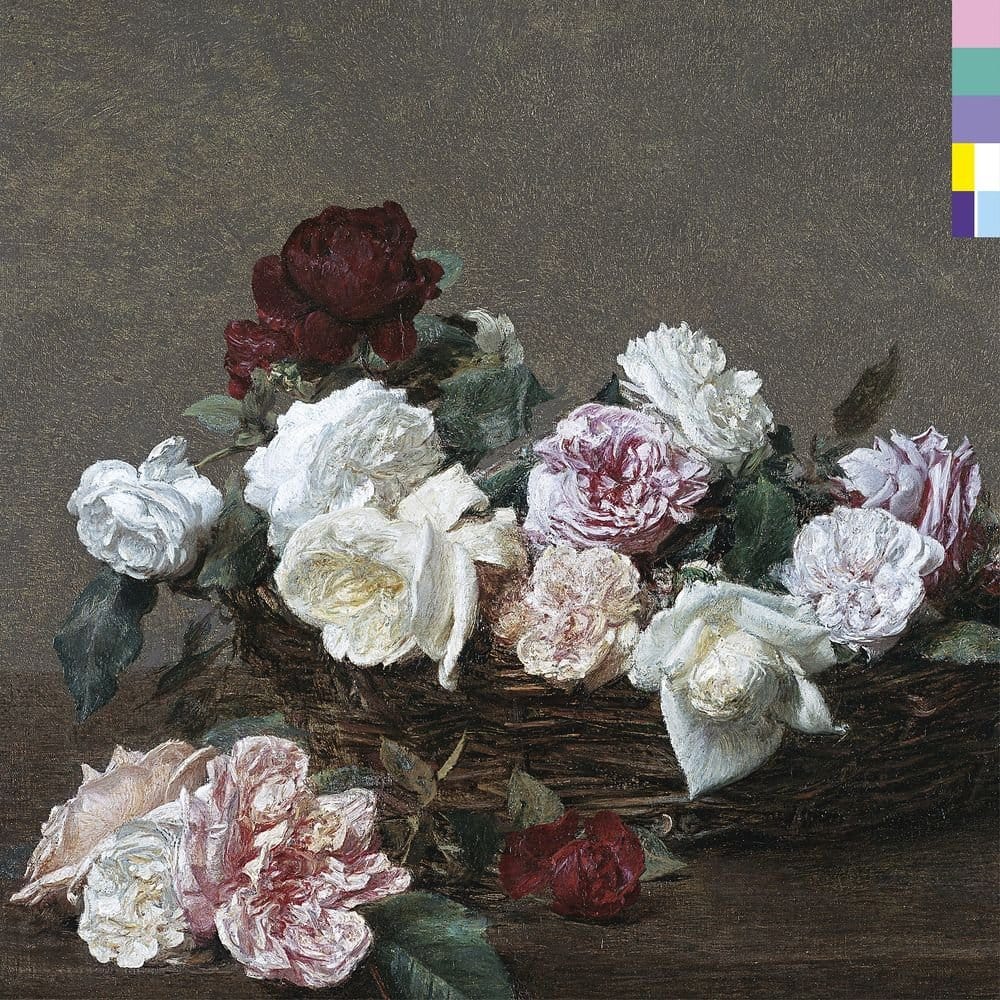
There's no denying the coincidence between the final artwork and an unreleased cover that legendary art director Peter Saville designed for New Order back in 2001. West supposedly approached Saville about designing a similar record cover for him, but he refused on the grounds that he didn't want to duplicate his work.
Peter Saville. The man who designed Unknown Pleasures. The man who put the pulsar graph on the first post ever written on this blog. The man behind Power, Corruption and Lies, the New Order album we featured in the Say Nothing post about covers with no text.
Kanye West approached Peter Saville to design Yeezus. Saville said no. And the cover that West ended up with was strikingly similar to Saville's unreleased New Order work from 2001 anyway.
Please Add Graffiti
A.P.C. founder Jean Touitou shared an image with "Please Add Graffiti" text above the album before release, encouraging fan participation. The directive led to the creation of YeezyGraffiti.com (don't go looking for it, the website is long gone). Fans could submit their own cover concepts, and the phrase appeared on street posters in New York City, turning the blank cover into a canvas and the release into a participatory event.
A blank cover. Deliberately blank. Inviting the world to fill it. The absence of design as an open invitation to design. The anti-cover becoming a collective canvas.
Virgil Abloh, who served as assistant creative director of West's creative content company DONDA at the time, described the packaging as an "open casket." The packaging performs the death of the format it inhabits.
The death of the album cover. Staged deliberately. By the man who would go on to become one of the most celebrated fashion designers of his generation before his own death in 2021.
The Gold Cover Nobody Saw
There is one final detail worth knowing about. This is the cover you know, but it was not the only version that existed.
The gold cover without the red tape reveals that the gold actually forms two faces splitting apart from each other; one representing Jesus and one representing Kanye. This would be consistent with the Yeezus theme, a portmanteau of Ye from Kanye and Ezus in reference to Jesus. The gold faces were purportedly inspired by artist George Condo's Mental States collection, which featured a series of golden busts with varied expressions.
George Condo again. The same artist who painted the cover of MBDTF. Appearing in the DNA of Yeezus even though his work never made the final version.
What The Cover Actually Says
I looked at the cover of Yeezus and moved on. I thought it was Kanye being Kanye. Provocative for the sake of provocation.
I was half right. It was Kanye being Kanye. Kanye is always being Kanye. But Kanye being Kanye at his most stripped-down, most minimal, most deliberately contrary, produced something that is genuinely extraordinary when you understand its context.
Ironically, the characteristics (or lack thereof) brilliantly mimic the tone of the album. Sonically, Yeezus differs drastically from West's traditionally warm and polished sound, instead offering a chaotic array of unfiltered digital noise. The cover embraces the album's CD-ness completely.
The cover and the music are the same thing. Both stripped back. Both raw. Both deliberately difficult. Both making you work before they give you anything.
Yeezus was the most critically acclaimed album of 2013 according to Metacritic, topping numerous end-of-year lists. Rolling Stone included it on its 2020 list of the 500 Greatest Albums of All Time.
The most acclaimed album of 2013 had no cover. Sometimes nothing says everything.



Discussion