



Most album covers shout at you. Band name. Album title. Sometimes a logo. Sometimes all three, in a font chosen to tell you exactly what kind of music is inside before you've heard a single note.
And then there are the ones that say nothing at all.
No name. No title. Just an image, confident enough to stand completely alone. These are nine of the best.
1. The Beatles - Abbey Road (1969)
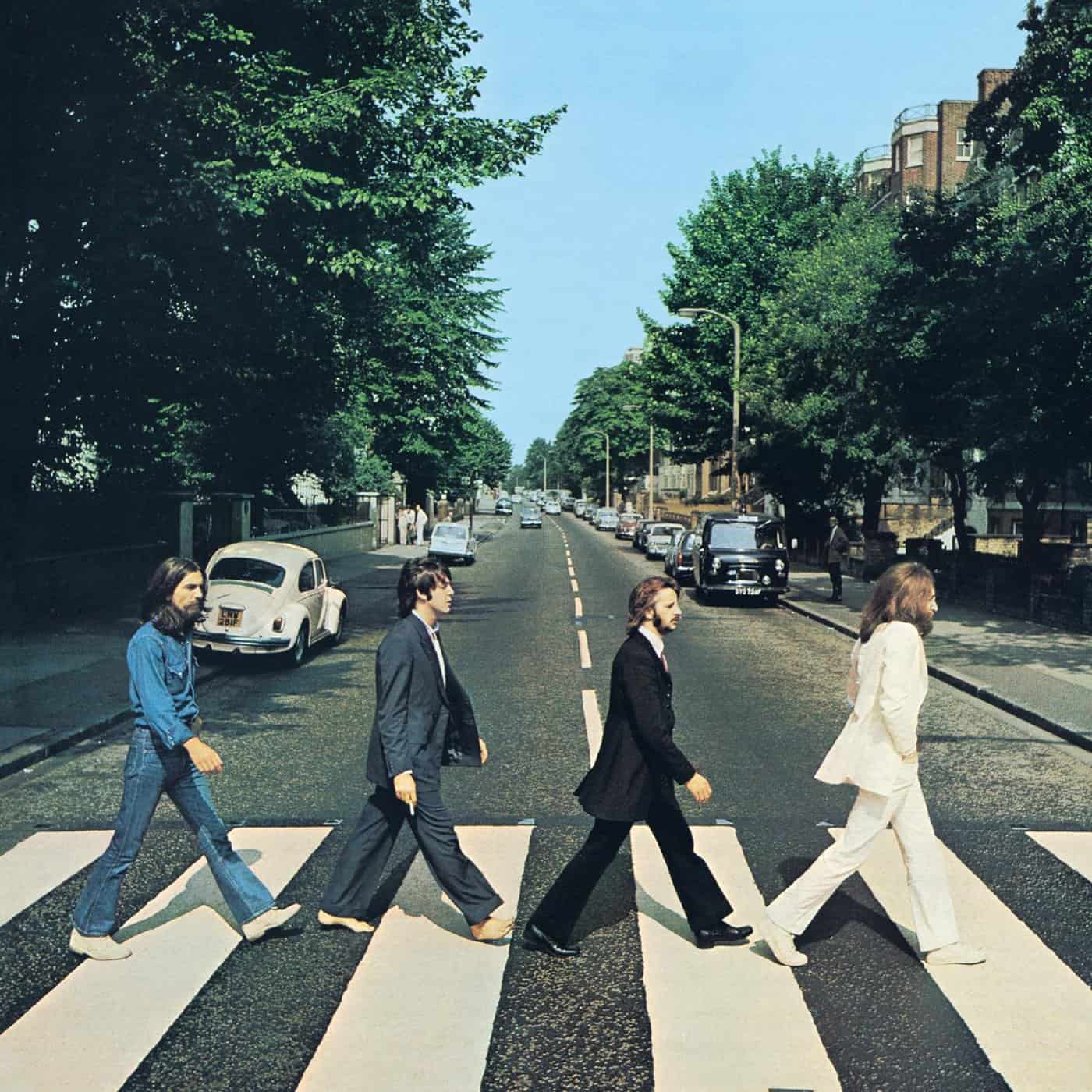
Four men crossing a road. No band name. No album title. Just a zebra crossing on a quiet London street and four of the most famous musicians in the world walking across it in a line. The cover was photographed by Iain Macmillan in under ten minutes, standing on a stepladder in the middle of the road while a police officer held back traffic. It is one of the most imitated images in music history. It needs no words because the four people on it are the words. They are walking away from the studio and each other, a physical manifestation of the record's sonic climax. Just as "I Want You (She's So Heavy)" builds its massive, suffocating groove only to be brutally chopped off in mid-second, this photo catches the exact moment the greatest band on earth decided they were done.
Add it to your collection - Abbey Road - The Beatles
Abbey Road doesn't give up its secrets easily. This cover has more than one hiding in plain sight, head over to Look Closer to discover it.
2. Pink Floyd - The Dark Side of the Moon (1973)
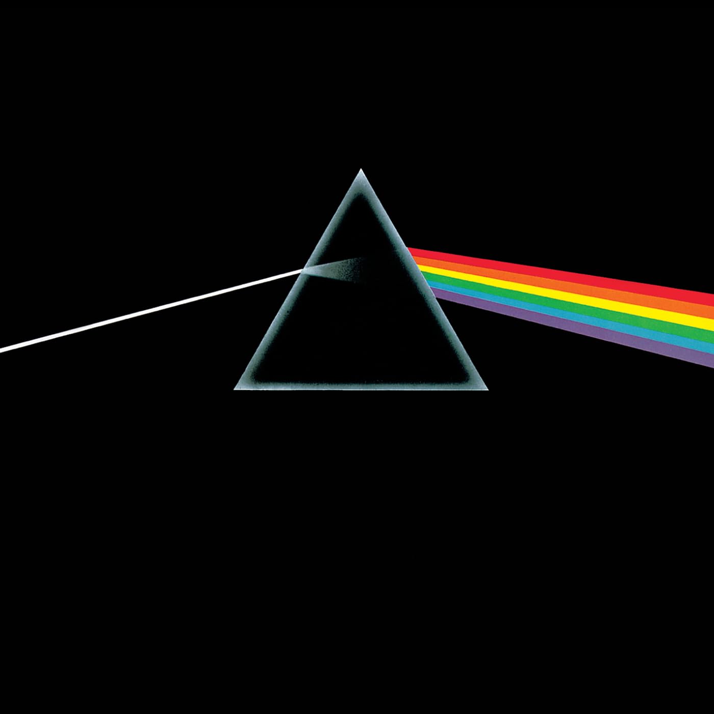
A beam of white light strikes a prism and splits into a spectrum of colour against a black background. No band name. No album title. Nothing. Designed by Hipgnosis and drawn by George Hardie, the brief from keyboardist Richard Wright was simple: "something clean, elegant and graphic." The image has since sold over 45 million copies, been projected onto buildings worldwide, and appeared on Royal Mail stamps. It remains the most recognisable piece of graphic design in the history of rock music. And it still has no words on it.
Add it to your collection - Pink Floyd - The Dark Side of the Moon
3. Led Zeppelin - Led Zeppelin IV (1971)
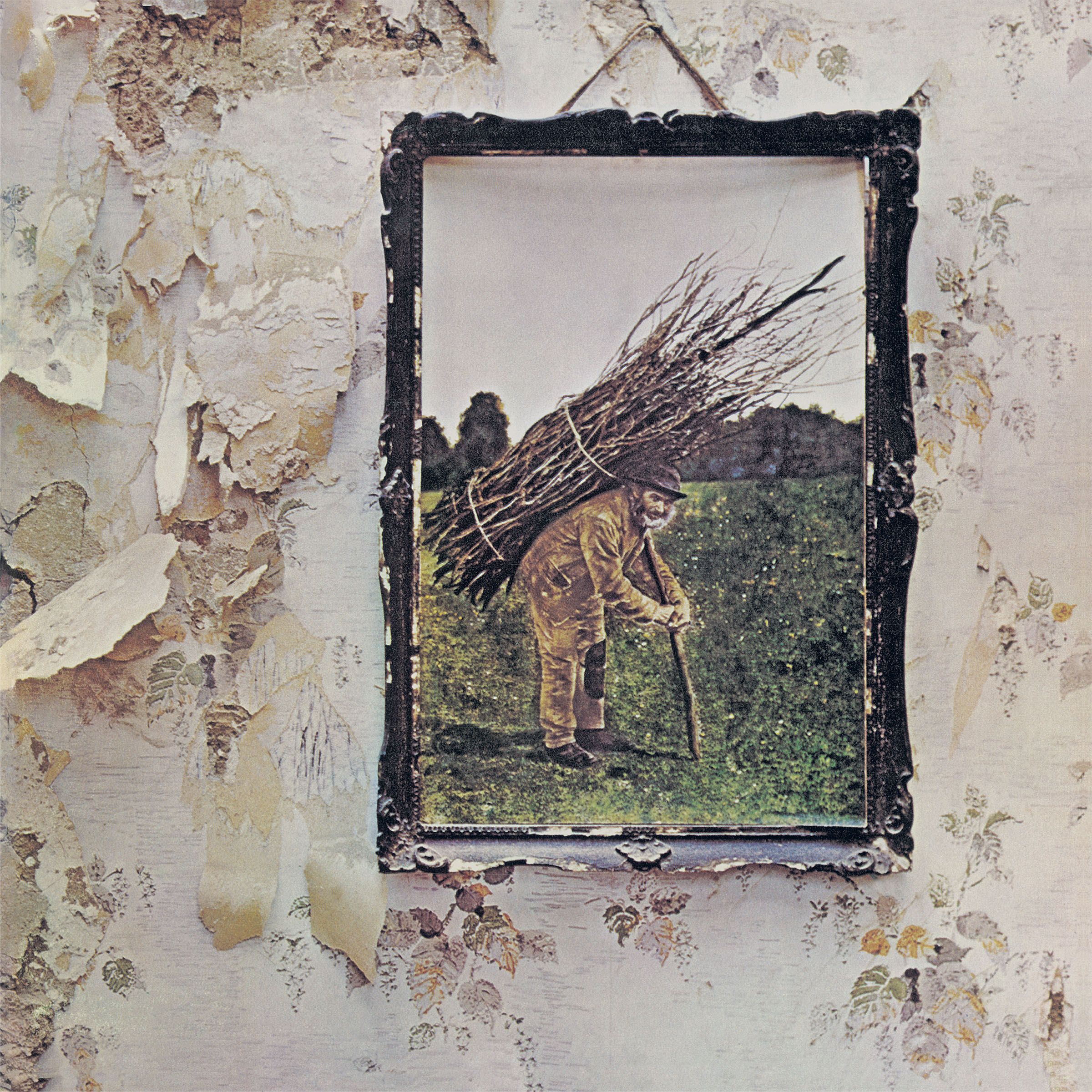
Again, no band name. No album title. Not even a record label. Just an old framed photograph of a man carrying a bundle of sticks on his back, hanging on a crumbling wall. The album has no official title. Fans call it Led Zeppelin IV or Four Symbols or Zoso, but none of those names appear anywhere on the cover. Jimmy Page insisted on the textless design as a deliberate rejection of the music industry's obsession with branding. EMI were baffled. The album sold 37 million copies. Page was right.
Add it to your collection - Led Zeppelin - Led Zeppelin IV
4. The Beatles - The White Album (1968)
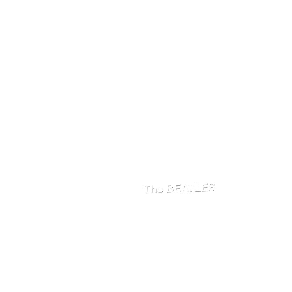
Pure white. The artist's name embossed so faintly it almost disappears. A serial number stamped in the corner. Nothing else. Designed by pop artist Richard Hamilton, it was a radical counterpoint to the maximalist explosion of Sgt. Pepper the year before. Every copy had its own unique serial number, making each one technically a limited edition. The cover said nothing. The music inside said everything.
Add it to your collection - The Beatles - The White Album
5. David Bowie - Blackstar (2016)
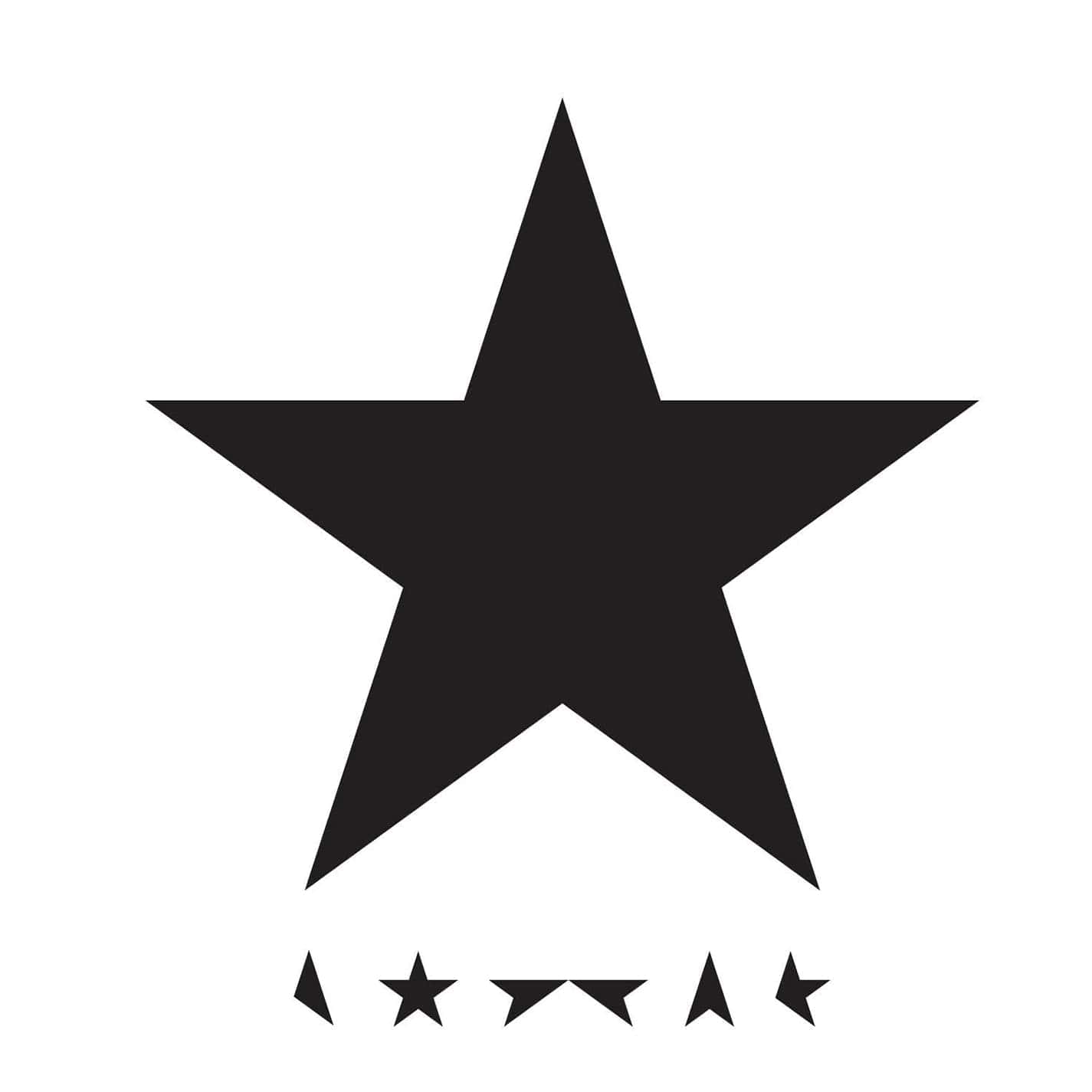
Five stars arranged in a pattern. No name. No title. Released two days before Bowie's death, the cover was designed by Jonathan Barnbrook and hidden within it was one final secret. The five stars on the cover are missing points in just the right places to spell out the word "BOWIE" if you know where to look. A message hidden in plain sight on a cover with no visible text. Bowie's last trick. Typically extraordinary.
Add it to your collection - David Bowie - Blackstar
6. Metallica - The Black Album (1991)
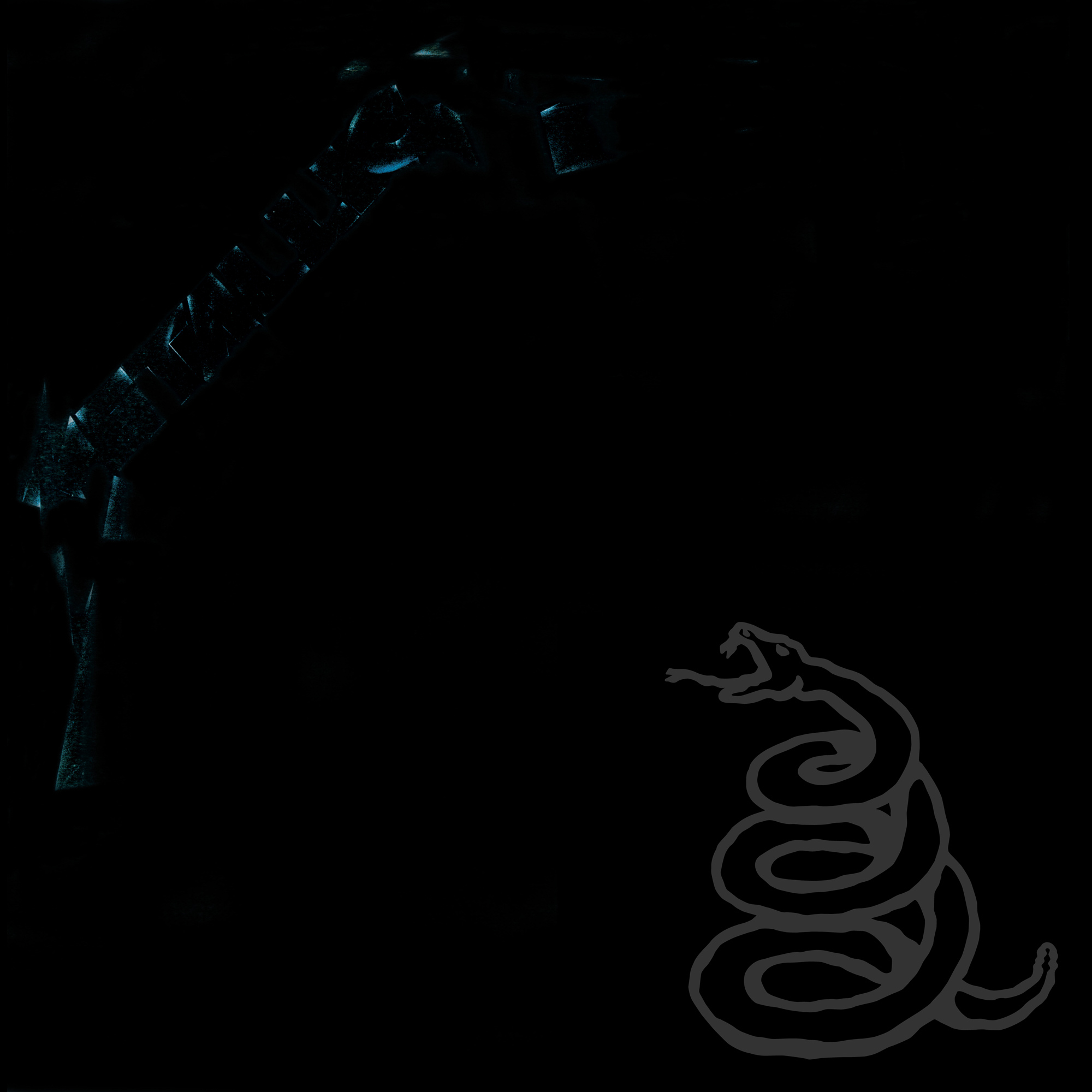
Almost entirely black. The Metallica logo and a coiled snake are visible only if you hold the record at exactly the right angle in the right light. The band called it The Black Album themselves. Nothing on the front cover confirms that. Produced by Bob Rock, it became the best selling album of the SoundScan era with over 16 million copies sold in the United States alone. A near-blank cover for the album that made them the biggest band in the world.
Add it to your collection - Metallica - The Black Album
7. New Order - Power, Corruption & Lies (1983)
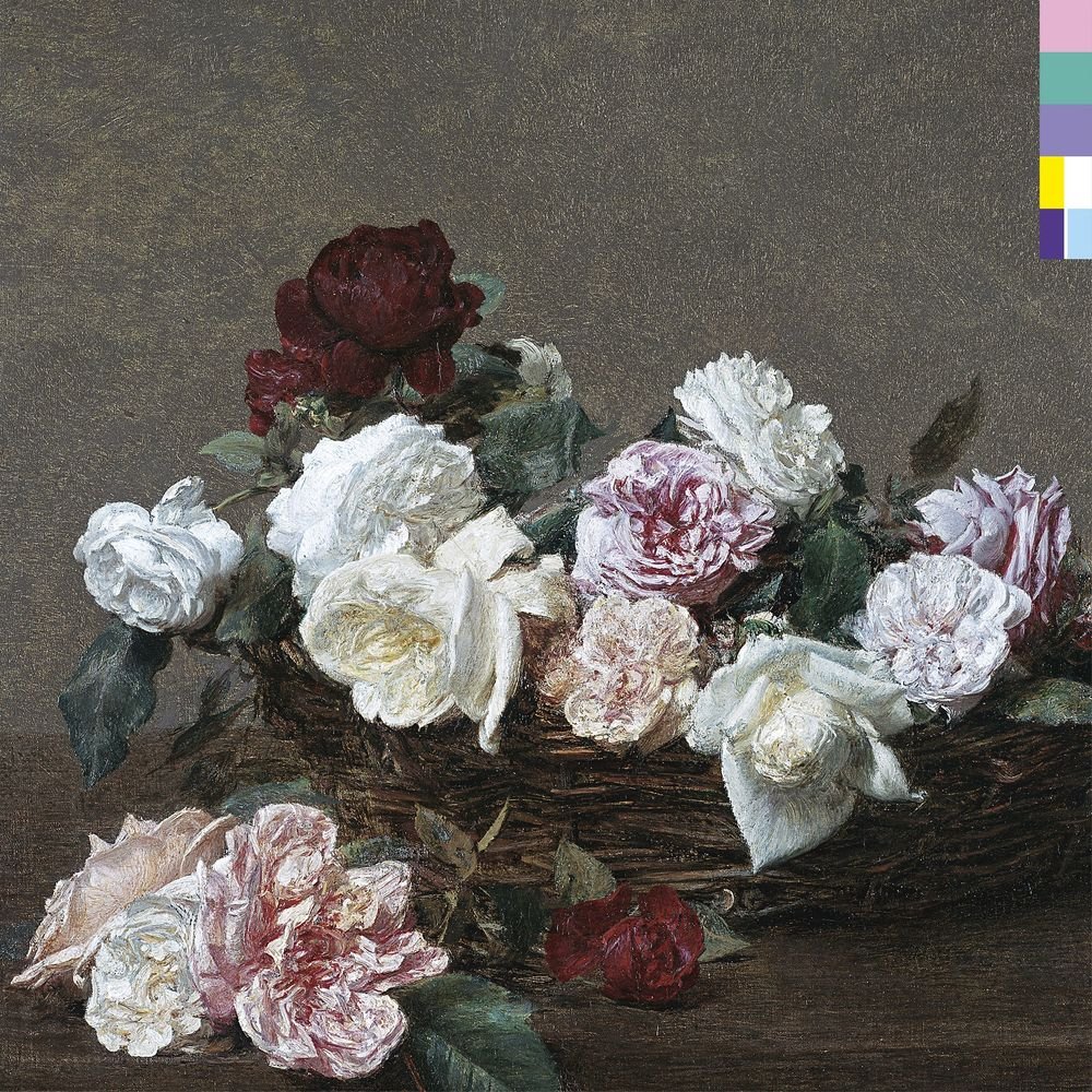
A painting of roses. No text. No band name. No album title. The painting, A Basket of Roses by Henri Fantin-Latour was chosen by designer Peter Saville after he spotted it at the National Gallery in London. Saville had already designed Unknown Pleasures for Joy Division. Here he placed a colour-coded chart around the edge of the sleeve, a simple graphic device that, if you knew how to read it, spelled out the album title. The information was there. You just had to work for it.
Add it to your collection - New Order - Power, Corruption & Lies
8. Sigur Rós - ( ) (2002)
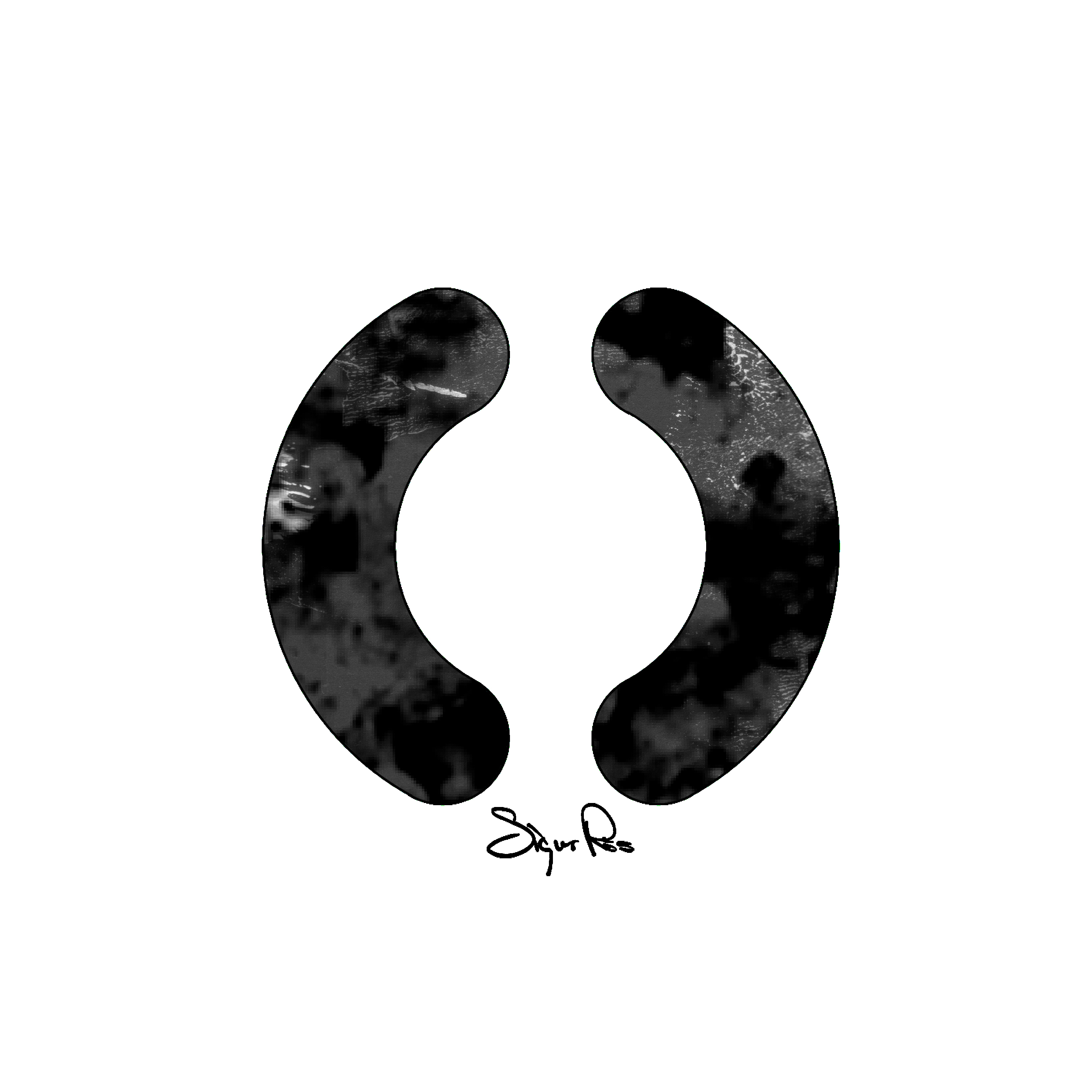
Parentheses. That is the album title, literally two brackets with nothing inside them. The cover is a blurred, hazy photograph; warm light, indistinct shapes, deliberately impossible to read. The album itself was recorded entirely in a made-up language that Sigur Rós called Hopelandic. No real words in the music. No real words on the cover. A completely self-contained world that existed entirely on its own terms.
Add it to your collection - Sigur Rós - ( )
9. The White Stripes - Elephant (2003)
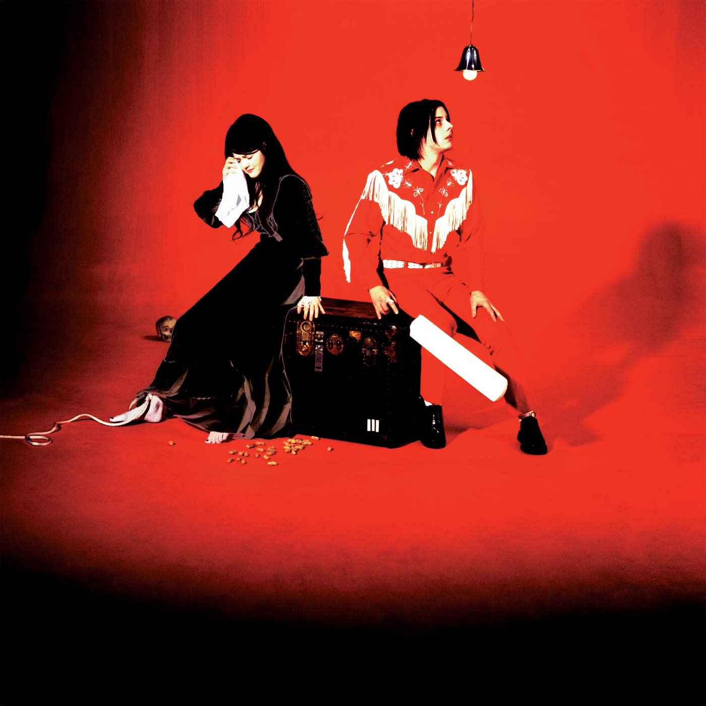
Jack and Meg White resting against an amplifier in a red room. No text anywhere. Jack White later revealed the pose was deliberately composed to suggest the shape of an elephant's head, subtle enough that you might look at the cover for years before suddenly seeing it. A hidden image on a cover with no words to distract you from looking. Exactly the point.
Add it to your collection - The White Stripes - Elephant
Which textless cover belongs on this list that we missed? Let me know via the comments section.




Discussion