

This is the first post I am going to write for Art Before Noise and I am a little apprehensive about it. I feel a little bit guilty as I start to type this. I'm going to be completely honest with you. I don't have a strong emotional connection this Joy Division's album, or their music overall. When this album was released, I was 5 years old. I cant have the same emotional connection to this album like you may or may not have. However, I get it. I know the songs. Disorder. Shadowplay. She's Lost Control. I know the reputation. I understand the legacy. But this isn't about the music.
It's those lines.
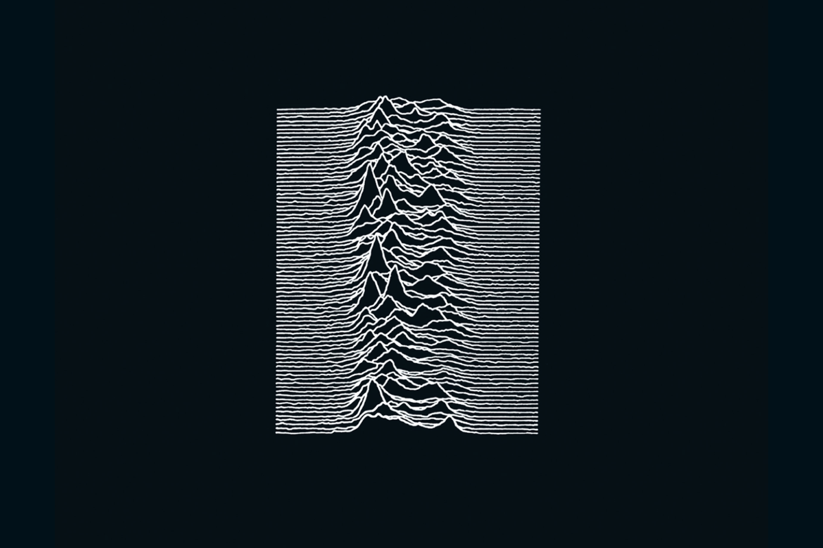
That series of jagged white peaks rising up and falling down against that black background. There is something about them that is magnetic in a way I couldn't explain or understand for years. They look like a heartbeat. Like mountains. Like sound itself, frozen in time. Whatever they are, they pulled me in long before I knew what I was actually looking at.
And that, in a nutshell, is why I created this blog. I guess I need to thank Joy Division for the inspiration.
So let's find out what those lines actually are. And who put them there.
The Band, the Label, and a Young Designer
By 1979, Joy Division were a post-punk band from Manchester with a growing reputation and a deal with Factory Records; the fiercely independent label run by the legendary Tony Wilson. They were ready to record their debut album, and they needed a cover.
Factory Records had a secret weapon: a 22-year-old graphic designer named Peter Saville. Fresh out of Manchester Polytechnic, Saville had been designing posters for Factory's club nights and was effectively the label's in-house designer. He was young, ambitious, and had a very clear vision of what he wanted design to be.
When Joy Division came to him, they didn't arrive empty handed. They brought a folder of reference material; cuttings, images, ideas. And somewhere in that folder was a page torn from The Cambridge Encyclopedia of Astronomy. On that page was a graph. A strange, beautiful graph of stacked lines that looked like nothing Saville had seen used on an album cover before.
He knew immediately it was the one.

The Lines Have a Name
That graph isn't abstract art. It isn't a sound wave or a heartbeat monitor, though it's easy to see why people assume either. It is something far more extraordinary.
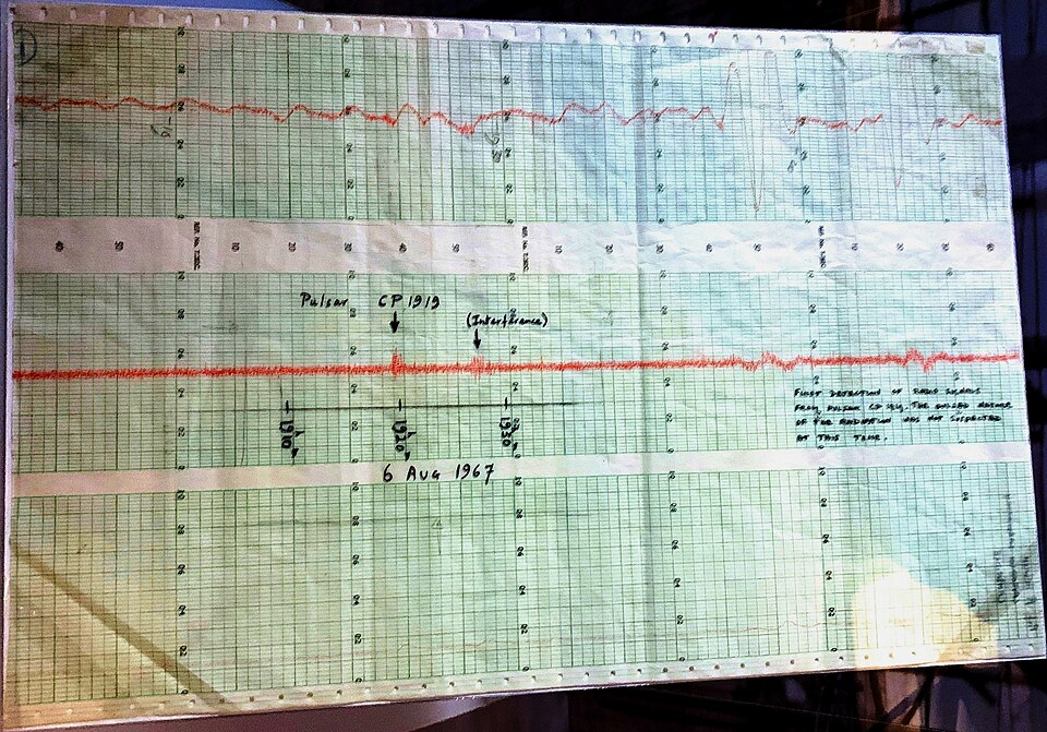
It is a visualisation of radio signals emitted by a pulsar; specifically the first pulsar ever discovered, designated CP 1919, later renamed PSR B1919+21. Exciting names, I know. Basically, a pulsar is a rotating neutron star, the collapsed remnant of a dead star, spinning at extraordinary speed and emitting beams of electromagnetic radiation like a cosmic lighthouse. Ah, it's getting more interesting now, huh?
CP 1919 was discovered in November 1967 by a Cambridge PhD student named Jocelyn Bell Burnell and her supervisor Antony Hewish. The discovery of the signal was very interesting. The signal was so precise and regular, pulsing every 1.337 seconds, that the researchers initially dubbed it LGM-1. Little Green Men. They briefly wondered if they were picking up an alien transmission.
It wasn't aliens. It was a dead star, spinning in the dark, sending out signals that nobody was listening to. Until a PhD student turned those signals into a graph. And then a designer found that graph in an encyclopedia a decade later and put it on an album cover.
Inverting the Image
The original graph in the encyclopedia showed dark lines on a white background, a pretty standard scientific illustration. Saville made one crucial creative decision that transformed it entirely: he inverted it. White lines on black. Much better.
That single decision changed everything. What had been a clinical scientific diagram became something mysterious, almost ominous. Something that probably belonged on a record sleeve more than a textbook.
The band's instructions to Saville were simple: they wanted it white on the outside and black on the inside. Saville took that and ran with it. As he later explained, the title Unknown Pleasures suggested something enigmatic, something that should evoke rather than explain. The darker and more inscrutable the better.
Remarkably, Peter Saville was also responsible for another quietly brilliant decision; removing all text from the front cover entirely. No band name. No album title. Just those lines on that black background. In 1979, that was almost unheard of. It treated the listener as someone who didn't need to be told what they were holding.
The Man Who Made the Graph
Here is the detail that makes this story even more extraordinary. The man who originally printed out that graph was a researcher named Harold Craft. Harold produced it as part of his own PhD work at Cornell in the late 1960s. And, he had absolutely no idea it had ended up on one of the most famous album covers in history.
When he eventually found out, he went to a record shop and bought a copy. And a poster.
The image drifted from a PhD thesis to a scientific journal to an astronomy encyclopedia to a folder carried into a design meeting by a post-punk band from Manchester. Nobody planned any of it. Nobody owned it in any meaningful sense. It just found its way, as the right image always seems to.
An Image That Escaped the Music
The cover of Unknown Pleasures was released on 15 June 1979. It is, notably, the only Joy Division album released during Ian Curtis's lifetime. Curtis died in May 1980, the night before the band's first American tour.
In the decades since, the image has taken on a life entirely separate from the music. It has appeared on t-shirts, trainers, babygrows and fine art prints. Raf Simons used it in a 2003 clothing collaboration with Saville. Supreme followed suit in 2006. Disney (presumably without fully grasping the irony) put it on a Mickey Mouse t-shirt in 2012. Vince Staples based his 2015 album cover on it.
In 2019, on the 40th anniversary of the album's release, astronomers revisited the original pulsar data as a tribute. Saville himself reworked the design for a climate emergency campaign, flattening the lines into silence; the sound of a dead planet.
The cover now lives in the permanent collection at MoMA in New York. A lithograph. 12 by 12 inches.
What The Lines Actually Mean
Here is the thing about those lines. Now that you know that they are radio pulses from a dead star, discovered by a PhD student, printed by a researcher who had no idea what he'd set in motion, inverted by a 22-year-old designer who just knew it was right; do they look different to you?
They do to me.
There is something almost unbearably poetic about it. A rotating neutron star, sending out signals in the dark. Faithful, precise, unheard for centuries until someone pointed a radio telescope at the right patch of sky. A cosmic heartbeat that nobody was listening to.
Put it on an album called Unknown Pleasures and suddenly it means everything.
That's what a great album cover does. It doesn't illustrate the music. It doesn't explain it. It adds another layer of meaning that the music alone couldn't carry. It makes you feel something before you've heard a single note.
Those lines. Those lines dragged me in.


Discussion