

When I first heard the name Massive Attack I assumed it was a metal band. Something loud. Something aggressive. Something that would make the neighbours knock on the wall.
I was wrong about almost everything. I blame the album covers. That is the vibe they give off.
Massive Attack are one of the most quietly extraordinary bands in the history of British music. And the word quietly is doing a lot of work there because everything about them, including their album covers, operates at a frequency that rewards attention rather than demands it.
Nobody in their face. No photographs of the band. Just a series of powerful, considered, often beautiful emblems that build into one of the most coherent visual identities in modern music.
I decided to find out more about those album covers.
Blue Lines (1991)
The debut. The one that invented trip hop before anyone had a name for it. And a cover so simple it almost disappears.
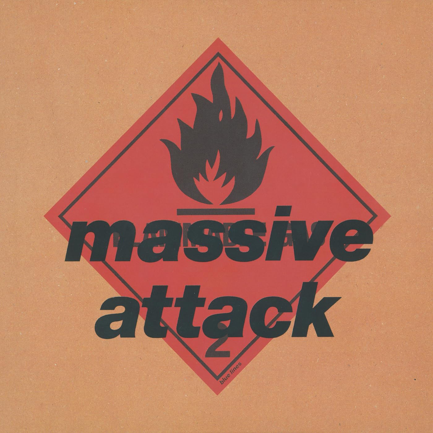
The band name and album title in Helvetica Black Oblique; bold, industrial, slightly tilted. And a large flame symbol at the top that Robert Del Naja, the band's visual brain and graffiti artist, effectively stole from a Stiff Little Fingers album sleeve. Del Naja has acknowledged the influence of the inflammable material logo used on the cover of Stiff Little Fingers' album Inflammable Material. They were the first band he'd ever seen live, back in Bristol in 1979. There was sentiment in the theft.
The record's fiery jacket art is known in health and safety booklets the world over as the symbol for combustible materials. A warning sign. A hazard marker. On a debut album. It was, in retrospect, exactly the right image; Blue Lines was combustible. It set something alight that is still burning.
One important detail most people don't know: due to assumed sensitivities concerning the Persian Gulf War raging at the time of the album's completion, the initial pressings were released under the temporarily abbreviated band moniker "Massive." A ceasefire was declared and "Attack" was reincorporated for all subsequent pressings.
The most important debut of the 1990s was briefly released without the word Attack.
Add Blue Lines to your collection - Grab it on Amazon
Protection (1994)
Three years later. The flame returns, but something has changed.
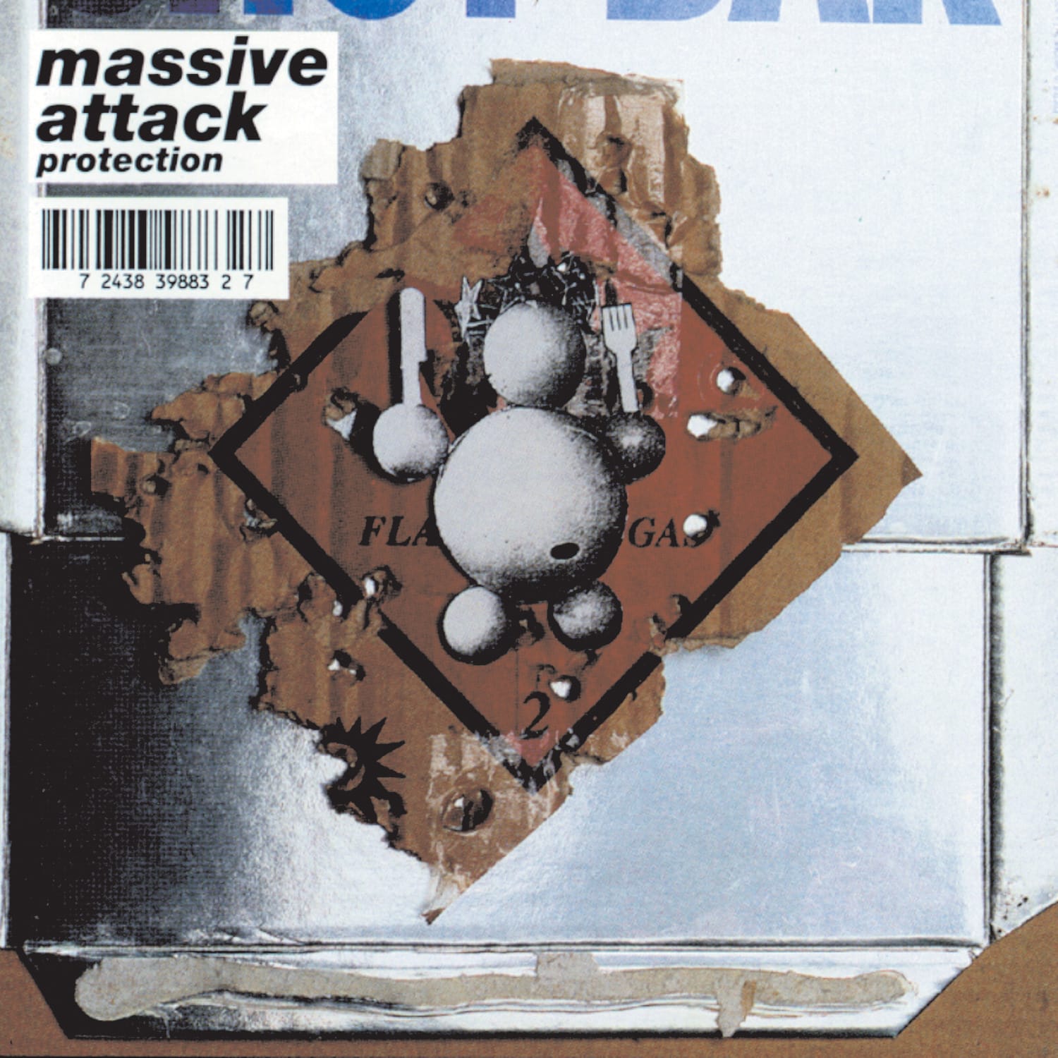
The album follows Blue Lines structurally, to the point that the font used on the cover is the same Helvetica Heavy Italic. The album cover also nods to Blue Lines, revealing a futuristic, impenetrable wall behind a mostly burned version of the previous album's artwork, implying that the depicted flammable gas had been ignited.
The flame from Blue Lines has been lit. What remains is a wall; dark, impenetrable, slightly ominous. The cover of Protection is a direct conversation with its predecessor. A sequel in visual language. A band saying: we were there, this is what happened next.
The Eurochild figure, a whimsical, slightly unsettling animated character, also appears on the cover, representing Europe and its disparate elements attempting to come together. Del Naja described him as "whimsical; you can take him seriously or just look at him as a cartoon character."
Same font. Same flame. Different world. That continuity, the sense that each cover is part of a longer conversation, is what makes Massive Attack's visual language so distinctive.
Are you beginning to see why I thought they were a metal band yet?
Add Protection to your collection - Its on Amazon
Mezzanine (1998)
And then everything changed.
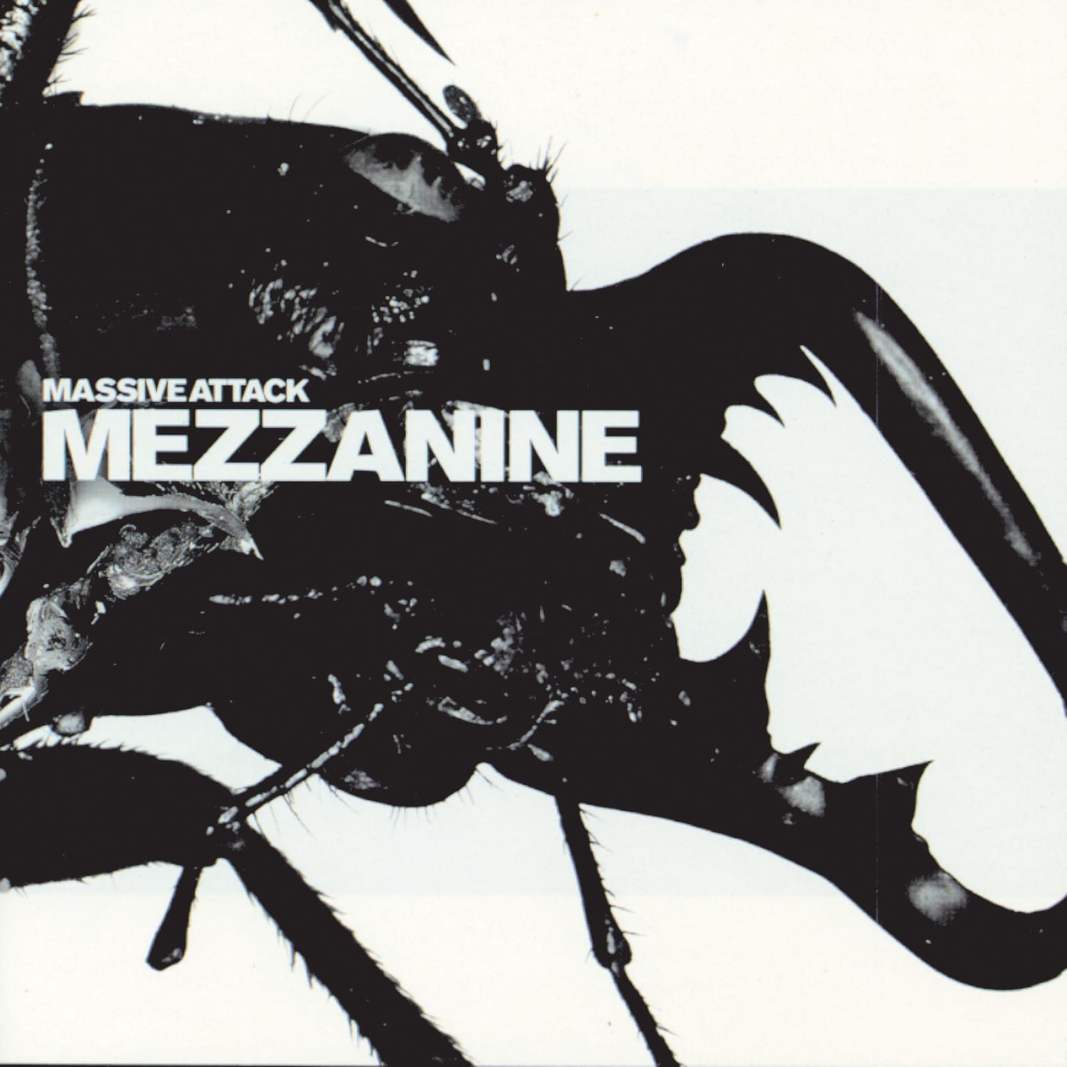
The album cover was a result of the first collaboration between Robert Del Naja, art director Tom Hingston and famed fashion photographer Nick Knight OBE. During the making of their third album, Del Naja had become fascinated by spiders, dreaming vividly of arachnids and the patterns on their backs. It led ultimately to the sleeve's stark gatefold black stag beetle on a white background, shot by Knight at the Natural History Museum in London. The final design was a composite of multiple shots.
A beetle. Shot at the Natural History Museum. Born from dreams about spiders. On what many consider the greatest album Massive Attack ever made.
Del Naja described it as "a chrysalis moment where we were trying to emerge as something different. We just wanted to firmly establish our own identity and I think Mezzanine was the opportunity to do that."
The cover of Mezzanine now lives in the permanent collection at MoMA in New York. A black beetle on a white background, stark, precise, slightly threatening, sits alongside Unknown Pleasures and the Thriller cover as one of the great pieces of album art of the modern era. And on the album's 20th anniversary, Massive Attack became the first band to encode an entire record in DNA, storing Mezzanine in synthetic DNA strands.
Add Mezzanine to your collection - Get it from Amazon
100th Window (2003)
Nick Knight returned for the fourth album, but this time the image was more violent.
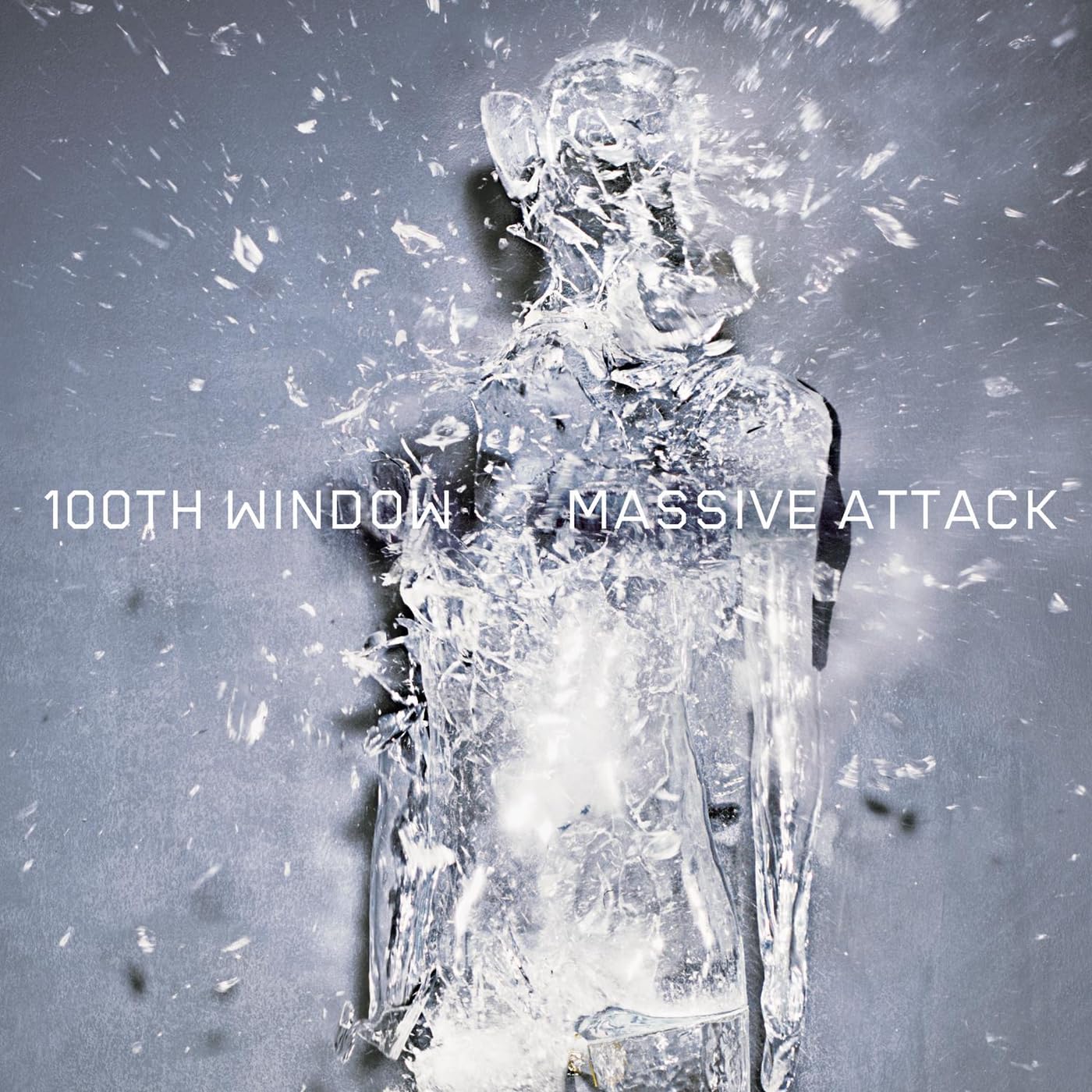
Knight shot glass figures through with bullets for the cover of 100th Window. The resulting image; a shattered, translucent human form, exploding outward from a point of impact is one of the most viscerally striking covers in the Massive Attack catalogue.
The album itself was a troubled one. Mushroom had left the band. Daddy G stepped back to raise his family. Del Naja was essentially alone, making a record in the aftermath of September 11, an event that fundamentally reshaped the album's tone. The September 11 attacks motivated Del Naja to depart from the original direction of the album.
A glass figure shot through with a bullet. An album made by one man, alone, in the shadow of one of the most violent events in modern history. The cover and the record are inseparable.
Tom Hingston described the visual philosophy connecting all four covers at this point: "You take the flame or the Eurochild or the beetle or the figure from 100th Window, what connects them all is that they are a series of powerful emblems."
Powerful emblems.
Add 100th Window to your rack - Get it on Amazon
Heligoland (2010)
Seven years passed between 100th Window and Heligoland. Seven years. And when the fifth album finally arrived, the cover felt like a reckoning.
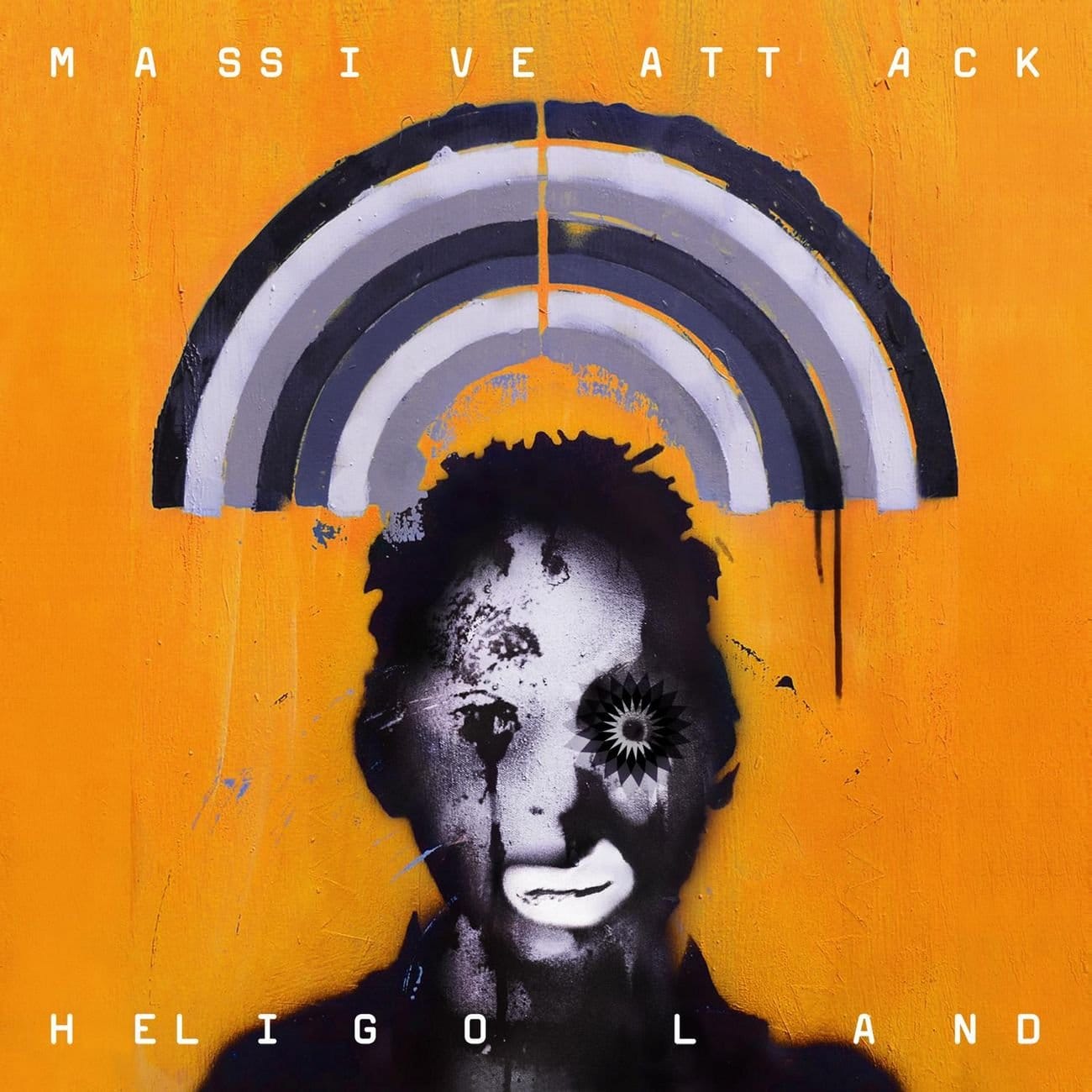
Designed by Del Naja and Tom Hingston Studio, Heligoland was released in multiple cover variants; blue, orange, pink, yellow. Each a different coloured field with the band name and album title in clean typography. Simple. Elemental. Almost a return to the spare directness of Blue Lines nearly twenty years earlier.
The deluxe edition went further, a unique black glitter coated cover that needed to be seen in person to be fully understood. Not a design to be photographed or streamed. A physical object that rewarded the act of holding it.
Del Naja's own words on the philosophy that runs through all five covers are the best summary of what Massive Attack's visual identity has always been about: "The promotion and marketing of Massive Attack, right up to Heligoland, has always been about creating a symbol that under normal circumstances would be considered a brand identity but actually was the opposite."
An anti-brand brand. A visual language that accumulates meaning across five albums and thirty years without ever repeating itself or explaining itself.
The flame. The Eurochild. The beetle. The shattered figure. The coloured field.
Five covers. One vision. Completely, unmistakably theirs.
Why not grab a copy of Heligoland - It's on Amazon


Discussion