That Was On Purpose
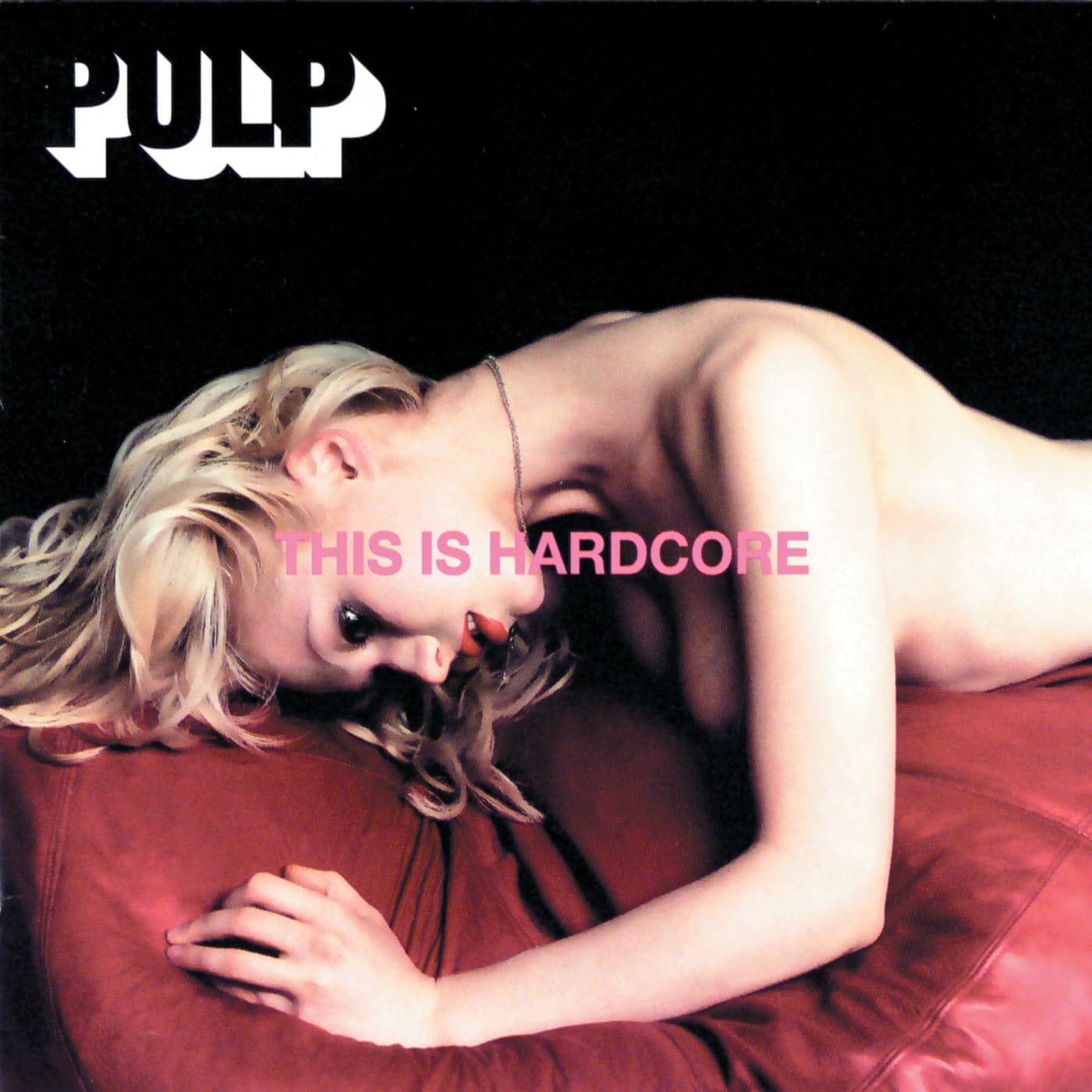
This Is Hardcore by Pulp - I was a young man in 1998. I saw the cover and noticed a semi-naked woman. I was mesmerised.
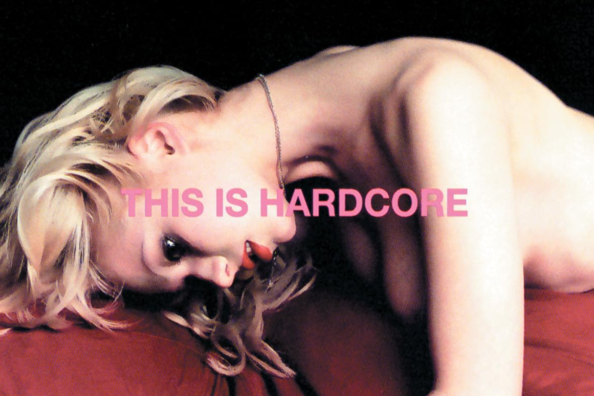

I was a relatively young man in 1998; 25 is still considered young, isn't it?. I think so. Anyway, I saw the cover of This Is Hardcore by Pulp and my honest reaction was "she's naked, awesome!". Then I wanted to know more. Who is she? What is going on here? Do I buy this album because of a naked chick? Do you think she is single? Do I have a chance? Will my girlfriend think I was a perve? How much trouble will I be in?
I bought it for the music, obviously.
This is actually what Jarvis Cocker intended. He just intended what came after the looking to be something more complicated than the cover. He wanted the cover to draw you in. And then repel you. And he assembled one of the most extraordinary creative teams in the history of album cover art to make sure it did exactly that. Well played, Jarvis.
Album Anatomy
| Album | This Is Hardcore |
| Artist | Pulp |
| Genre | Alternative |
| Released | 30 March 1998 |
| Label | Island Records |
| On the cover | A woman reclining across the frame in a staged, cinematic pose, shot to evoke the glossy sleaze of a film poster |
| Design | Art direction by Peter Saville and John Currin, photography by Horst Diekgerdes, design by Howard Wakefield and Paul Hetherington |
| Decade | 1990s |
The Painter, The Designer and The Shag Pad
The cover of This Is Hardcore was the result of a collaboration between three extraordinary creative minds; Jarvis Cocker, Peter Saville and American painter John Currin.
I've written about Peter Saville before on this blog, he designed Unknown Pleasures for Joy Division and Power, Corruption and Lies for New Order. He is one of the great graphic designers of his generation. His involvement alone signals that this cover was going to be something unusual.
Currin was an American figurative painter whose work typically portrayed seedy ageing playboys and improbably fulsome women in a hyper-realistic style. In 1998 he was not yet famous; Cocker had spotted his work and been struck by it, particularly his Martini Man series, which took Playboy magazine advertisements and mischievously altered the faces of the admiring women to make them look contemptuous.
Cocker recalled: "I was feeling like that man in the ad. I'd achieved success, but I felt a bit of an idiot. I don't know. It didn't work out the way I thought it was going to. I was going through a dark time."
Fame had arrived. It hadn't felt the way he thought it would. The cover of This Is Hardcore was Cocker's attempt to say something honest about that feeling, using the visual language of adult cinema and the aesthetic of 1970s sleaze to make a point about the gap between fantasy and reality.
The shoot took place at Saville's own apartment, which he had transformed into what The Quietus described as "a swanky celebration of a 1970s shag pad" with the help of Hacienda designer Ben Kelly. The band had run out of money by this point. The final cover shot was taken in Peter Saville's living room.
The Model
Who is the woman on the cover?
Her name is Ksenia Zlobina. She was photographed by fashion photographer Horst Diekgerdes, not as the intended cover shot, but as one of a series of images taken at Saville's apartment when the band decided that the original Hilton Hotel shoot wasn't hardcore enough.
As Saville himself later admitted: "We ended up with this very misogynistic shot of Steve with Ksenia on the pouf... When I look back, it's so questionable. But Ksenia looked wonderful on the red pouf, so we also shot her alone on the pouf and that ended up being the cover."
The cover shot, Zlobina alone on the red pouf, her expression vacant and slightly unreal, was not the planned image. It was a pickup shot. A last resort. Taken in a designer's living room with no money left.
And it became one of the most discussed album covers of the decade.
The Smart Blur
After the photographs were taken, Saville processed them using a Photoshop filter called Smart Blur. At full strength it alters an image so that it looks as if it was painted by numbers. But used gently, it nudges it from photographic reality into painterly photorealism. "We don't quite know digitally what it does," said Saville. "But fascinating things happen between A and B that are not aesthetics-based."
The result is an image that looks almost real but not quite. Almost a photograph but not quite. Almost a painting but not quite. It exists in an uncanny valley between reality and representation, which is precisely where Cocker wanted it to be.
As Currin put it: "It's weirdly offensive without figuring out why. Just the way the words sit on there is both very elegant and strangely provocative. And the ugly Helvetica."
The typography was chosen by Saville to mimic government warnings, the kind of stamped official language you'd find on adult material. Blocky. Authoritative. Slightly threatening. The title THIS IS HARDCORE stamped across the image like a censor's mark.
Transport for London refused to display the image and title together on bus advertising, they would accept the image alone or the title alone but not both simultaneously. The combination was too much.
Draw You In. Repel You.
Here is Cocker's own explanation of what the cover was supposed to do, and it's the clearest statement of intent behind any cover we've written about on this blog.
"The idea behind the picture was that, initially, it would be attractive, you'd look at the picture and realise it's a semi-clad woman. But then her look is vacant. It almost looks as if she could be dead, or a dummy. So it was supposed to be something that would draw you in and then kind of repel you a bit. That was on purpose."
Draw you in. Repel you. On purpose.
The cover uses the visual language of exploitation, the adult film aesthetic, the naked woman, the provocative title, to make you feel the thing that exploitation makes you feel. And then it makes you feel uncomfortable about feeling it.
Advertising posters showing the cover on the London Underground were defaced by graffiti artists with slogans including This Offends Women and This is Sexist and This is Demeaning. The Independent declared that the woman "looks as if she had been raped."
Cocker's response was to point at the vacancy in her expression, the deliberate unreality of the image, the Smart Blur that makes her look almost like a dummy and argue that the cover was a critique of the male gaze rather than an example of it.
It is, as Peter Saville himself admitted, a complicated image. One he still finds questionable. One that divides opinion sharply even now.
What The Cover Actually Says
I was a young man in 1998. I saw the cover and noticed a semi-naked woman. I didn't understand what I was looking at.
Now I do. And I'm not sure I'm entirely comfortable with it, which is, of course, exactly what Jarvis Cocker intended.
The cover of This Is Hardcore is a cover about the lie at the heart of desire. About the gap between what you imagine and what you get. About fame and how it promises everything and delivers something considerably more complicated. About being a young man who achieves everything he wanted and feels, somehow, like an idiot.
The woman on the cover is almost real. Almost a photograph. Almost alive. The Smart Blur makes her something between a person and an object, which is the most uncomfortable thing about it.
It will draw you in. Repel you. On purpose. It worked on me in 1998. It still works now.