The 1970s was the decade when the album sleeve stopped being packaging and became a full‑blown art form. Designers, photographers and painters turned twelve inches of cardboard into cinema screens, protest banners, sci‑fi book jackets and family snapshots that just happened to change the look of music.
Concept albums needed concept visuals. Progressive bands wanted entire universes painted for them. Jazz musicians demanded covers that were as radical as the music inside. Punk stripped it all back to the brick wall and a stare.
For this list, I’ve looked at what critics, designers and music historians consistently pick out as the most important sleeves of the decade; 70s‑specific round‑ups, design‑led features, “greatest covers ever” lists, plus the stories behind how these images were actually made. The focus, as always, is on the cover first. The record is a bonus.
This post is part of the “Best Album Covers by Decade” series
(Next: 1980s)
11. The Nice - Elegy (1971)
(Almost made the Top 10)
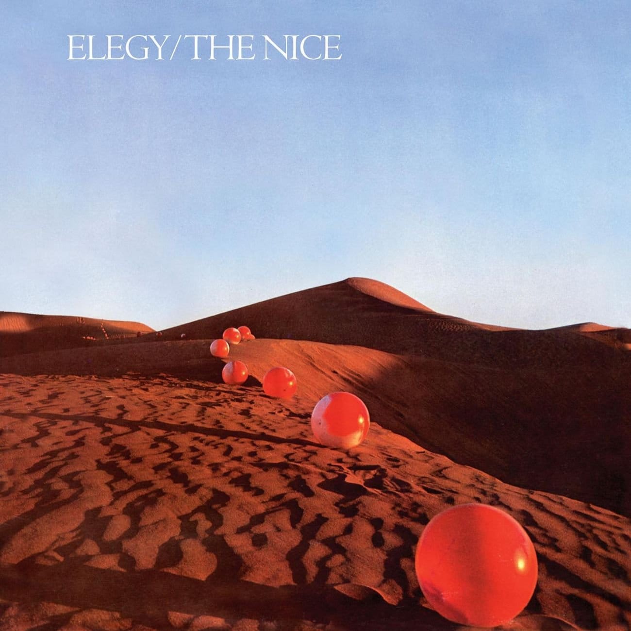
A line of red balls snakes its way over a Sahara dune, each casting a long evening shadow, disappearing into the horizon under a flat blue sky. No band photo. No title screaming at you. Just a strange, almost calm landscape that becomes stranger the longer you look at it.
Hipgnosis took the idea literally: Storm Thorgerson dreamt the image, then he, Aubrey “Po” Powell and Peter Christopherson flew to Morocco with a van full of 120 red plastic balls, paying locals to help inflate and position them before the sun vanished. This is pre‑Photoshop problem‑solving, brooming away footprints in the sand, shooting fast as the light dies.
It’s an elegy in visual form: a band on its way out, a day almost over, a line of colour vanishing into the desert. Quiet, weird and weirdly moving.
Add it to your collection: Elegy - The Nice.
10. Carole King - Tapestry (1971)

Carole King sits barefoot on a window seat in her Laurel Canyon home, bathed in soft natural light, a woven tapestry hanging beside her and her cat Telemachus perched calmly on the sill. She looks straight at the camera, relaxed but self‑possessed, like you’ve just dropped in for coffee and she hasn’t bothered to dress up.
Photographer Jim McCrary reportedly asked if they could move the cat into shot after remembering a Kodak survey that said people loved photos of their pets; he scooped up Telemachus and his cushion, placed them by the window and got only a handful of frames before the cat bolted. One of those shots became one of the most recognisable sleeves of the decade.
In an era obsessed with spectacle, Tapestry sells something different: domestic intimacy as a kind of power. It’s a singer‑songwriter record that looks exactly like it sounds.
Add it to your collection: Tapestry - Carole King.
9. Sly & The Family Stone - There’s a Riot Goin’ On (1971)
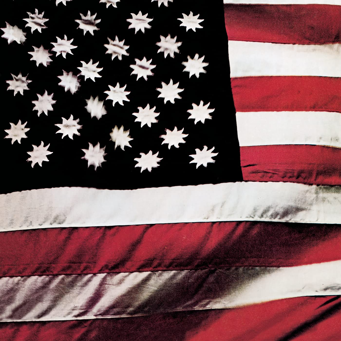
From a distance it’s just an American flag. Look closer and the stars replaced by suns on a black bakground, the whole thing darker, heavier, stranger. No band name. No album title. Just this altered banner.
Sly Stone’s concept was deliberate: he wanted a flag that represented “people of all colours” - black for the absence of colour, white for the sum of all colours, red for the blood everyone shares, suns instead of stars because the sun is always there. It’s both patriotic and anti‑patriotic at once.
For a record steeped in exhaustion, disillusion and warped funk, the cover does the same thing visually: takes a familiar symbol and drags it somewhere murkier. Simple idea, massive resonance.
Make room for it on your shelf: There’s a Riot Goin’ On – Sly & The Family Stone.
8. Ramones - Ramones (1976)
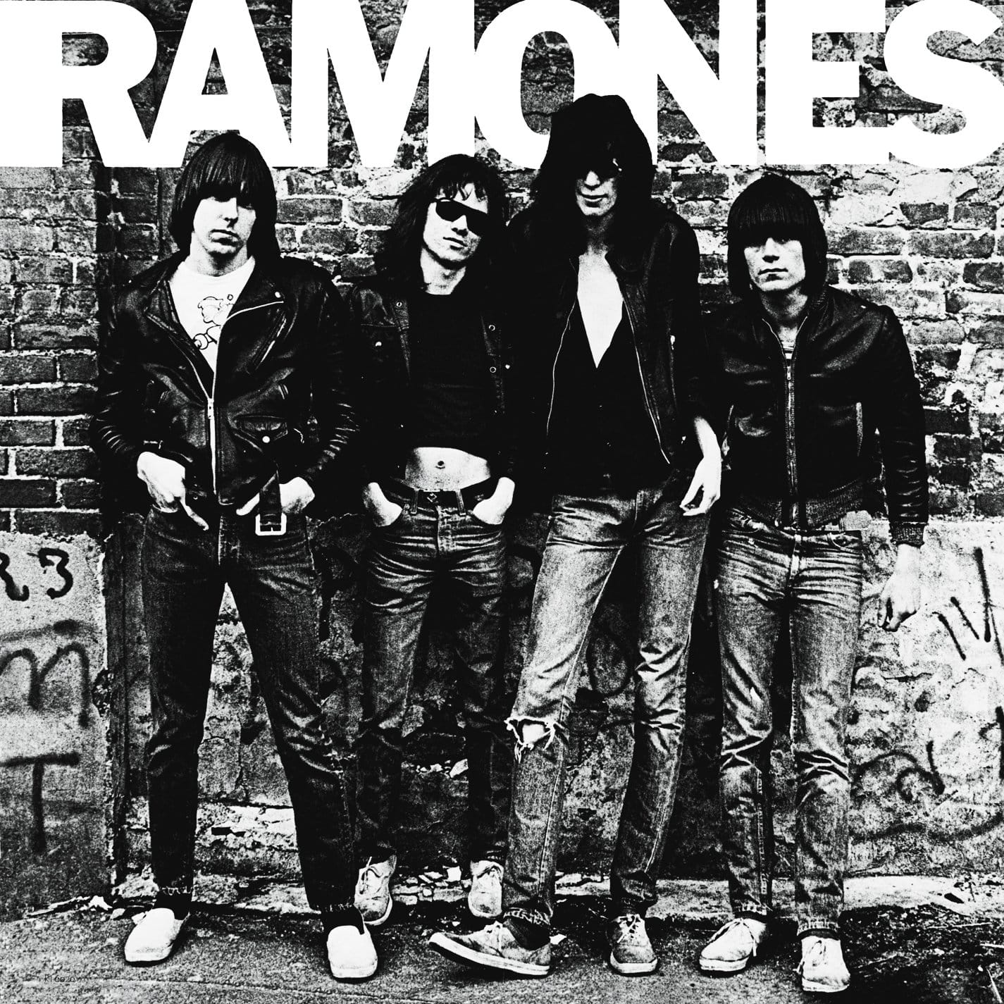
Four guys in leather jackets lean against a scuffed brick wall in New York, ripped jeans, sneakers, snarls (or boredom) aimed straight at you. No props, no styling beyond what they already live in, just the band, the wall and a logo stamped above them.
Photographer Roberta Bayley shot the cover outside a studio in the East Village; the label reportedly paid her around $125 for what became one of the most imitated band portraits in rock history. You can feel how cold and cheap the shoot was, that’s the charm.
As a visual manifesto for punk, it’s perfect: this is what we look like, this is where we live, no fantasy necessary. Every garage band against a brick wall since is really just copying this.
Worth owning in any format: Ramones - Ramones.
7. Wishbone Ash - Argus (1972)
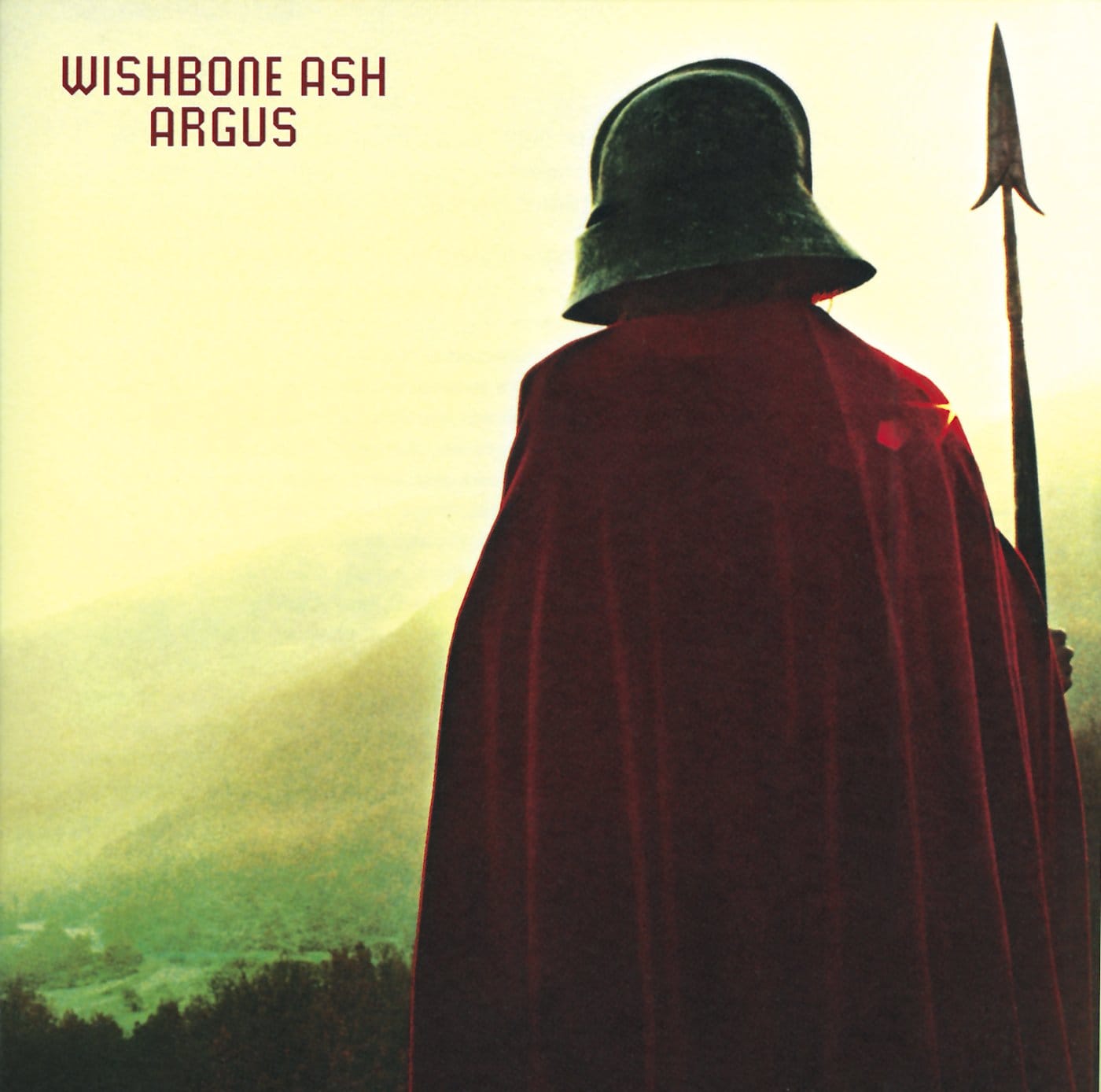
A cloaked warrior stands on a hilltop, back to the camera, spear in hand, looking out over a hazy valley as the sun burns through the mist. His helmet hides his face completely; he could be a medieval soldier, a sci‑fi sentinel or someone out of a half‑remembered myth.
Hipgnosis shot the cover in the Gorges du Verdon in France, dressing the figure in costume borrowed from Ken Russell’s The Devils and intending to arm him with both spear and sword; a sword rented from Roman Polanski’s Macbeth that, according to the designers, never made it into the final shot. On the back cover, the same sentinel appears to herald or witness the arrival of a spaceship, quietly folding science fiction into the pastoral scene.
It’s a prog rock sleeve that understands the assignment: give you a world to step into before the needle even drops.
Add it to your collection: Argus - Wishbone Ash.
6. Miles Davis - Bitches Brew (1970)
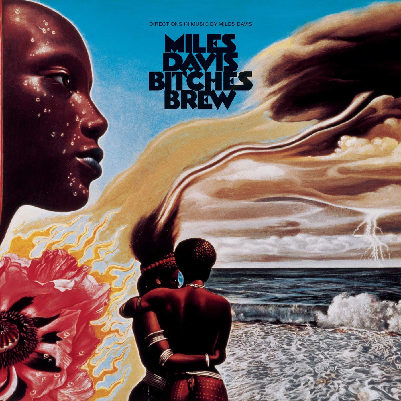
A couple’s faces in profile, hair whipped by unseen wind; to their right, a turbulent ocean, clouds forming a skull‑like shape overhead, lightning strikes over the ocean. Everywhere you look, there are tiny details.
Miles Davis asked painter Mati Klarwein to listen to the music and paint what he heard; the result is a dense Afro‑futurist collage of African, Eastern and interracial imagery that feels as restless as the double‑LP inside. Columbia’s art director John Berg framed it with gothic lettering and let the painting dominate.
Plenty of covers try to say “this music is new.” Bitches Brew actually matches the shock of the sound, visually.
For anyone wanting the real thing: Bitches Brew - Miles Davis.
5. Pink Floyd - Animals (1977)
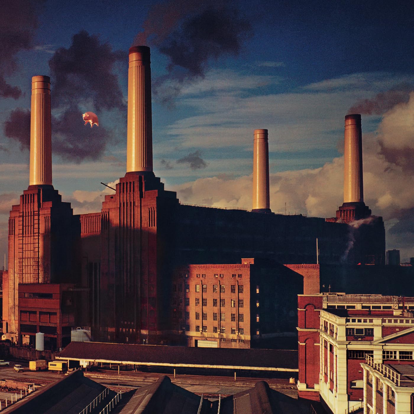
Battersea Power Station looms under a heavy, polluted sky, all brick and chimneys and industrial gloom. Between two of the stacks, calmly floating, is an inflatable pig.
The cover concept came from Roger Waters and was executed by, who else, Hipgnosis: a giant helium pig tethered between the chimneys for a series of shoots. At one point the pig famously broke free, drifting into the flight path at Heathrow and forcing the band to reschedule the shoot; the final sleeve uses a composite image with a retouched pig.
It’s a blunt but brilliant metaphor: a bloated animal drifting above a monument to industrial capitalism, the whole thing looming over London. Satire, postcard and dystopia in one frame.
Add it to your collection: Animals - Pink Floyd.
4. Led Zeppelin - Houses of the Holy (1973)
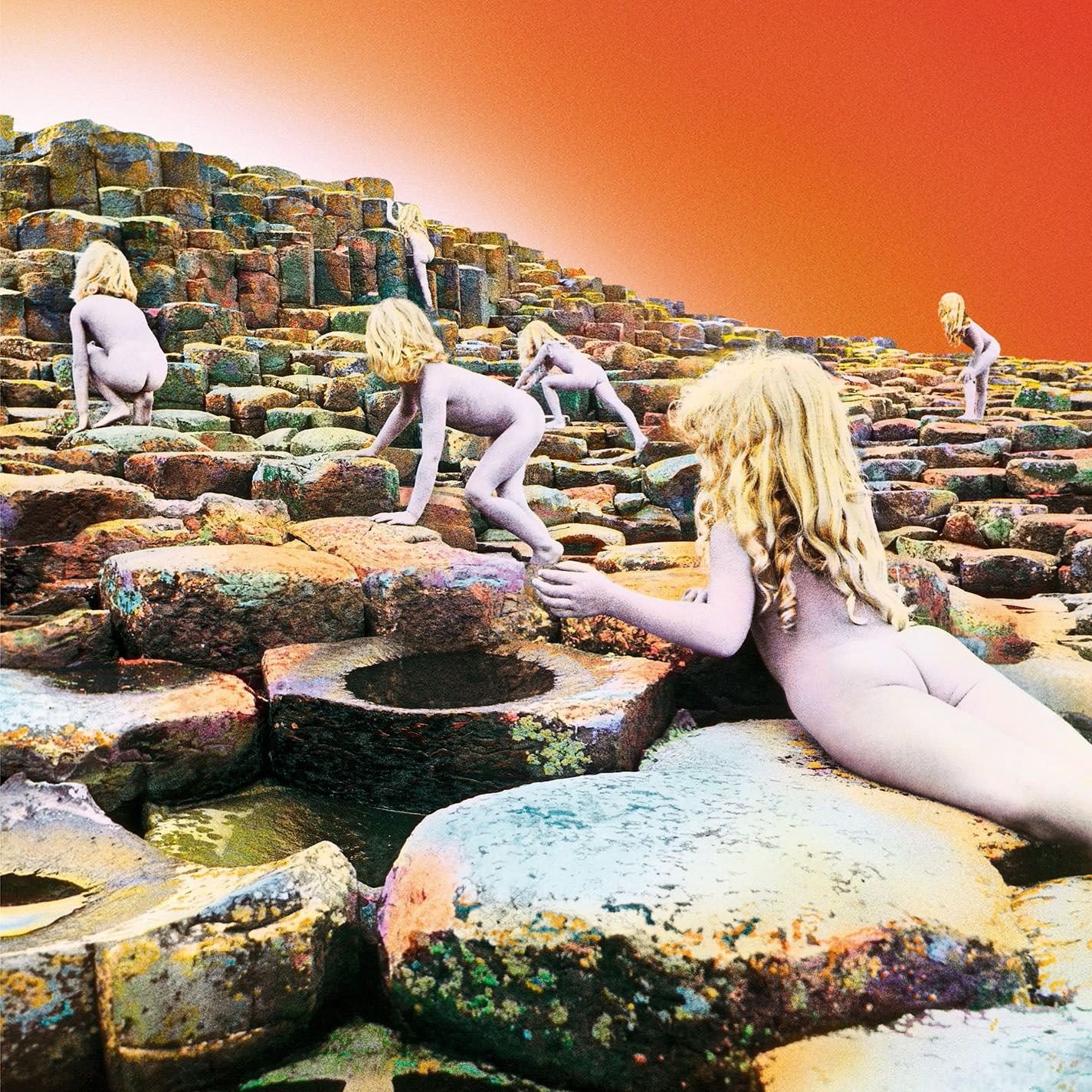
Naked, pale‑haired children clamber over a landscape of stacked basalt columns, the rocks glowing in orange and purple as if lit from another planet. There’s no band visible, no instruments, just figures moving inexorably upwards toward a white horizon.
The photographs were shot by Aubrey Powell of Hipgnosis at the Giant’s Causeway in Northern Ireland, then multi‑printed to make two child models look like many. The entire scene was inspired by the closing image of Arthur C. Clarke’s Childhood’s End, in which groups of children leave Earth in a strange, collective rapture.
The result is eerie and beautiful in equal measure, rock album as science‑fiction book cover, mythologising the band without ever showing them.
Add it to your collection: Houses of the Holy - Led Zeppelin.
3. Meat Loaf - Bat Out of Hell (1977)

A graveyard stretches into the distance under a blood‑red sky. In the foreground, a man on a motorcycle explodes out of a fresh grave, wheels turning in mid‑air; behind him, a gigantic bat perches on a mausoleum like a demon gargoyle surveying its kingdom.
The concept came from songwriter Jim Steinman and was brought to life by comic artist Richard Corben, whose heavy‑metal pulp style turns the whole thing into a paperback horror poster turned up to eleven. Q magazine later named it one of the hundred best record covers of all time.
Subtle it isn’t. But for a record that lives on operatic excess, motorbikes, sex and death, it’s exactly right: one ridiculous, glorious, unforgettable panel.
For anyone wanting the real thing: Bat Out of Hell - Meat Loaf.
2. Pink Floyd - The Dark Side of the Moon (1973)
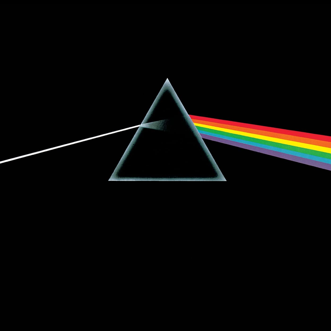
A beam of white light enters a glass prism from the left, breaks into a rainbow and exits as a spectrum on the right, all against a pure black field. No band name. No album title. Just physics, reduced to logo.
Hipgnosis came up with the idea after seeing a prism diagram in a school science book, then refined it with ultra‑clean lines and subtle gradients until it felt less like a diagram and more like an emblem. On the original gatefold the beam wraps around the package, turning the whole sleeve into one continuous flow of light.
Every designer list and magazine feature that tries to rank album art ends up putting this somewhere near the top, and not just for the 70s. It’s one of those rare covers that escapes its own record and becomes a symbol for an entire genre.
Add it to your collection: The Dark Side of the Moon - Pink Floyd.
1. Joy Division - Unknown Pleasures (1979)
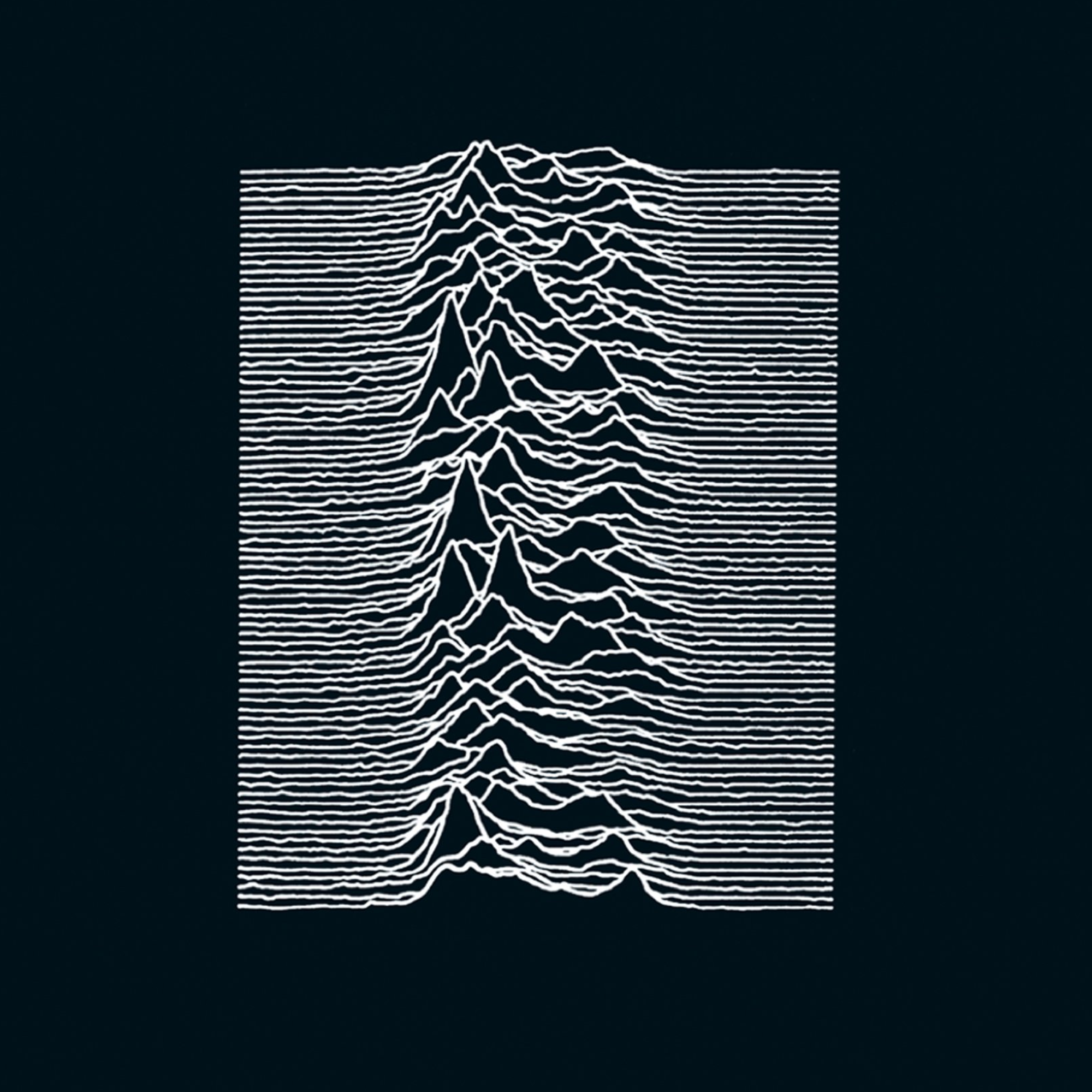
Twenty‑four white waveforms pulse up and down on a black background, stacked like a mountain range or a cardiogram frozen mid‑beat. No text. No logo. Nothing to explain what you’re looking at.
Designer Peter Saville lifted the image from an illustration of radio pulses from the collapsed star PSR B1919+21 in The Cambridge Encyclopaedia of Astronomy, then inverted it so the pulses became bright lines on darkness. Factory Records printed it with no title on the front, trusting that the stark graphic would do all the work.
Rolling Stone’s recent ranking of the greatest album covers of all time put Unknown Pleasures at number one, ahead of Abbey Road, Dark Side of the Moon and everything else. It’s hard to argue: few sleeves are this minimal, this mysterious and this widely copied.
Add it to your collection: Unknown Pleasures - Joy Division.
Look across these eleven albums and their covers, and you get a decade in miniature: desert surrealism, domestic portraits, protest flags, punk brickwork, prog fantasy, Afro‑futurist painting, industrial satire and pure, distilled graphic design. The music inside ranges from jazz fusion to punk to stadium rock, but the sleeves are all doing the same basic job; pulling you closer, asking you to look, and rewarding you when you do.