The 10 Best Album Covers of the 1960s (Ranked)
The best album covers of the 1960s, ranked from a screaming face to a single peelable banana, and everything psychedelic in between.

The 1960s is where the modern album cover really begins. Jazz sleeves turned into miniature abstract paintings, rock bands started behaving like art projects, and designers treated the 12‑inch square as a space for collage, comics, psychedelia and pop art rather than just a band photo and a logo.
You expect to see Sgt. Pepper, Revolver, Abbey Road and a banana on this kind of list, and you will, but the decade is much more than a few canonical rock covers. It’s also comics drawn by underground cartoonists, bossa nova reduced to pure shape and colour, and jazz records that look like they wandered in from a gallery wall.
Ranked from 11 down to 1, here are eleven 1960s sleeves that still feel alive on a turntable, on a screen or hung, quite literally, as art.
This post is part of the “Best Album Covers by Decade” series
Also check out: 1970s, 1980s
11. Thelonious Monk - Underground (1968)
This is the one album that just missed the top 10. I had to include, didn't I?
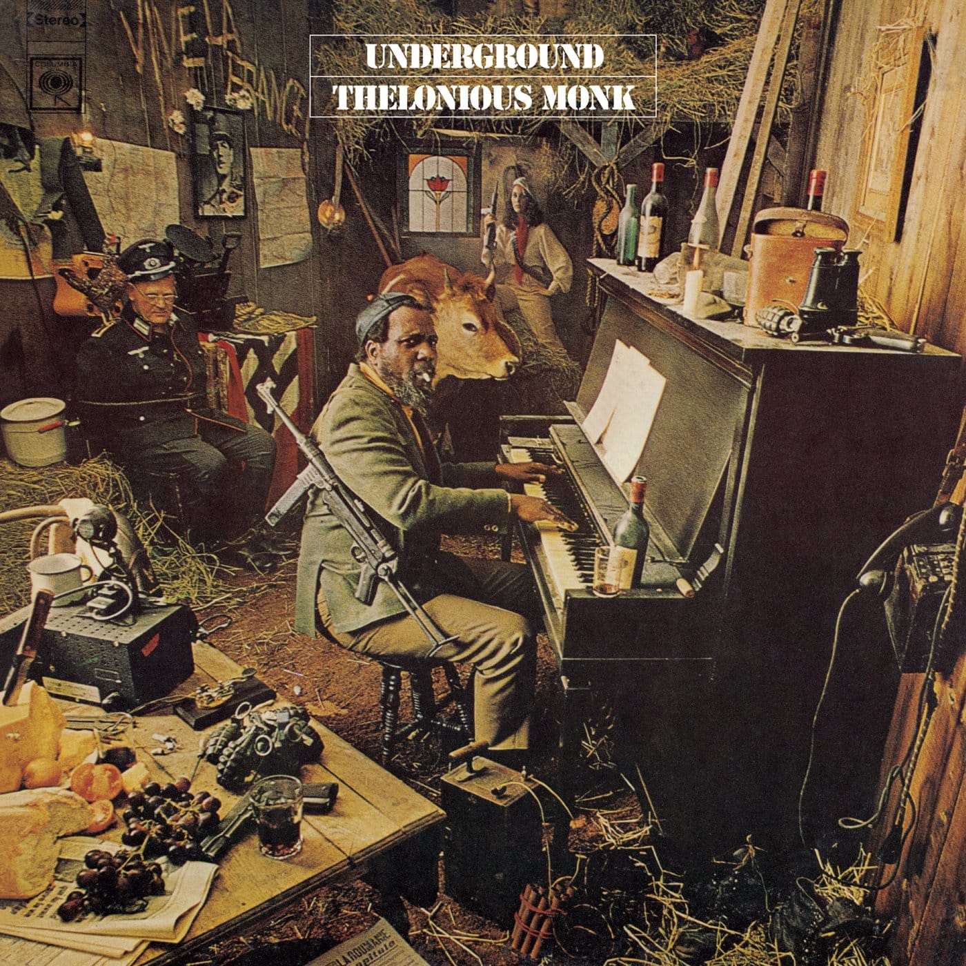
The cover of Underground isn’t just a photo, it’s a set: Thelonious Monk at a piano in a cluttered barn, wearing a French Resistance armband and a beret, surrounded by guns, hay bales, a cow, maps and a tied‑up Nazi officer in the corner. It looks like a scene from a wartime movie that someone paused and pressed onto cardboard.
Everything in the tableau is doing double duty. The weapons and costumes nod to the album title and Monk’s reputation as a musical “resistant”; the chaos of props mirrors the dense, unpredictable harmonies inside. Columbia’s art department reportedly won a Grammy for the packaging, and it’s not hard to see why, it’s one of the most detailed narrative covers of the decade.
Most album photos capture a moment. Underground stages a whole story and leaves you to decode it.
Add it to your collection: Underground - Thelonious Monk.
10. Stan Getz / João Gilberto - Getz/Gilberto (1964)

Getz/Gilberto is almost aggressively simple: blocks of warm orange with small black shapes arranged like pieces of a modernist painting, the musicians’ names sitting quietly above. No instruments, no palm trees, no “Brazilian” clichés. Just colour and composition.
The abstract art (by Olga Albizu) does exactly what it needs to: it suggests warmth, movement and intimacy without literal illustration. The typography is clean and unfussy, letting the painting breathe and leaving plenty of negative space.
For a record that effectively introduced much of the world to bossa nova, Getz/Gilberto is the perfect visual ambassador: sophisticated, understated and utterly confident.
Add it to your collection: Getz/Gilberto - Stan Getz & João Gilberto.
9. Miles Davis - Sketches of Spain (1960)
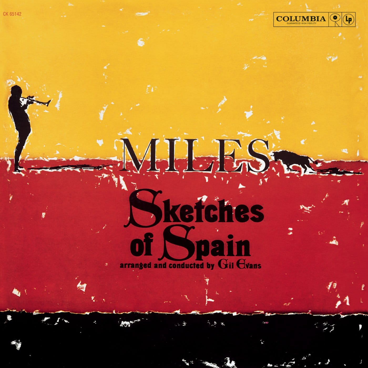
A block of bright yellow sits above a band of deep red, divided by a strip of black type; on the right, a tiny black silhouette of a matador or trumpeter stands alone against all that colour. That’s Sketches of Spain, almost nothing on the page, and yet it feels huge.
The design is classic early‑60s modernism: bold colour fields, plenty of empty space, and typography that refuses to shout. The little figure does all the emotional work, hinting at bullrings and open skies without ever resorting to cliché Spanish imagery.
It’s a reminder that not every great 60s sleeve is psychedelic swirls and collage; some of the most enduring were built from almost nothing.
Add it to your collection: Sketches of Spain - Miles Davis.
8. Big Brother and the Holding Company -Cheap Thrills (1968)
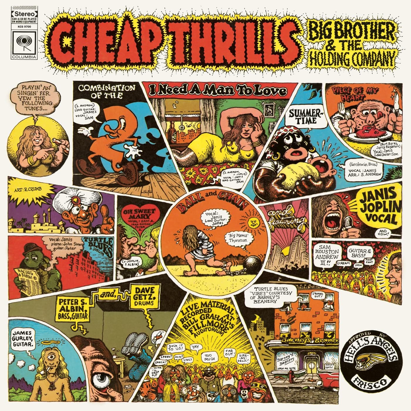
Cheap Thrills doesn’t look like an album cover so much as a comic book you’re about to sit down and read. Robert Crumb’s hand‑drawn panels cram the front with mini‑stories: “THE WHOLE SHOW!”, “JANIS JOPLIN”, tiny scenes of the band playing, hanging out, generally causing trouble.
Every panel is lettered and illustrated in Crumb’s unmistakable underground‑comix style, all wobbly lines and dense cross‑hatching. The original plan was to put the art on the back and a photo on the front; Janis Joplin fought to have Crumb’s piece take over the cover instead.
It was the right call. You don’t just glance at Cheap Thrills; you read it.
Add it to your collection: Cheap Thrills - Big Brother and the Holding Company.
7. Cream - Disraeli Gears (1967)
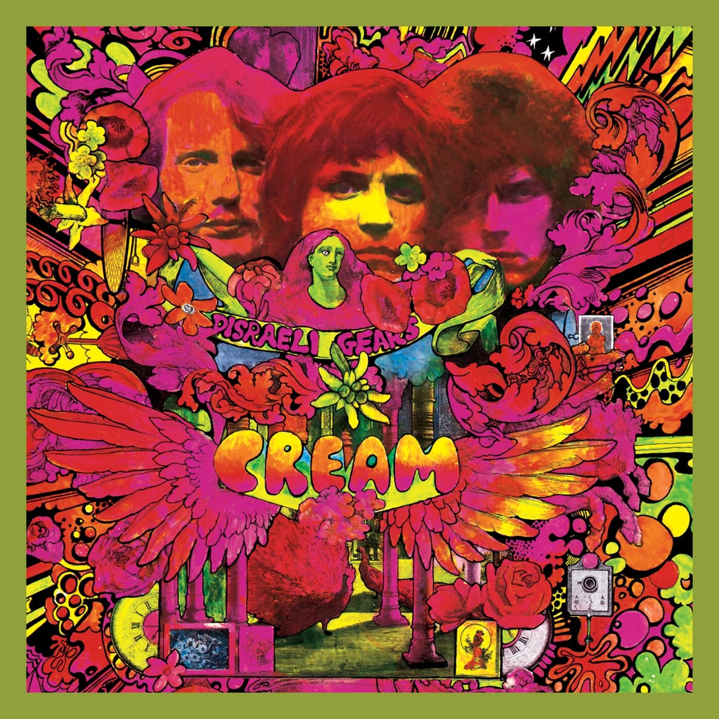
Disraeli Gears hits you like walking into a head shop: neon pinks, acid greens, swirling patterns and faces emerging from the chaos. The band members’ portraits float inside a blooming, psychedelic garden of wheels, wings, hearts and mechanical parts.
Marijke Koger and Simon Posthuma of The Fool art collective layered the image with near‑hallucinogenic detail; the typography melts and curls into the illustration rather than sitting on top of it. It’s unapologetically “too much,” in exactly the way late‑60s rock wanted to be.
If you had to explain “psychedelic album cover” in one image, Disraeli Gears would be very hard to beat.Also, have a look at the cover story for Wheels of Fire by Cream.
Add it to your collection: Disraeli Gears - Cream.
6. The Zombies - Odessey and Oracle (1968)
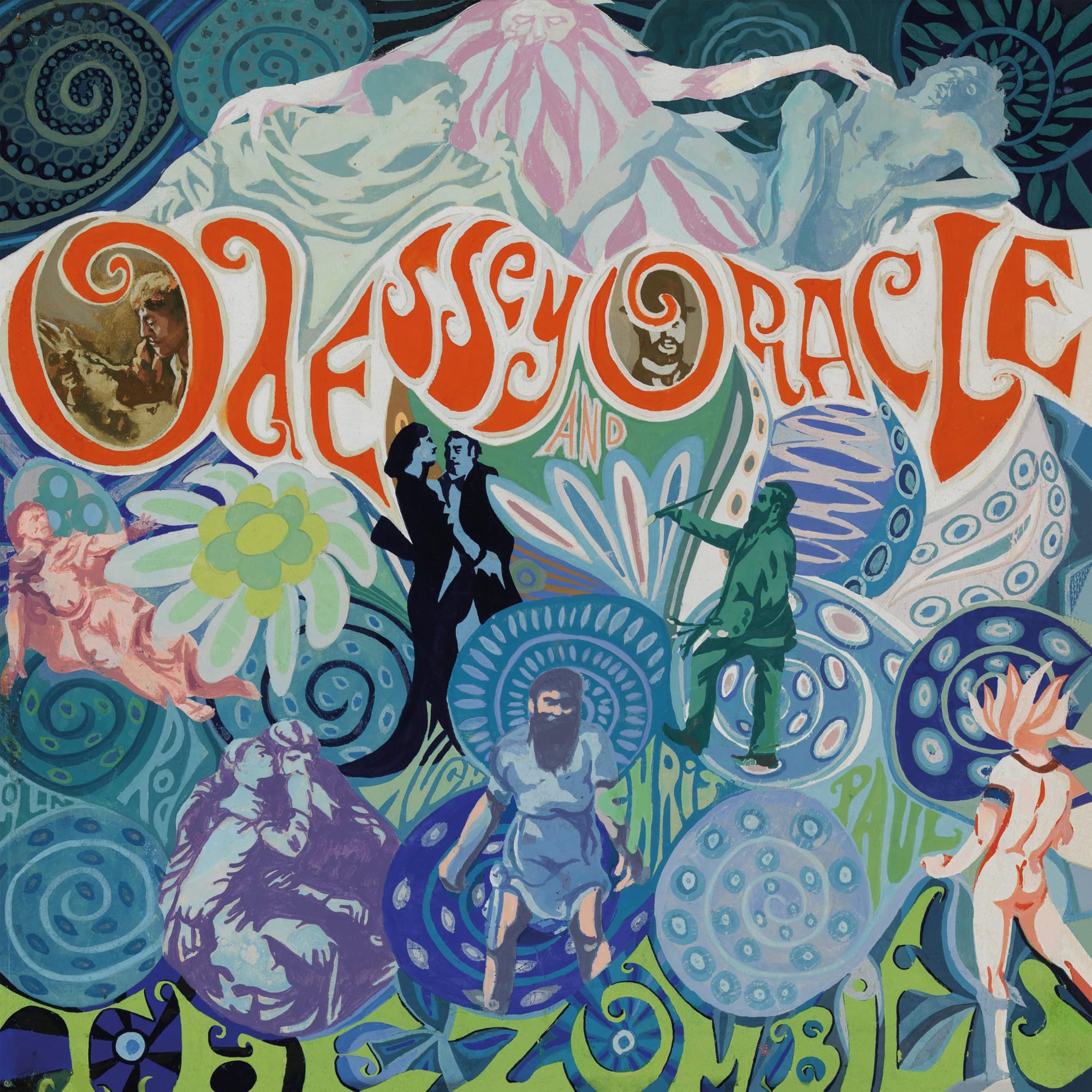
Yes, the title is misspelled. No, that’s not a typo. Odessey and Oracle wraps its baroque pop in a cover that looks like a cross between Art Nouveau and a children’s storybook: swirling lettering, overlapping figures, flowers, clocks and bright stained‑glass colours.
Designer Terry Quirk hand‑painted the entire scene, filling it with symbols and visual rhymes, the kind of cover you could stare at for an entire side and still notice new details. The mis‑spelled “Odessey” ended up baked into the mythology of the record, another odd little flourish in a very late‑60s package.
It’s one of those sleeves where the artwork and the music feel exactly right for each other: ornate, slightly fragile and endlessly replayable.
Add it to your collection: Odessey and Oracle - The Zombies.
5. The Rolling Stones - Let It Bleed (1969)
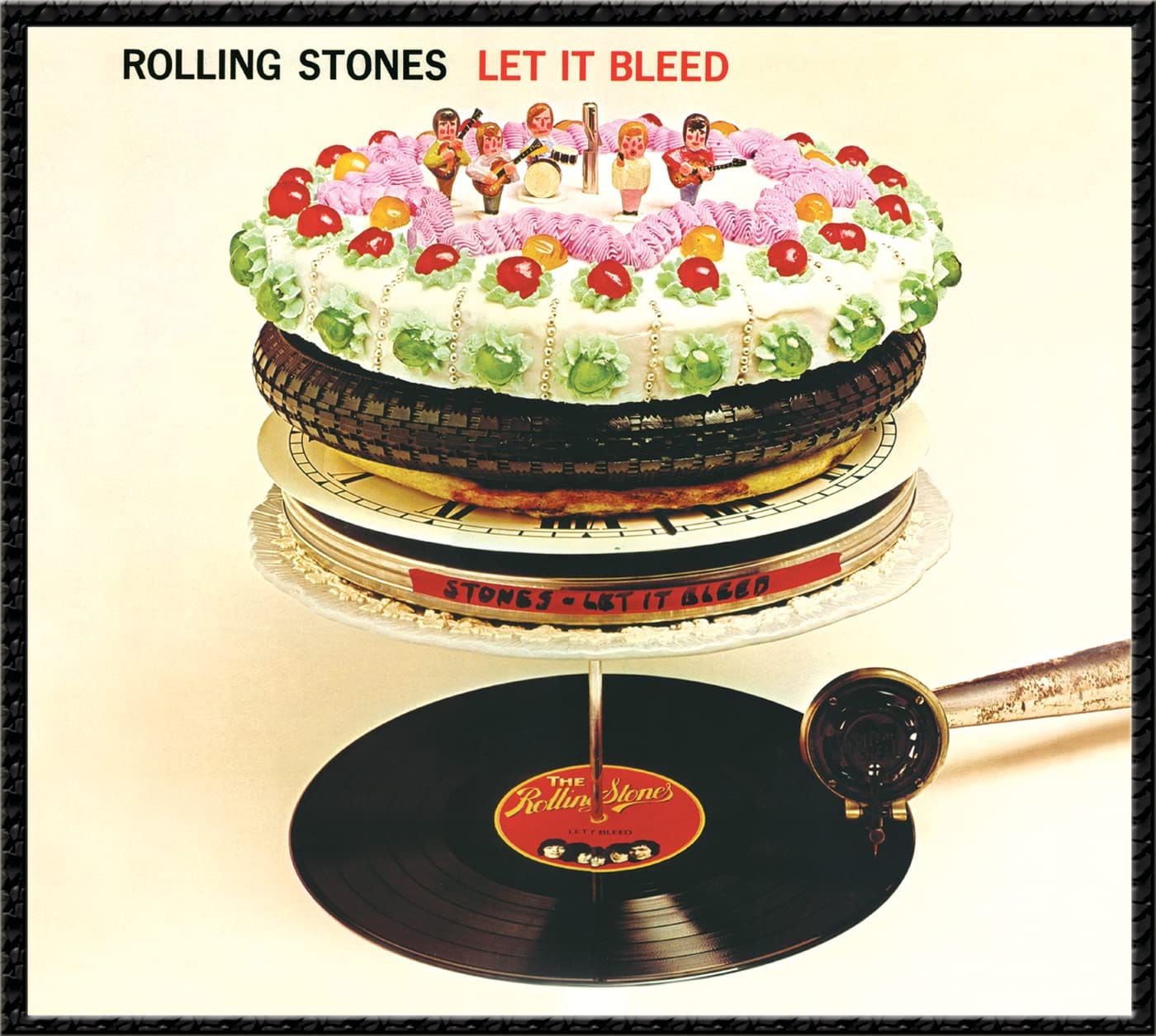
On the cover of Let It Bleed, a record spins on a multi‑layered sculpture: a tape box, a clock face, a pizza, a film canister, a tyre and finally a cake covered in figurines of the band, all stacked on a turntable spindle. On the back, the same tower appears smashed, the record broken.
Designer Robert Brownjohn turned the album into a little physical joke about consumption and collapse, using everyday objects instead of cosmic imagery. The handmade cake was baked and decorated by then‑unknown TV chef Delia Smith.
It’s playful, slightly grotesque and totally late‑60s; a sleeve that manages to feel both like a party and a warning that the party’s almost over.
Add it to your collection: Let It Bleed - The Rolling Stones.
4. Jimi Hendrix - Electric Ladyland (1968)
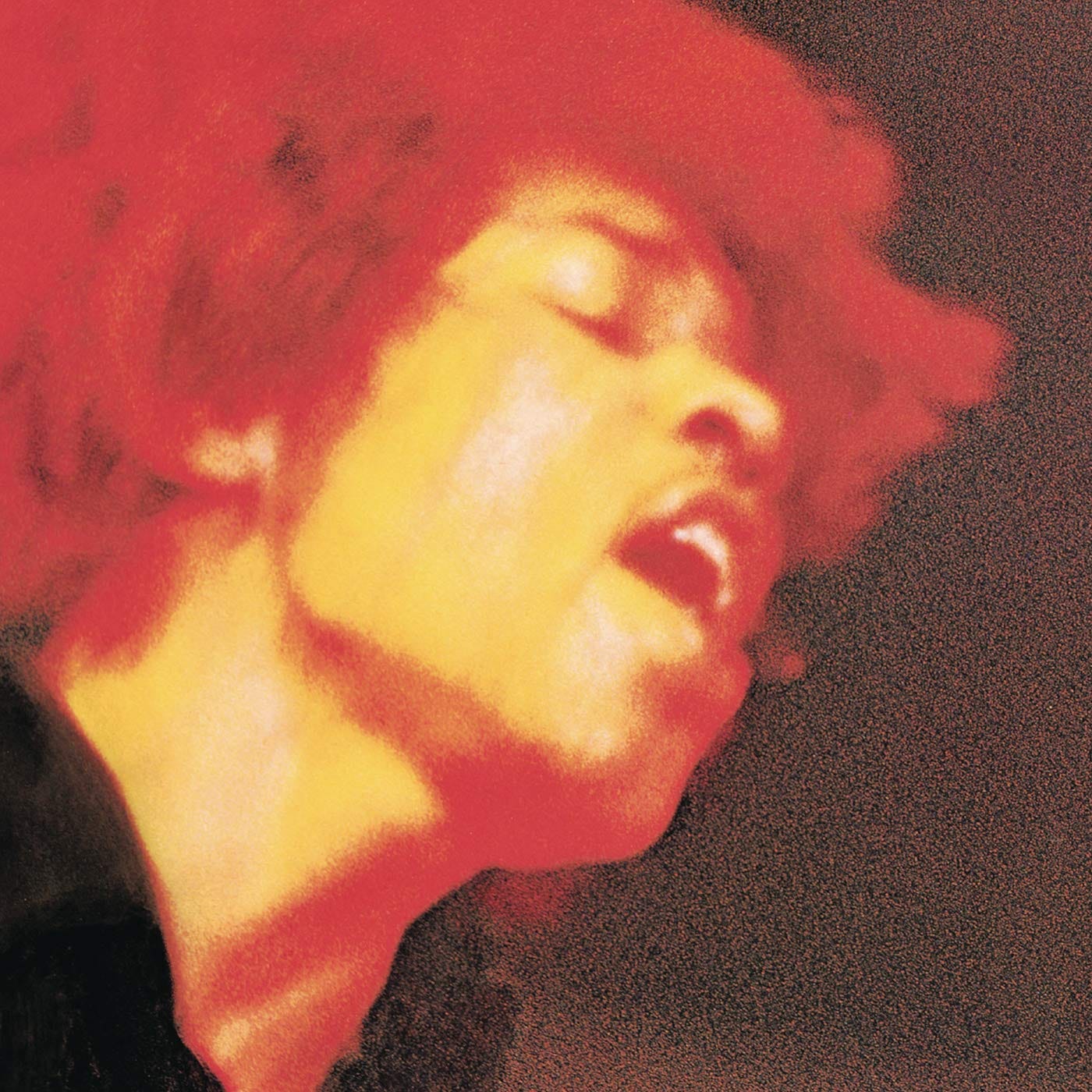
The cover most people know for Electric Ladyland is the controversial UK version: a grid of nude women against a black background, staring down the camera. But the more enduring image in design circles is the US sleeve: a close‑up, blurred photograph of Hendrix’s face, bathed in hot reds and oranges as if he’s lit entirely by stage lights.
That close‑cropped, saturated portrait feels less like a simple gig shot and more like an attempt to capture the intensity of Hendrix’s playing in a single frame. The motion blur and colour cast make his features almost melt into the background.
Either way, the album’s visual identity is about overload. Too much colour, too much heat, too much Jimi, which is exactly how the record sounds.
Add it to your collection: Electric Ladyland - The Jimi Hendrix Experience.
3. King Crimson - In the Court of the Crimson King (1969)
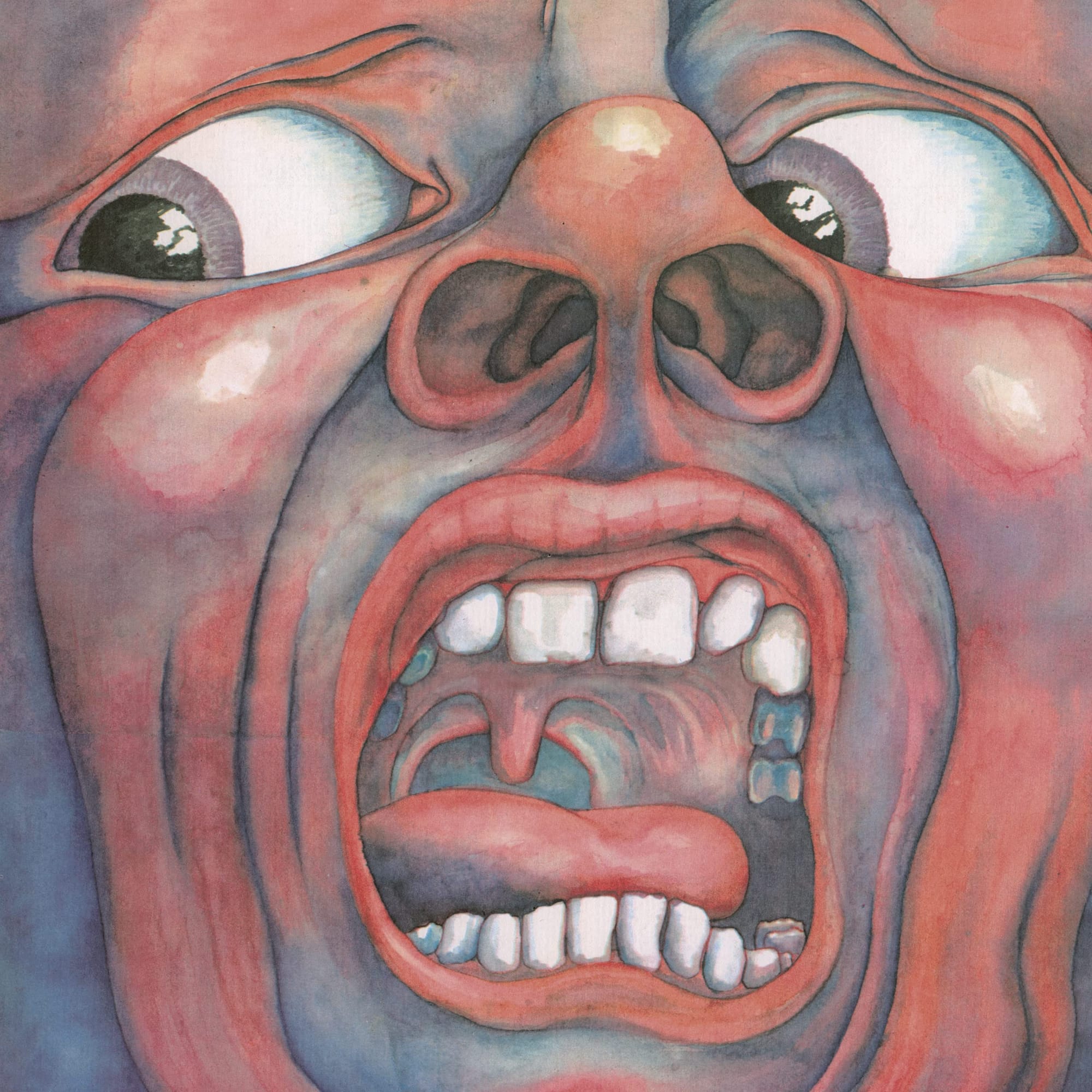
A screaming face fills the entire sleeve, eyes bulging, nostrils flared, teeth bared, every wrinkle and pore painted in painful detail. There’s no band name or title on the front, just this one, overwhelming expression.
Artist Barry Godber, a computer programmer and friend of the band, painted the “Schizoid Man” in gouache; it was the only album cover he ever created before his early death. The inside gatefold reveals a calmer, pale face, the “Crimson King” looking straight back at you.
It’s one of the most intense images of the decade, as visceral as any rock photograph but entirely hand‑made. Even if you’ve never heard a note of the record, you probably recognise that face.
Add it to your collection: In the Court of the Crimson King - King Crimson.
2. The Beatles - Sgt. Pepper’s Lonely Hearts Club Band (1967)
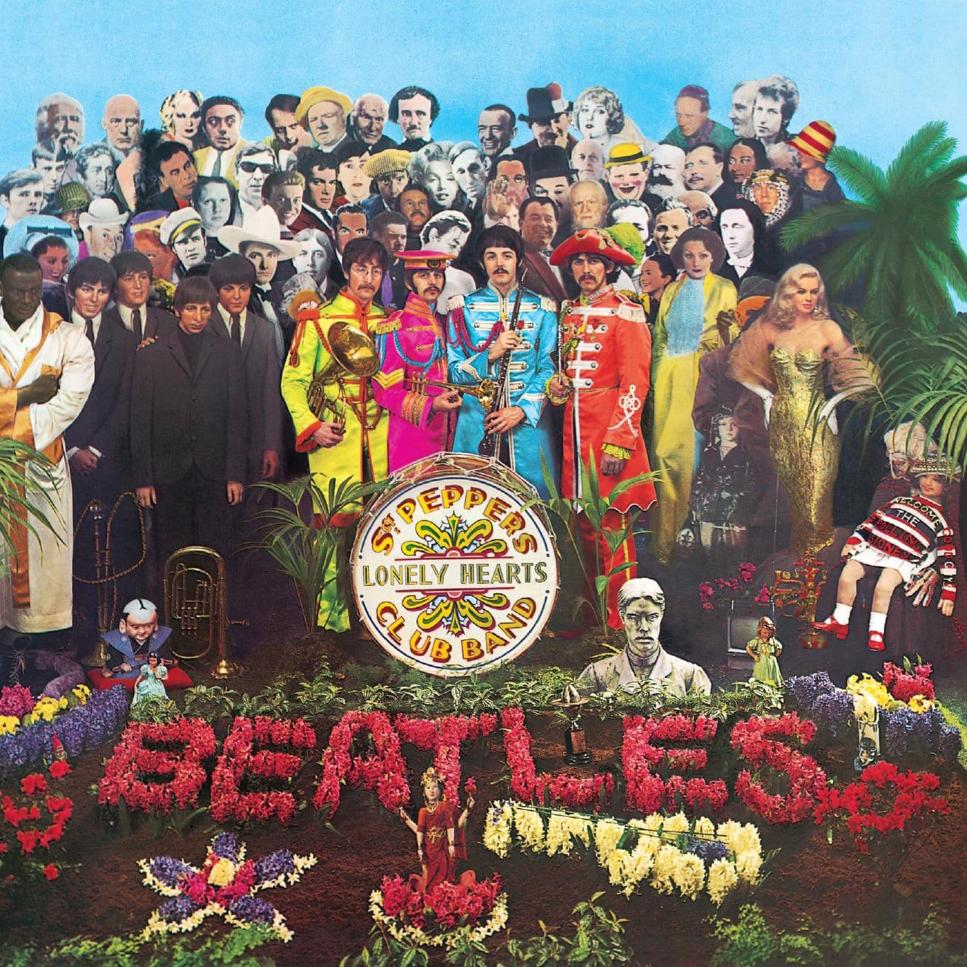
Sgt. Pepper is part album cover, part group portrait, part art installation. The Beatles stand in psychedelic military uniforms surrounded by a crowd of life‑size cardboard cut‑outs: actors, writers, musicians, gurus, comedians, plus waxworks of their younger selves, all pressed into a single tableau.
Designed by pop artists Peter Blake and Jann Haworth from a concept by Paul McCartney, the set reportedly cost a small fortune in rights fees for the likenesses, and the photo session required an entire stage to construct. Floral arrangements spelling “Beatles” sit at their feet; every inch of the scene is loaded with references.
Multiple histories of album art call Sgt. Pepper the moment rock sleeves fully crossed into modern art. It's an image that doesn’t just decorate the music but comments on fame, identity and the band’s place in culture.
Add it to your collection: Sgt. Pepper’s Lonely Hearts Club Band - The Beatles.
1. The Velvet Underground & Nico - The Velvet Underground & Nico (1967)
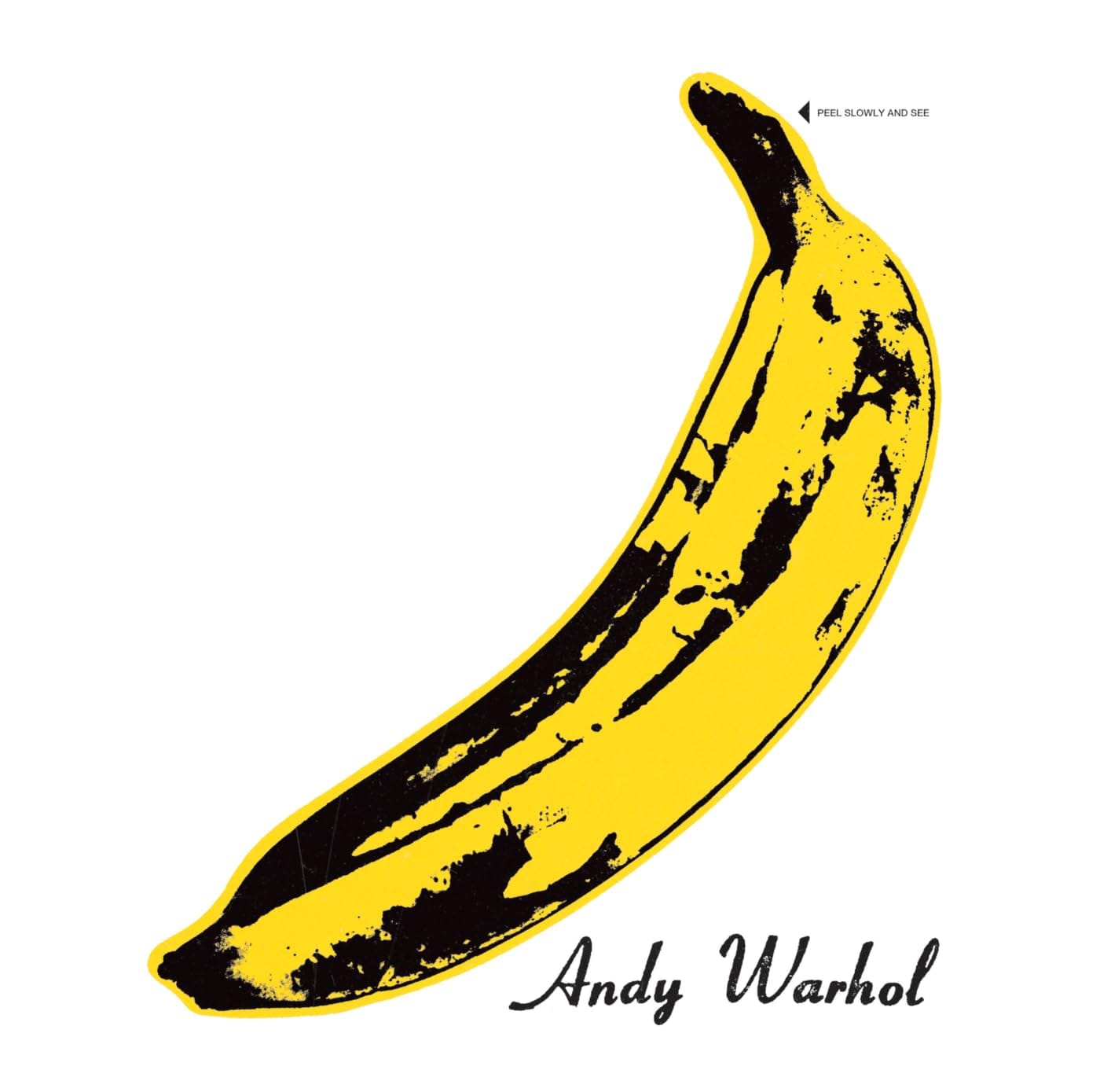
A single yellow banana on a white background. That’s it. No band photo, no scenery, just Andy Warhol’s flat, graphic fruit with his signature printed underneath.
On early pressings, the banana was a peelable sticker with the words “Peel slowly and see”; underneath was a flesh‑coloured version of the fruit. It turned the cover into an interactive object, half pop art joke, half strange invitation.
Design writers often point to this sleeve as the moment the person behind the cover, Warhol, became the star as much as the band, and multiple rankings of 60s and all‑time album art put the banana right at the top. It’s a simple, almost meaningless object turned into one of the most recognisable images in music.
Add it to your collection: The Velvet Underground & Nico - The Velvet Underground & Nico.
Taken together, these eleven sleeves show just how fast the 1960s moved: from modernist blocks of colour and jazz silhouettes to psychedelic illustration, comic‑book chaos, conceptual rock sculpture and pop‑art provocation. They’re the covers that turned the album sleeve from a nice‑to‑have into a place where artists, designers and musicians all met in the same 12 inches.
Have a complaint? Let me know in the comments!