A Poem On A Napkin
Wheels of Fire by Cream - My parents had this album. It sat in the collection looking too strange to touch. I left it alone for years. Here's what I found when I finally looked properly.
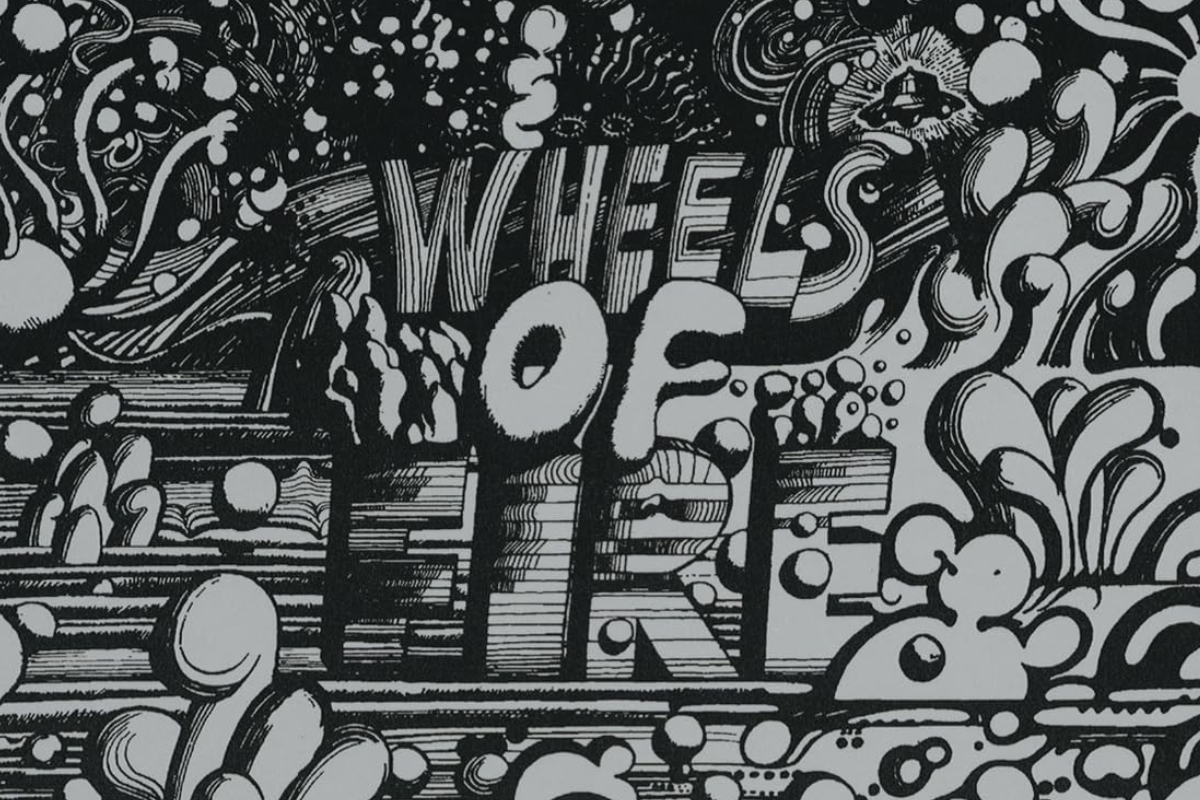

My parents had this album. I remember seeing it as a kid. That swirling, silver, slightly overwhelming image sitting in the record collection like something that had arrived from a different planet. Too strange to touch. Too intimidating to play. I left it alone and moved on to something less confusing.
I came to Cream later in life. White Room. Sunshine of Your Love. The bass. The drumming. All of it remarkable. And then I went back to that cover, that cover that had intimidated me as a kid and had a good look at it for the first time.
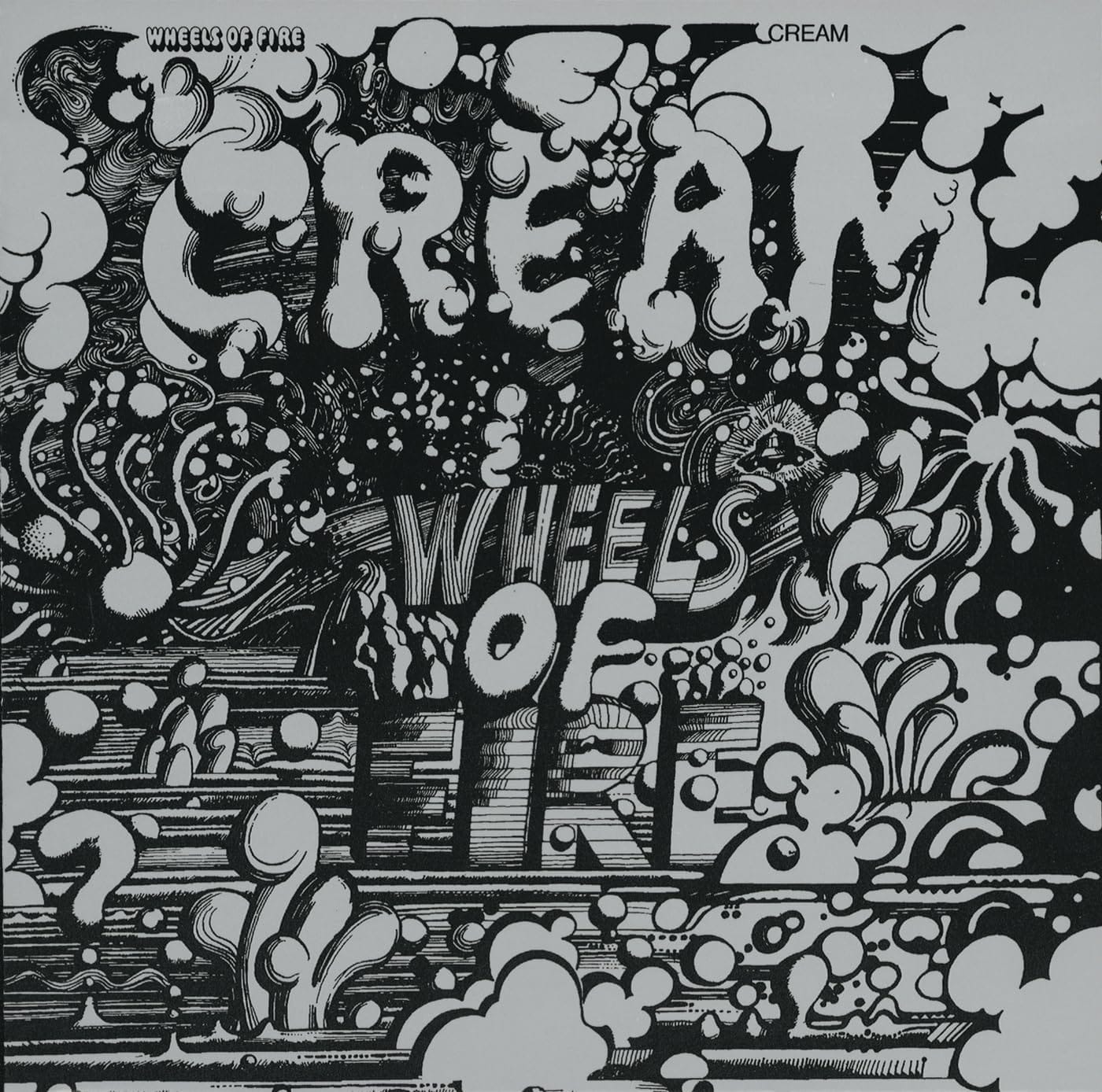
| Album | Wheels of Fire |
| Artist | Cream |
| Genre | Rock |
| Released | 14 June 1968 (US) / 9 August 1968 (UK) |
| Label | Polydor (UK) / Atco (US) |
| On the cover | A silver-grey psychedelic drawing on the front and back, with a matching Day-Glo version in orange, green, pink and yellow inside the gatefold |
| Design | Martin Sharp |
| Decade | 1960s |
The Artist Nobody Talks About Enough
Before we talk about the cover of Wheels of Fire we need to talk about the man who made it. Because Martin Sharp is one of the most singularly talented visual artists of the 1960s and one of the least celebrated outside his native Australia.
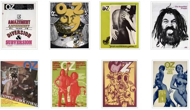
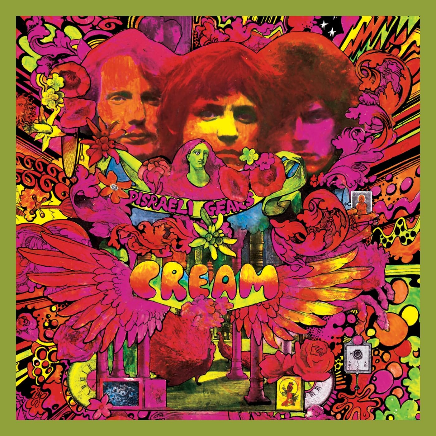
A native of Australia, Sharp was one of the people who established the legendary underground magazine Oz, contributing a great many memorable and cheeky covers. In addition to designing the covers of Cream's second and third albums, Disraeli Gears and Wheels of Fire, Sharp also produced many iconic psychedelic artworks featuring the images of Bob Dylan, Mick Jagger, Jimi Hendrix, and Donovan, among others.
He was not, in other words, a hired gun brought in to illustrate someone else's vision. He was a genuine artist; witty, technically brilliant, and operating at the absolute centre of London's late 1960s cultural explosion.
And he got the Cream job because of a poem he wrote on a napkin.
A Poem On A Napkin
A chance meeting at London's Speakeasy nightclub in early 1967 led to Cream guitarist Eric Clapton asking Sharp to create the cover to Cream's psychedelic masterpiece Disraeli Gears. "I just started chatting to Eric," Sharp told Classic Rock in 2003. "I told him I had written a poem. He in turn told me he'd written some music. So I gave him my poem. Two weeks later he turned up with it on a B-side of a 45 record."
The poem became Tales of Brave Ulysses, the B-side to Strange Brew and one of the defining tracks of the psychedelic era. Sharp wrote it on a napkin. Clapton set it to music in a fortnight. And the collaboration that produced two of the most celebrated album covers of the 1960s was born in a London nightclub over a casual conversation.
Clapton moved Sharp into a studio apartment on London's trendy Kings Road and asked him to create a cover for Cream's next album. That apartment was The Pheasantry, a remarkable Kings Road commune that at various points housed Germaine Greer, Anthony Haden-Guest and top rock photographer Robert Whitaker. Robert Whitaker, the same photographer who shot the Beatles Butcher cover. The same Pheasantry. The same moment in London's cultural history. Art Before Noise keeps finding the same people in the same rooms. Why is that?
The Cover That Looks Like A Cliché
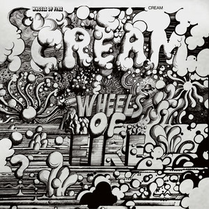
To me, the Wheels of Fire cover looks like a psychedelic cliché. The swirling Op Art lines. The minimal colour palette: black on silver, with that foil finish. The sense of controlled visual chaos. These things look familiar now because everything that came after them borrowed from them. Martin Sharp wasn't following a template. He was creating one.
The album was issued by ATCO in the United States during August 1968 as a double album with gatefold cover, and through Polydor in the United Kingdom as two single albums. Martin Sharp's art featured on the front and rear covers of the majority of original releases, and within the inner gatefold section of the American release and later special re-releases.
And the foil, that silver surface that makes the cover shimmer and shift depending on the light was not a standard printing choice. In the UK, the studio album was black print on aluminium foil, while the Live at the Fillmore album was a negative image of the studio cover. In Japan, the studio album was black on gold foil, while the live album was black on aluminium foil.
Different versions. Different foils. Different countries. The same swirling Sharp artwork catching different light in different ways around the world.
In Australia both covers were laminated copies of the Japanese releases. It was never released as a double album in Australia. The copy sitting in my parents' collection was a laminated Japanese pressing.
Listen to Wheels of Fire by Cream

The Prize Nobody Remembers
Sharp won the New York Art Director's Prize for his design of Cream's Wheels of Fire.
The New York Art Directors Prize. For Best Album Design. In 1969. One of the most prestigious design awards of its era was given to an Australian artist living in a Kings Road commune in London, who got the job because he wrote a poem on a napkin in a nightclub.
Sharp's draftsmanship and artistic flexibility are impressive, as is his irreverent wit. He was not hemmed in by the psychedelic genre the way many of his contemporaries were. His line work is precise and disciplined beneath the apparent chaos. The kind of technical control that takes years to develop and looks effortless once achieved.
The Wheels of Fire cover won a prize that most people who own the record have never heard of. That feels right somehow. The best design is the kind that earns its place without announcing it.
The Man Who Came Home
Martin Sharp left London and returned to Australia in the 1970s. He proceeded to cement his reputation as the country's pre-eminent pop artist, holding numerous exhibitions of his work on canvas while continuing to engage in a steady stream of carefully chosen commercial jobs.
He died in Sydney in December 2013 at the age of 71. The obituaries were warm but brief. The fate of artists who work in the commercial space between fine art and popular culture, never quite belonging fully to either world.
He wrote a poem on a napkin. He lived in a commune with Germaine Greer. He designed two of the most celebrated album covers of the psychedelic era. He won the New York Art Directors Prize. And he went home to Sydney and kept working quietly until the end.
Australia doesn't always celebrate its own. Martin Sharp deserved better than the footnote he has largely become.
Not A Cliché. A Blueprint.
I understand now why that album sat in my parents' collection looking too strange to touch. It was strange in the best possible way. Strange in the way that genuinely new things always are before the world catches up with them.
The swirling lines. The silver foil. The minimal palette. These things look like the 1960s because they helped define what the 1960s looked like. Martin Sharp didn't arrive late to a party. He helped set the table.
White Room. Sunshine of Your Love. The bass. The beats. All remarkable.
I should have dived in earlier.