Almost Looks Like It Means Something
OK Computer by Radiohead - A road. Some blurred figures. White space. Here's what it all means and the hotel window it was photographed from.

What does the OK Computer cover have to do with the name of the album?
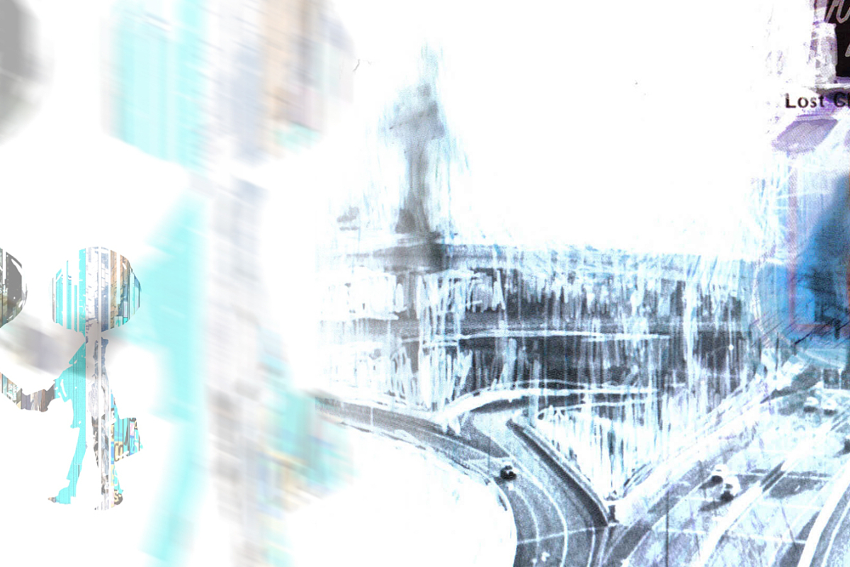
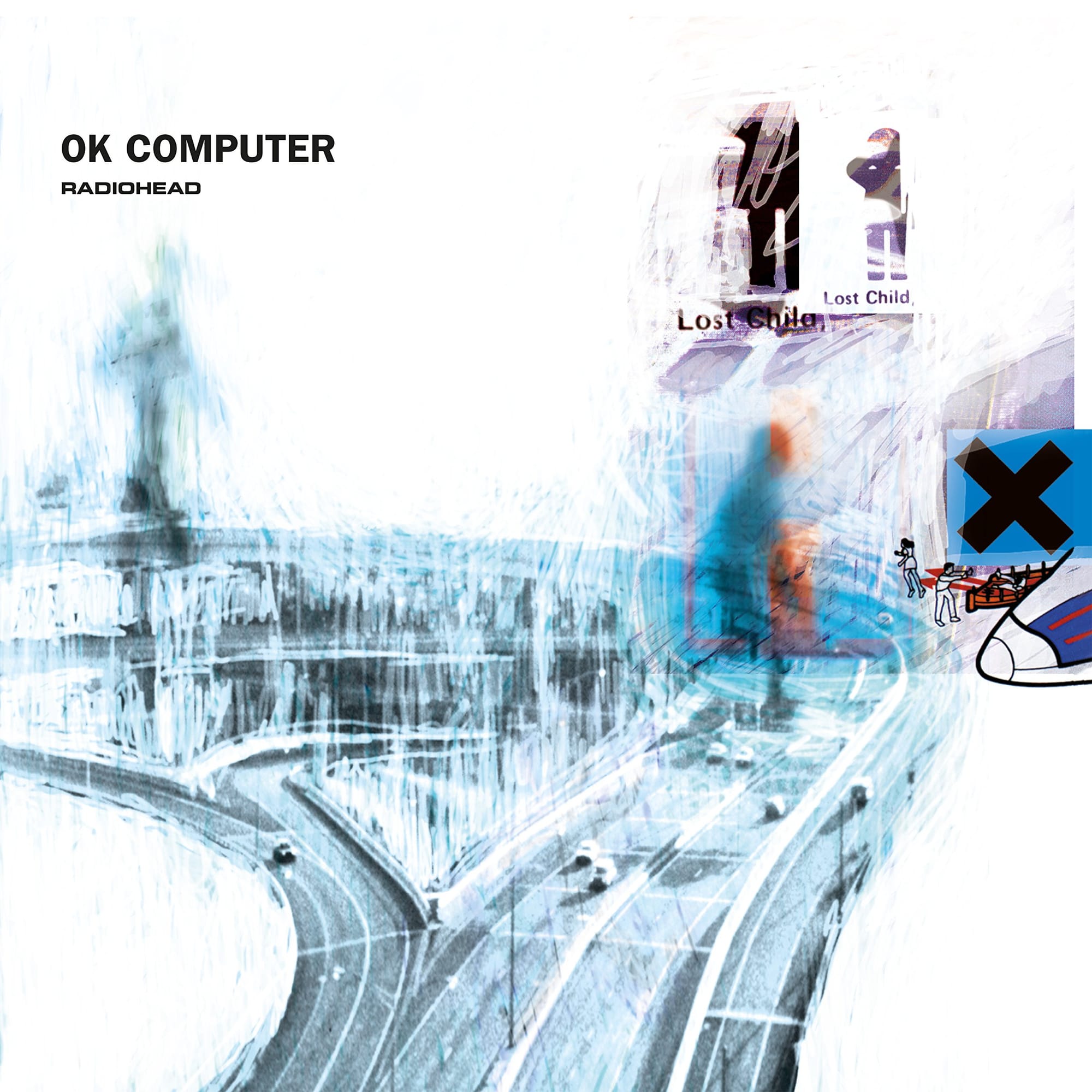
A road junction. Blurred figures. White space. What appears to be a lost child poster. Fragments of text that almost resolve into meaning and then don't. It looks like something important is being said. But what?
It comes from Stanley Donwood himself, who designed the cover with Thom Yorke. A newspaper review of the artwork described it as: "It almost looks like it means something."
Donwood's response? "Which I thought was fucking brilliant."
That is the OK Computer cover in a single exchange. An image that almost looks like it means something. Designed by two people who were processing something they couldn't fully articulate. About a world moving too fast. About technology and highways and the dehumanising hum of modern life.
Album Anatomy
| Album | OK Computer |
| Artist | Radiohead |
| Genre | Alternative |
| Released | 16 June 1997 |
| Label | Parlophone |
| On the cover | A bleached, fogged-out motorway interchange, scratched over with stick figures, scrawled text and found-image fragments |
| Design | Stanley Donwood, with Thom Yorke (as "the White Chocolate Farm") |
| Decade | 1990s |
| Buy | Amazon |
Two Art Students At Exeter
The story of the OK Computer cover begins not in a recording studio but in a university corridor.
Stanley Donwood met Thom Yorke while they were both studying art at Exeter University. Donwood's first impression of Yorke was characteristically blunt; he seemed "mouthy, pissed off, someone I could work with."
That assessment turned out to be accurate on all three counts. Yorke went on to become one of the most celebrated musicians of his generation. Donwood went on to design every Radiohead album cover from The Bends onwards, including the bleak, scratchy roadscape for OK Computer and the landfill heap of coloured word blocks on Hail to the Thief.
It is widely known that Stanley Donwood is heavily involved throughout the band's recording process, working on artwork as the songs unfold. He is not brought in to simply draw some interesting pictures afterwards. He is an integral part of the whole process.
That matters enormously for understanding the OK Computer cover. This is not a designer handed a finished album and asked to illustrate it. This is a collaborator who was present as the music was being made, absorbing the same anxieties, processing the same feelings, reaching for the same images.
Listen to OK Computer by Radiohead

A Hotel Room In Hartford
The artwork is based partly around photographs Thom Yorke took of motorways and a highway interchange in Connecticut. Radiohead were on tour in America in 1996, one of the last live runs before returning to the UK to record OK Computer and something about the American highway system was getting under Yorke's skin.
Fans eventually pieced together the specific location. After posting images on an AARoads forum, eagle-eyed road enthusiasts identified the interchange as Hartford, Connecticut's I-84 to I-90 connector. The band performed at Hartford's outdoor venue The Meadows on August 20th 1996 and the exact angle of the photo would place the photographer in a Hilton hotel room.
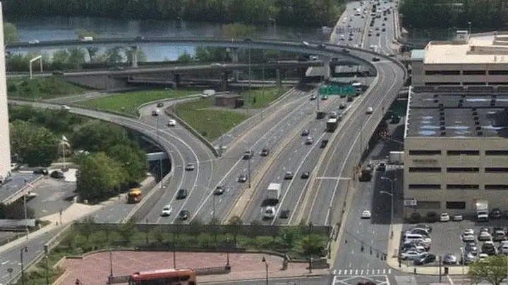
A hotel room in Hartford. A tour stop on August 20th 1996. Thom Yorke looking out of a Hilton window at an American highway interchange and photographing what he saw. That photograph was blurred, processed, and combined with Donwood's hand-drawn elements became one of the most recognisable album covers of the 1990s.
Yorke later described that period as "an odd time for me personally... of living in a bubble... touring endlessly... feeling like everything was moving too fast." The highway outside the hotel window was a perfect visual metaphor for exactly that feeling; constant movement, constant noise, nobody going anywhere that matters.
The Making Of The Image
The artwork to OK Computer features a combination of computer-generated images by Thom Yorke and hand-drawn artwork by Donwood.
Yorke worked on the digital elements. Donwood worked on the drawn elements. The two were combined into something that sits uncomfortably between the mechanical and the human, which is precisely where the album's themes live.
Working with a palpable motif, Donwood blurred the lines with artistic abstraction, tailoring a chromatic palette to the mood of the music. In Radiohead's case, these are usually somewhat bleak pictures.
The palette for OK Computer is almost entirely white, which makes the blurred road junction and the scattered figures feel even more isolated. They are details adrift in a vast emptiness. Small human presences in a world dominated by infrastructure.
Yorke's own description of what the artwork means is one of the most honest things ever said about an album cover: "Someone's being sold something they don't really want, and someone's being friendly because they're trying to sell something. That's what it means to me. All the artwork… it was all the things that I hadn't said in the songs."
The things he hadn't said in the songs. The cover as overflow. As the residue of everything that didn't make it into the music.
What You're Actually Looking At
The road is a highway interchange in Hartford, Connecticut, photographed from a hotel window on a tour stop in 1996. It represents the relentless, dehumanising movement of modern life; the infrastructure that connects everyone and connects nobody.
The blurred figures are people rendered almost invisible by the speed and scale of the world around them. Not a lost child poster, though the instinct to see one says something interesting about how the image works on you.
The white space is not emptiness. It is the digital world, the OK Computer of the title, pressing in on the human figures, making them smaller, making them less distinct.
And the name? OK Computer is a phrase of resigned acceptance; the okay you type into a machine when you want it to do something. A surrender to the technological world. The cover shows you what that world looks like from the outside; a highway, some figures, the hum of infrastructure, and the overwhelming white of screens and data and noise.
When Yorke and Donwood finished the artwork, Yorke described it as "a quite good full stop over that period. It's like: that's what it was like. Even though it's sort of nonsense, for some reason it said what we needed to say."
The Pink Floyd Connection
One final detail worth knowing and it connects directly to another post on this blog.
One of the inner sleeves shows a silhouette of two males, seen as a link to the two businessmen on the cover of Wish You Were Here. And on the other inner sleeve is a drawing of a pig, a clear link to Pink Floyd's Animals.
Almost Looks Like It Means Something
I didn't understand the OK Computer cover when I first encountered it. A road. Some blurred figures. White space.
Now I do. It is a photograph taken from a hotel window in Hartford, Connecticut, on August 20th 1996, by a man who was feeling like everything was moving too fast. Processed, combined with hand-drawn elements, and printed on a white background that represents the digital world pressing in on all of us.
It almost looks like it means something.
It means everything.