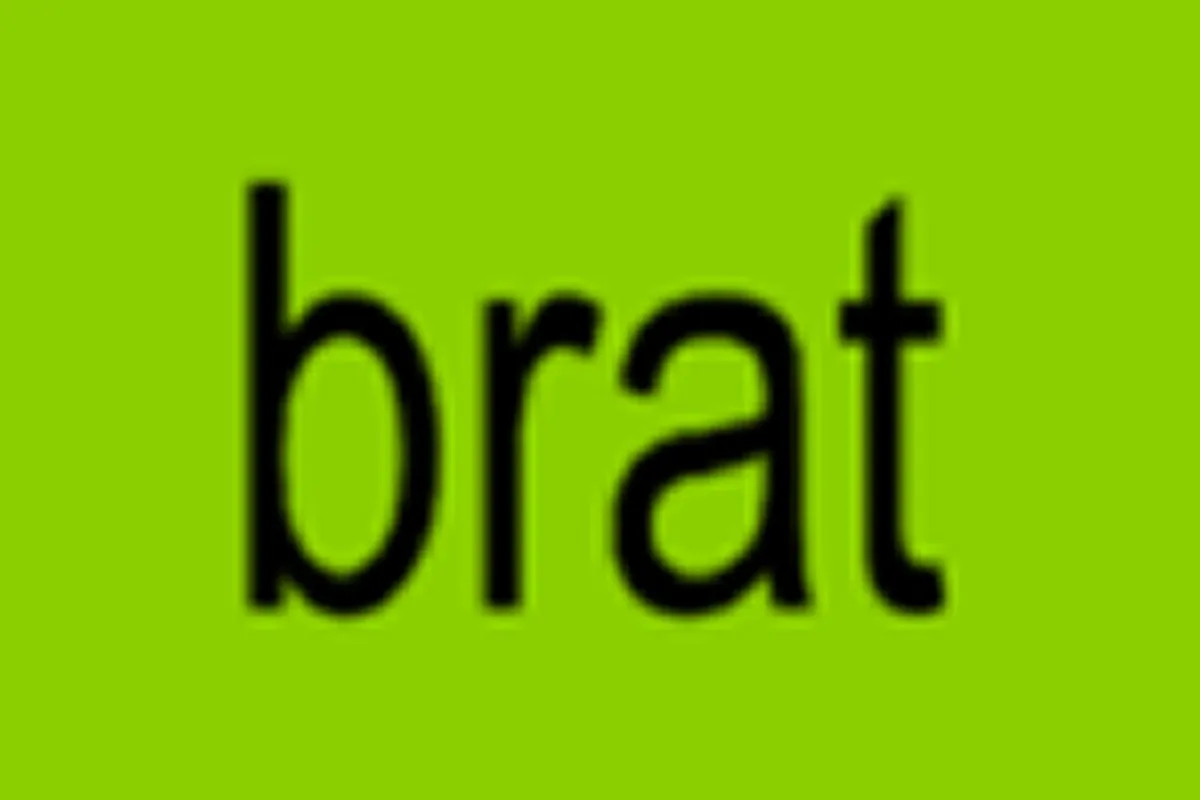
I don't know much about Charli XCX. But I know that cover.
The bold lime green. The blurry lowercase text. Four letters. Nothing else. It catches your eye before you know what you're looking at, which is, as it turns out, exactly what it was designed to do.
Album Anatomy
| Album | Brat |
| Artist | Charli XCX |
| Genre | Electronic |
| Released | 7 June 2024 |
| Label | Atlantic Records |
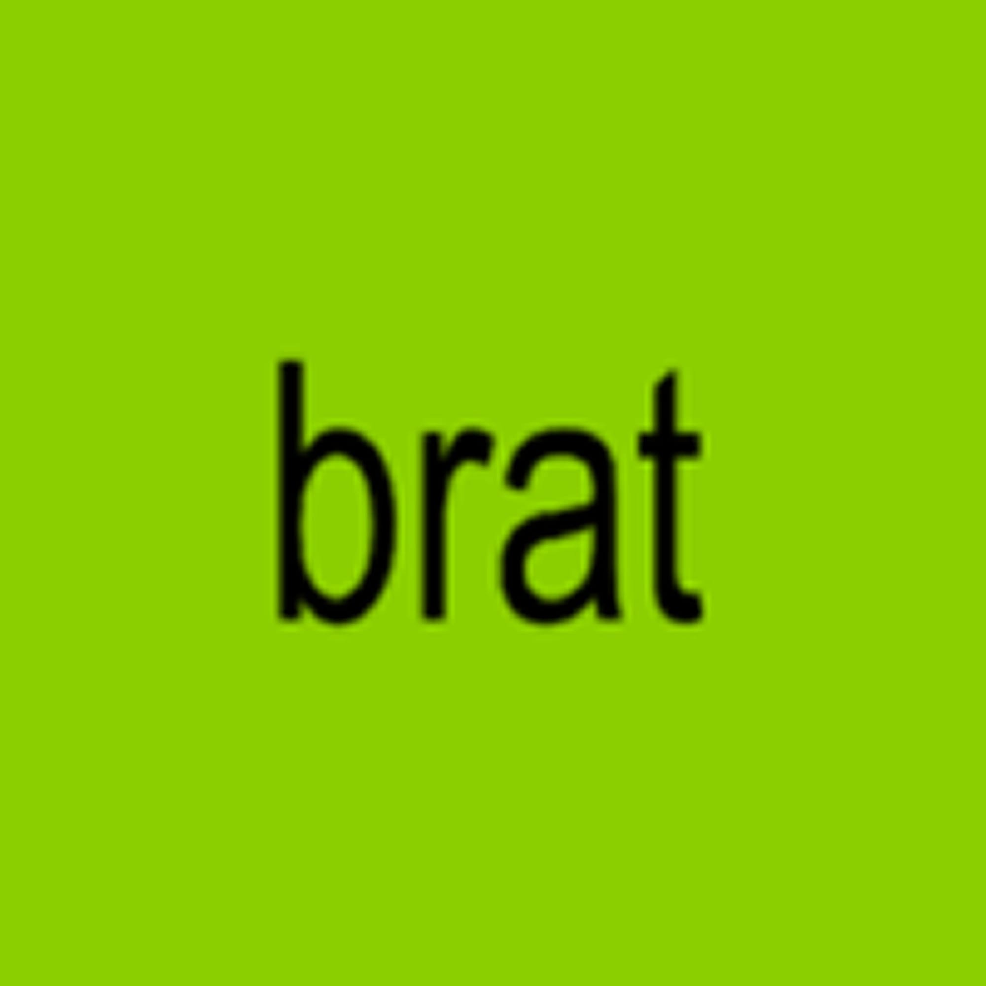
| On the cover | A flat, low-resolution square of lime green with the word "brat" stretched and blurred across it in lowercase Arial |
| Design | Brent David Freaney at Special Offer, Inc., art direction by Imogene Strauss and Charli XCX |
| Decade | 2020s |
500 Shades Of Green
The cover of Brat looks like it took about thirty seconds to make. A colour. A word. Done.
It did not take thirty seconds. Designer Brent David Freaney of creative tech studio Special Offer admitted they combed through 500 shades of green before landing on that one. Five hundred. The one that made your eyes squint. The one that Charli herself called "unfriendly and uncool."
The shade of green was selected on the basis of whichever variation drew the most averse reaction from her team. They tested greens until they found the one that made everyone uncomfortable. And then they used that one.
The colour is #8ACE00; a specific, registered, reproducible hex code that became one of the most recognised colours in popular culture in 2024. It has a name now. Brat Green. Not Pantone's official colour of 2024, that was Peach Fuzz, but the colour that actually defined the year.
The Font That Isn't Blurry
Most people assume the text on the Brat cover is blurry. It isn't. Not exactly.
In honour of the MySpace days, where tiny images were reused by upscaling them without accounting for resolution, the album cover's text received the same treatment. The pixelation effect is deliberate, stretched Arial font that looks low resolution because it is low resolution. On purpose.
Arial. The most unremarkable font in the history of digital communication. The font your school used for worksheets. The font nobody chooses when they have a choice.
As Freaney put it: "It's weirdly offensive without figuring out why. Just the way the words sit on there is both very elegant and strangely provocative. And the ugly Helvetica."
Wait, he called it Helvetica. It's Arial. Even the designer got confused about which unremarkable font they used on one of the most iconic covers of the decade. That detail feels very brat.
The Cover Charli's Team Didn't Want
"My manager, my creative director, all my friends were like nooo, not the text cover," Charli said.
Everyone around her said no. And she did it anyway.
Charli moved forward with the idea after making some design mock-ups on her phone, stating that the concept, especially her physical absence from the cover, "very much embodies the word brat."
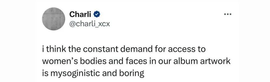
No face. No body. No glamour. Just a colour and a word. "I think the constant demand for access to women's bodies and faces in our album artwork is misogynistic and boring," Charli wrote on X in response to fan criticism.
The cover wasn't just an aesthetic choice. It was a statement about what a female artist owes her audience, and the answer, according to Charli, is nothing. Not her face. Not her body. Just the music. And a very specific shade of green.
The Brat Wall
On May 2, Charli tweeted out an address for a street in Brooklyn, NY, the location of a surprise pop-up performance and what would become the infamous Brat Wall. The wall was used pre-release to write messages over the lime-green background, including lyrics from the album's tracks, all live streamed on her TikTok account each time it was updated.
The cover had escaped the album before the album was even released. A wall in Brooklyn became a canvas. The colour became a movement.
The London Eye was lit up in lime green on the day of the album's release. A landmark. In Brat Green. Because a designer found the right shade of ugly on attempt number 500.
Kamala Is Brat
And then something nobody predicted happened.
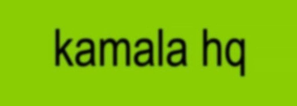
On July 21, mere hours after Joe Biden dropped out of the 2024 presidential race, Charli went to X to tweet "kamala IS brat." Almost immediately, Harris' marketing team changed their X campaign banner to a lime green, brat-stylized banner with "kamala hq" written in the signature low-resolution Arial font.
A cover designed to save money. A colour chosen because it made everyone uncomfortable. A font nobody respects. And it ended up on the social media campaign of a US presidential candidate.
Barack Obama put Brat on his playlist and said: "Charli XCX, she knows what she's doing."
What The Cover Actually Says
The cover of Brat is not trying to be beautiful. It is not trying to be sophisticated. It is not trying to give you anything you expected.
In a cultural moment where aesthetics are algorithmically sanitised, Brat felt like a slap. A cover that looked wrong. That made people uncomfortable. That everyone said no to. That ended up on a Brooklyn wall, the London Eye, a presidential campaign, and Barack Obama's playlist.
On 31 October 2024, "brat" was named the word of the year by the Collins English Dictionary.
A four letter word. In blurry Arial. On a disgusting shade of green.
That catches your eye before you know what you're looking at.
That's the point.