Back when I wrote about covers that dropped every last word and let the picture do the talking on its own (that's the Say Nothing post, if you haven't read it), I figured that was the extreme end of the spectrum. Turns out there's an equally stubborn opposite camp: album covers that skip the picture altogether and just say what they are, in plain type, and dare you to be interested. Here are nine of them.
The Howlin' Wolf Album - Howlin' Wolf (1969)
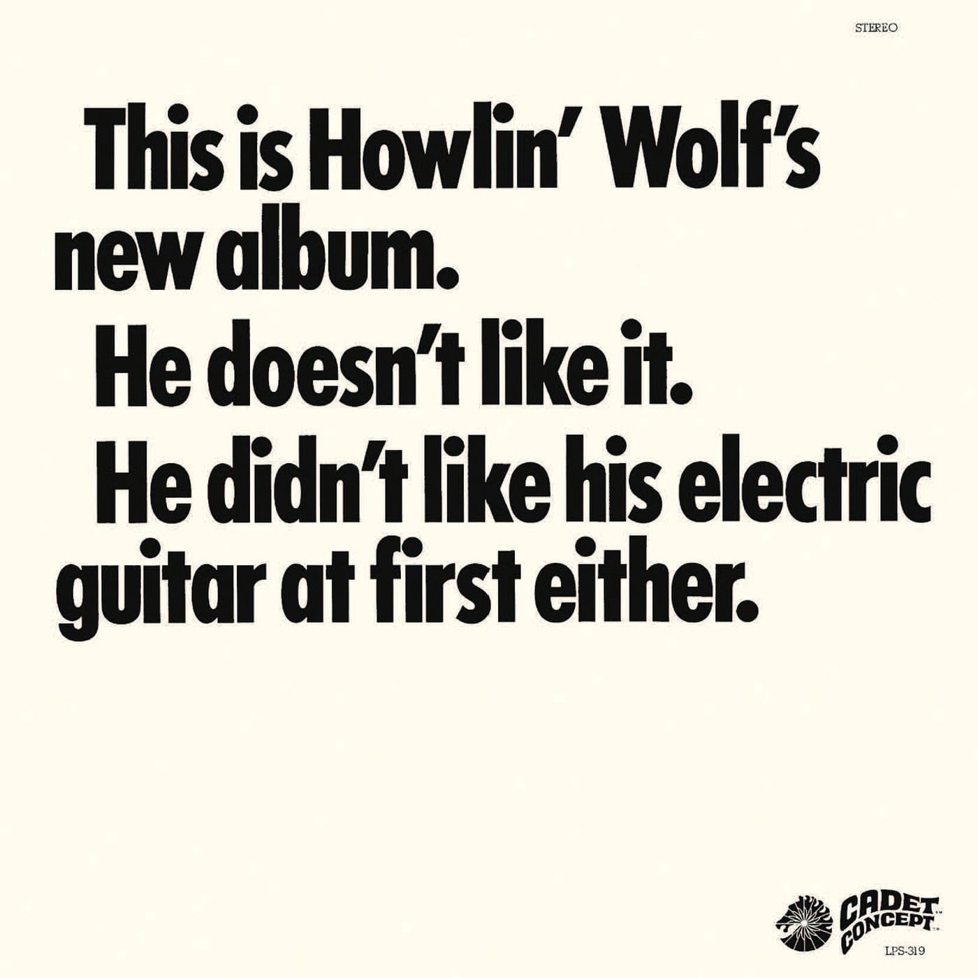
Three lines of black text on a white sleeve: this is Howlin' Wolf's new album, he doesn't like it, and he didn't like his electric guitar at first either. Chess Records producer Marshall Chess had pushed the blues legend into a psychedelic-rock makeover, and rather than hide the tension, the label put it right on the cover. It's blunt, a little mean, and, as you'll see further down this list, it had a very famous echo four decades later.
Master of Reality - Black Sabbath (1971)
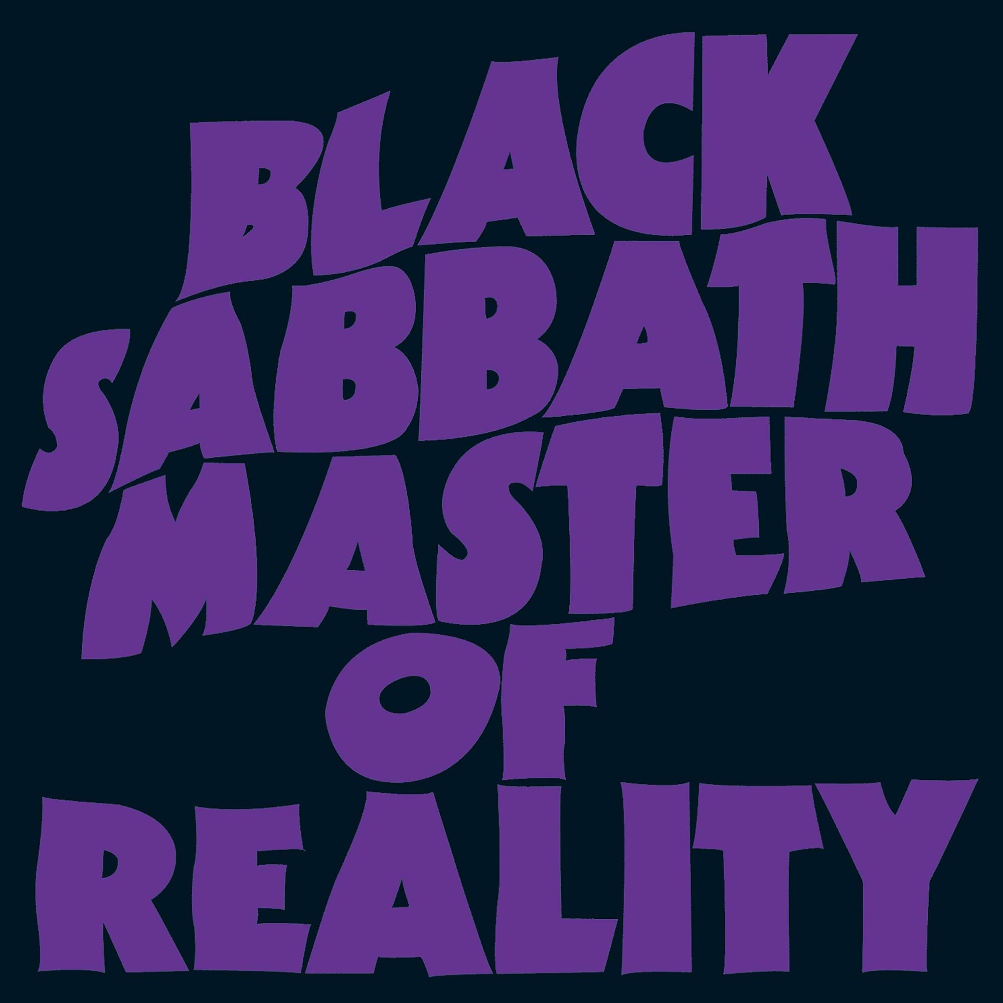
No photo, no illustration. Just the band's name in purple, embossed so it only catches the light at certain angles, the letters distorted like a flag caught mid-flap. That purple-on-black palette became Sabbath's signature for the rest of their career, born entirely out of a typesetting choice.
Never Mind the Bollocks - Sex Pistols (1977)
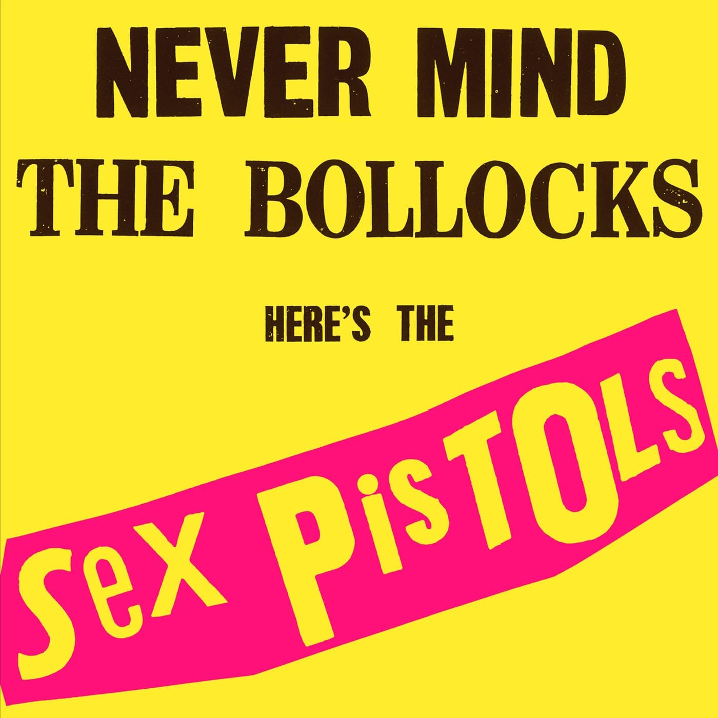
Jamie Reid's queasy yellow background and ransom-note pink logo is one of the most copied designs in music history. The best part is what happened after it's release: a Nottingham Virgin shop was hauled into court for displaying it, and won only when the defense proved "bollocks" was legitimate Old English for nonsense. A record cover that got itself acquitted.
Go 2 - XTC (1978)
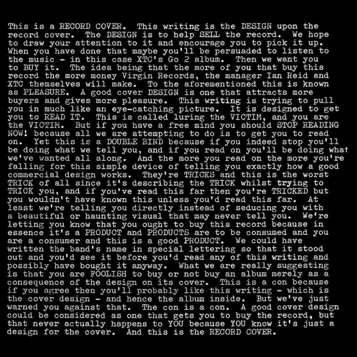
Hipgnosis's cover for this one isn't decoration at all; it's a wall of typewriter text confessing, in real time, that this writing exists purely to sell you the record. It opens with the flat admission that this is a record cover designed to help sell the record, and keeps going for the whole sleeve. Meta before meta was a word anyone used for album art.
The Earth Is Not a Cold Dead Place - Explosions in the Sky (2003)
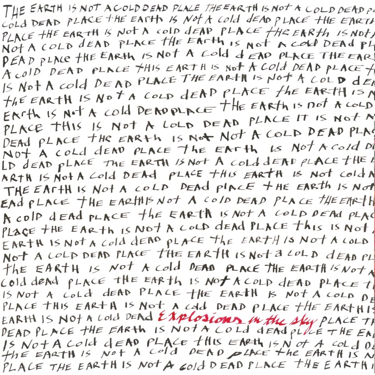
Designer Esteban Rey scrawled the album's title over and over in black handwriting, meant to read like a mantra from someone who'd seen every terrible thing in the world and chosen hope anyway. Coming out two years after September 11, that repetition does a lot of emotional work with zero imagery.
Brothers - The Black Keys (2010)
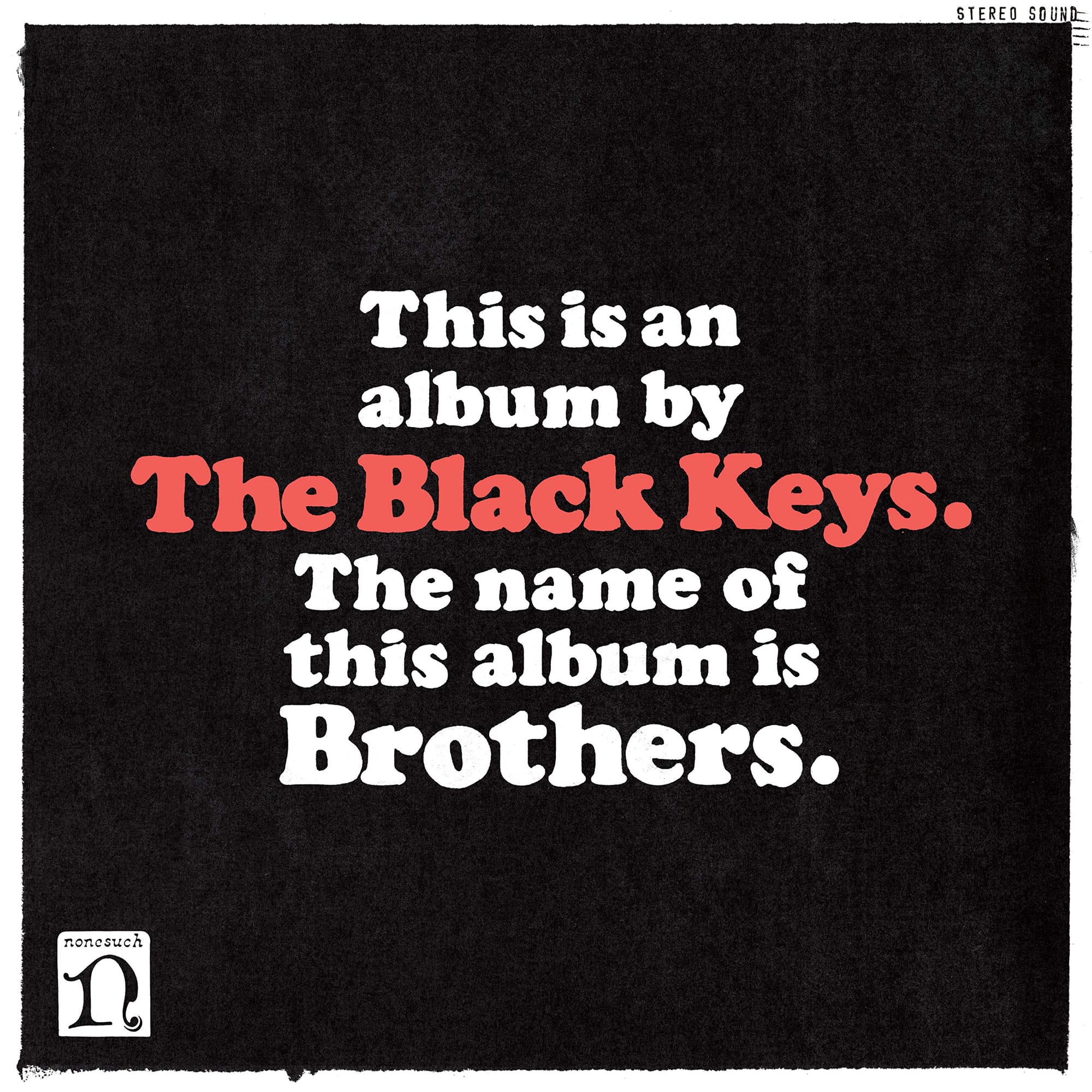
This is the modern descendant of the Howlin' Wolf cover above, and not by accident; critics clocked the resemblance the moment it came out. Designer Michael Carney put two flat sentences on a black background: this is an album by The Black Keys, the name of this album is Brothers. The label was baffled at first, then loved it, and Carney won a Grammy for it.
Add Brothers to your collection
Beyoncé - Beyoncé (2013)
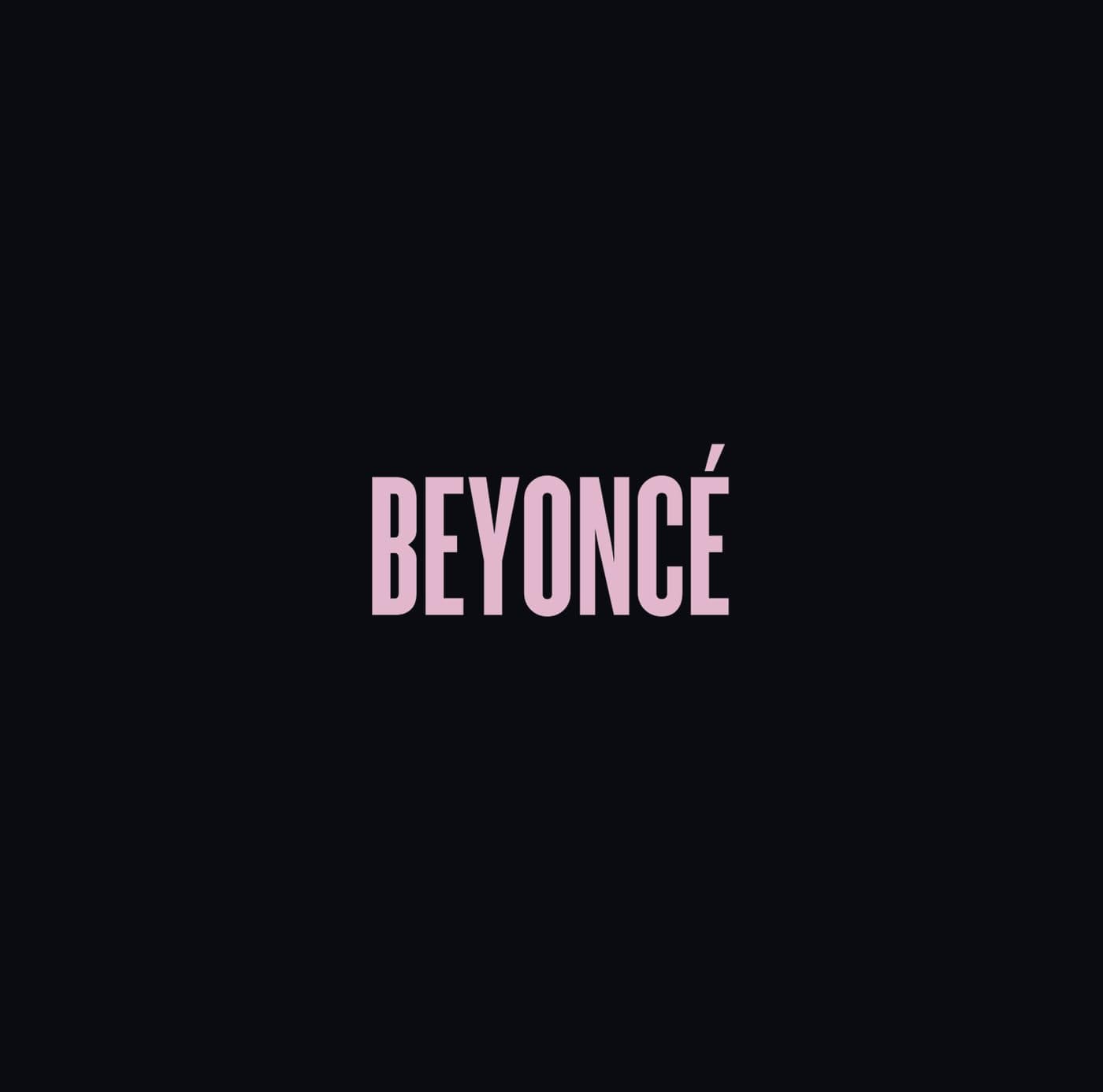
Dropped at midnight with zero warning, the cover is just her name in pale pink capitals on black. The first Beyoncé album cover without her face on it, which is a strange choice for a project built entirely around visuals. The restraint on the outside made the surprise inside land harder.
Pure Heroine - Lorde (2013)
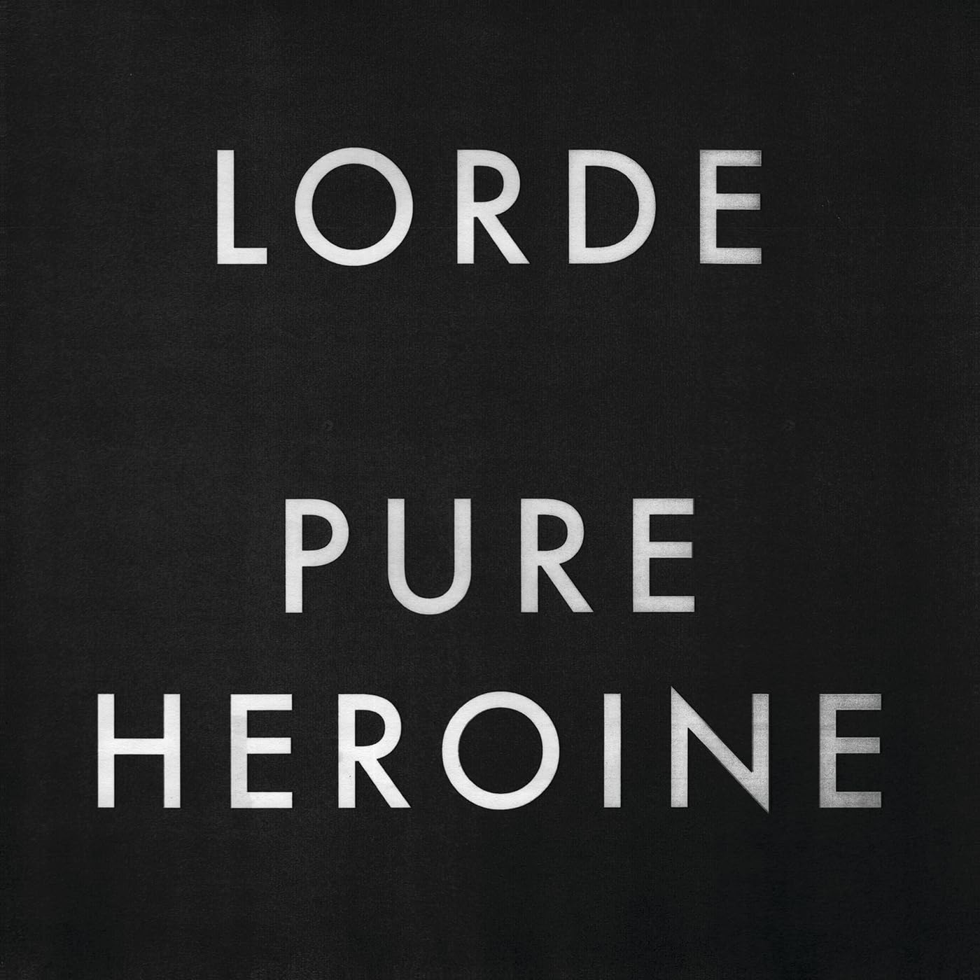
"LORDE" and "PURE HEROINE" stacked in brushed silver caps on black, nothing else in frame. A sixteen-year-old from Auckland refusing the usual pop-star glamour shot before you've heard a single bar. The cover was already telling you this wasn't going to sound like the radio.
Add Lorde to your record collection
Honestly, Nevermind - Drake (2022)
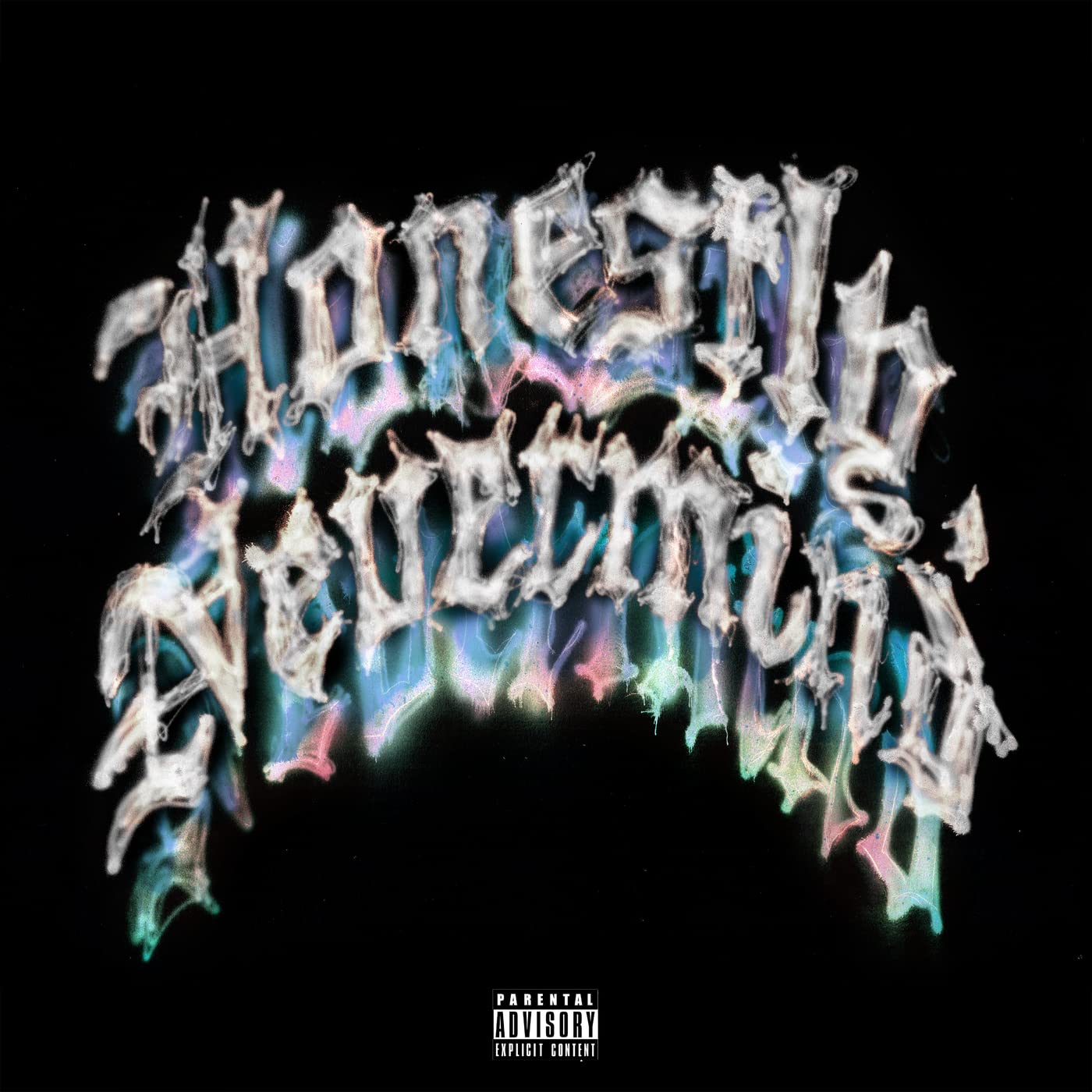
A black screen, the title in gothic silver lettering with a faint rainbow drop shadow, designed by Ben Dorado. Announced and released the same day, dedicated to the late Virgil Abloh, it's Drake at his most stripped-back. A surprising choice from an artist not exactly known for restraint.
Nine records, zero pictures between them, and yet every one of them tells you exactly what you're about to hear before the needle drops. Sometimes the loudest statement a cover can make is refusing to show you anything at all.