I came to Lupe Fiasco through the songs rather than the cover. "Kick, Push" first; that skateboarding love story that felt like nothing else in hip hop at the time. Then "Daydreamin'." Two songs that told me immediately this was someone I might like to listen to.
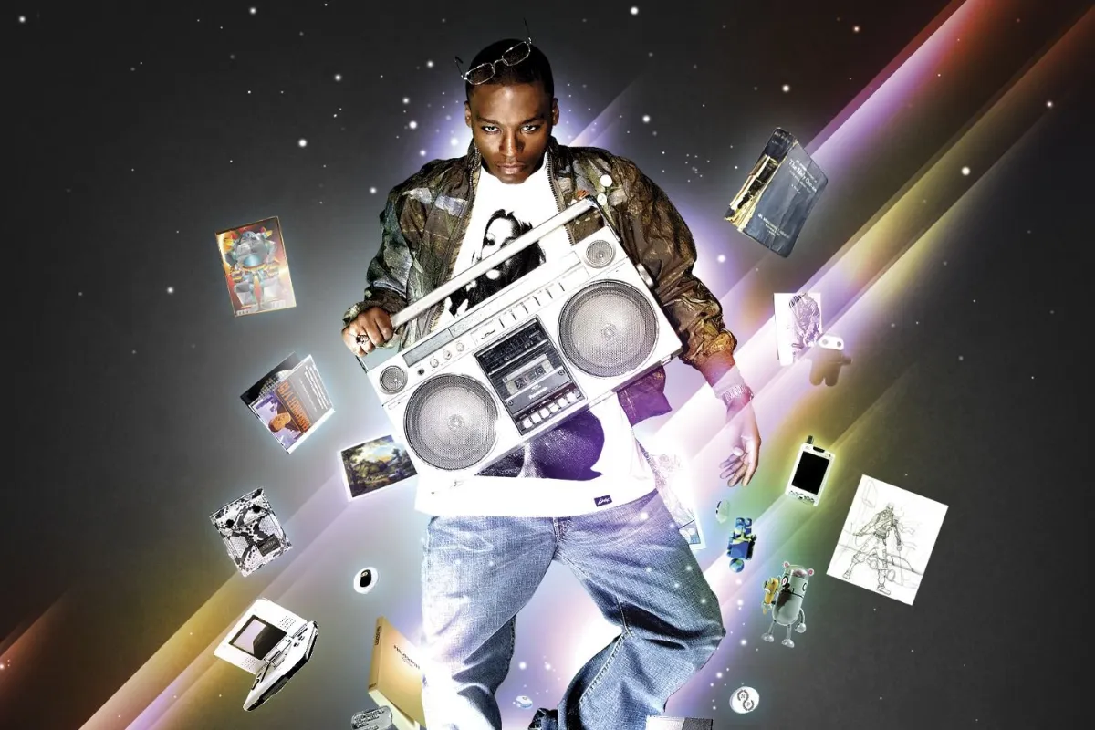
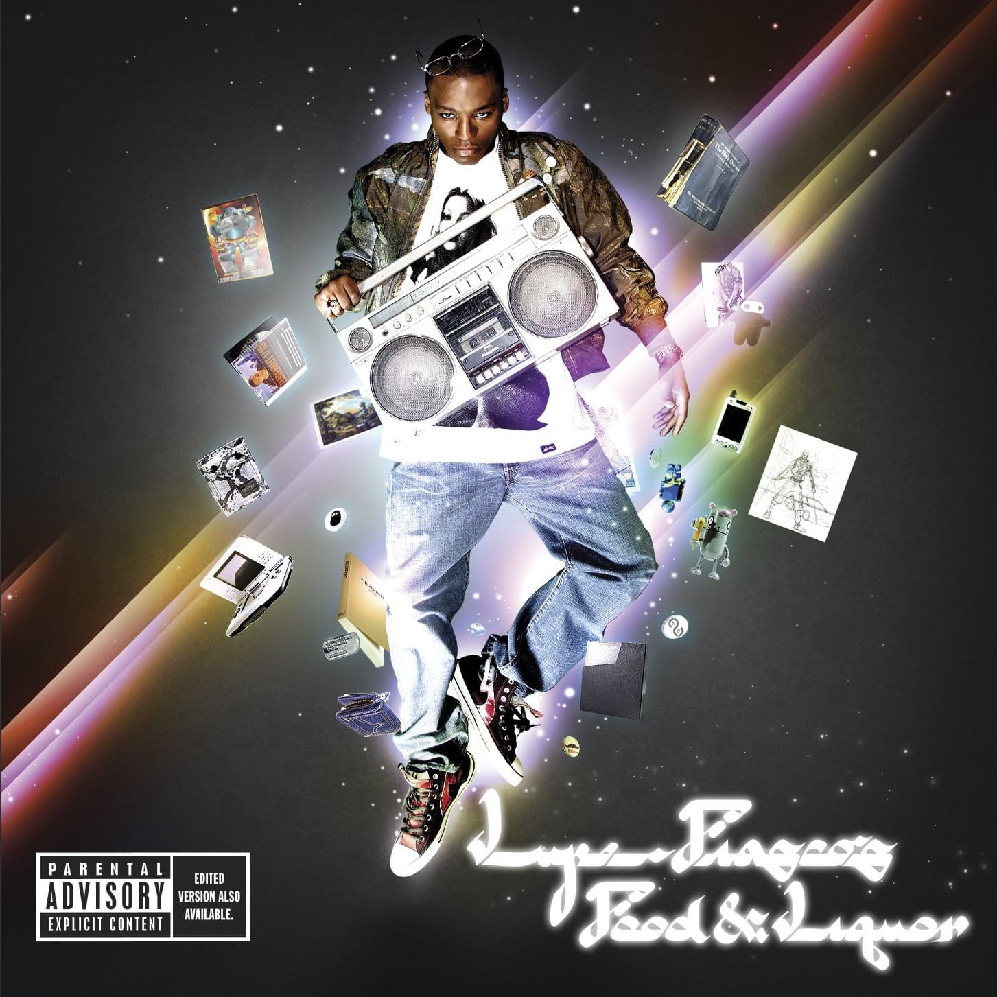
And then, there was the cover. A young man floating in space, surrounded by a bunch of objects: a boombox, a Nintendo DS, a skateboard, pieces of his world arranged around him like a beautiful constellation. Something about it felt familiar without being placeable. Like a memory of something I'd never actually seen.
That feeling, as it turns out, was intentional. And the story behind it starts with a Japanese manga comic.
Album Anatomy
| Album | Lupe Fiasco's Food & Liquor |
| Artist | Lupe Fiasco |
| Genre | Hip-Hop |
| Released | 19 September 2006 |
| Label | Atlantic Records / 1st & 15th |
| On the cover | Lupe floating in mid-air, surrounded by a scattered collage of personal objects — a Qur'an, a Nintendo DS, a sketchbook, a Banksy postcard and a toy robot |
| Design | Chuck Anderson (No Pattern) and Righteous Kung Fu |
| Decade | 2000s |
The Manga That Started Everything
The baseline inspiration for the Food & Liquor cover was the work of Japanese manga artist Katsuhiro Otomo, specifically the cover for his graphic novel Domu, which features the main character floating surrounded by collected objects.
Lupe Fiasco had first encountered that image as a teenager. It kept reappearing throughout his life; on the cover of the comic, then years later on a skateboard deck. By the time he was making his debut album, the image was so embedded in his visual memory that it became the starting point for everything.
A floating figure. Objects arranged in orbit around them. A world rendered in miniature, circling a single human being at its centre.
Lupe is a visionary. His album covers were intricately sourced and he was merging a vast array of influences including fashion, toys and brands a decade before that would come into the mainstream.
Chuck Anderson and the Light Streaks
The photographer and designer behind the cover is Chuck Anderson of NoPattern Studio. Chuck is a self-taught Chicago based designer who had been making a name for himself with a distinctive style of light streak photography and digital illustration.
In Anderson's own words: "He knew he wanted glowing lights, coloured kind of stuff. I don't really know, to this day, where that effect came from. It was a lot of experimenting. I just merged what I was doing personally with Lupe's vision for the album that came from his own ideas and the anime artwork that he was interested in at the time."
That merger, Anderson's light streak aesthetic combined with Lupe's manga and anime influences, produced something that felt genuinely new in hip hop visual culture. The cover doesn't look like a hip hop album cover from 2006. It looks like something from another world entirely, which was precisely the point.
Listen to Lupe Fiasco's Food and Liquor

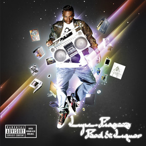
The Objects In Orbit
Let's talk about what's actually floating around Lupe on that cover. Because every object was chosen deliberately.
The boombox; a nod to hip hop's origins, to the street corners and block parties where the music was born. The skateboard; a direct reference to "Kick, Push" and Lupe's own skateboarding background, which made him an outsider in both the hip hop world and the skate world simultaneously. The Nintendo DS; a marker of his generation, of the particular cultural moment of 2006, of a young man who grew up with technology as a natural part of his world.
And then there is the Banksy postcard. Hidden among the objects, a piece of street art by the world's most famous anonymous artist. A nod to the visual culture of protest and subversion that ran through the album's themes.
The cover is a self-portrait made from objects rather than features. You don't need to see Lupe's face clearly to understand who he is. The things that orbit him tell you everything.
More Hip Hop
 Craig
Craig
The 80s Feel That Wasn't The 80s
I think the cover has an 80s feel to it. But it isn't a nostalgia exercise. It's something more interesting.
Lupe was drawing from manga and anime aesthetics that themselves had drawn from American pop culture of the 1970s and 80s. The boombox. The light streaks. The floating figure. These are images that exist in a kind of cultural timelessness; familiar without being dated, retro without being backward looking.
In 2006, hip hop album covers were dominated by luxury; cars, jewellery, designer clothes, diamond teeth, aspirational imagery. Food & Liquor did something completely different. It put a young man from Chicago's West Side in space, surrounded by the objects of his actual life, rendered in the visual language of Japanese manga and anime.
What The Cover Actually Says
Food & Liquor: the title refers to the two kinds of establishments that dominate certain Chicago neighbourhoods. The food store and the liquor store. The necessities and the temptations. The album is about growing up between those two poles; the pressure of the street and the possibility of something beyond it.
The cover doesn't show you a street corner. It shows you a young man who has risen above one; floating, surrounded by the objects of his world, looking out at something beyond the frame.
"Kick, Push" is a song about skateboarding as escape. The cover is the same idea made visual. A person who has found a way to float above the neighbourhood that shaped him without forgetting where he came from.
The objects in orbit. The manga inspiration. The light streaks. The boombox and the Nintendo DS and the Banksy postcard.
I came to this album through the songs. But the cover was telling the same story all along.